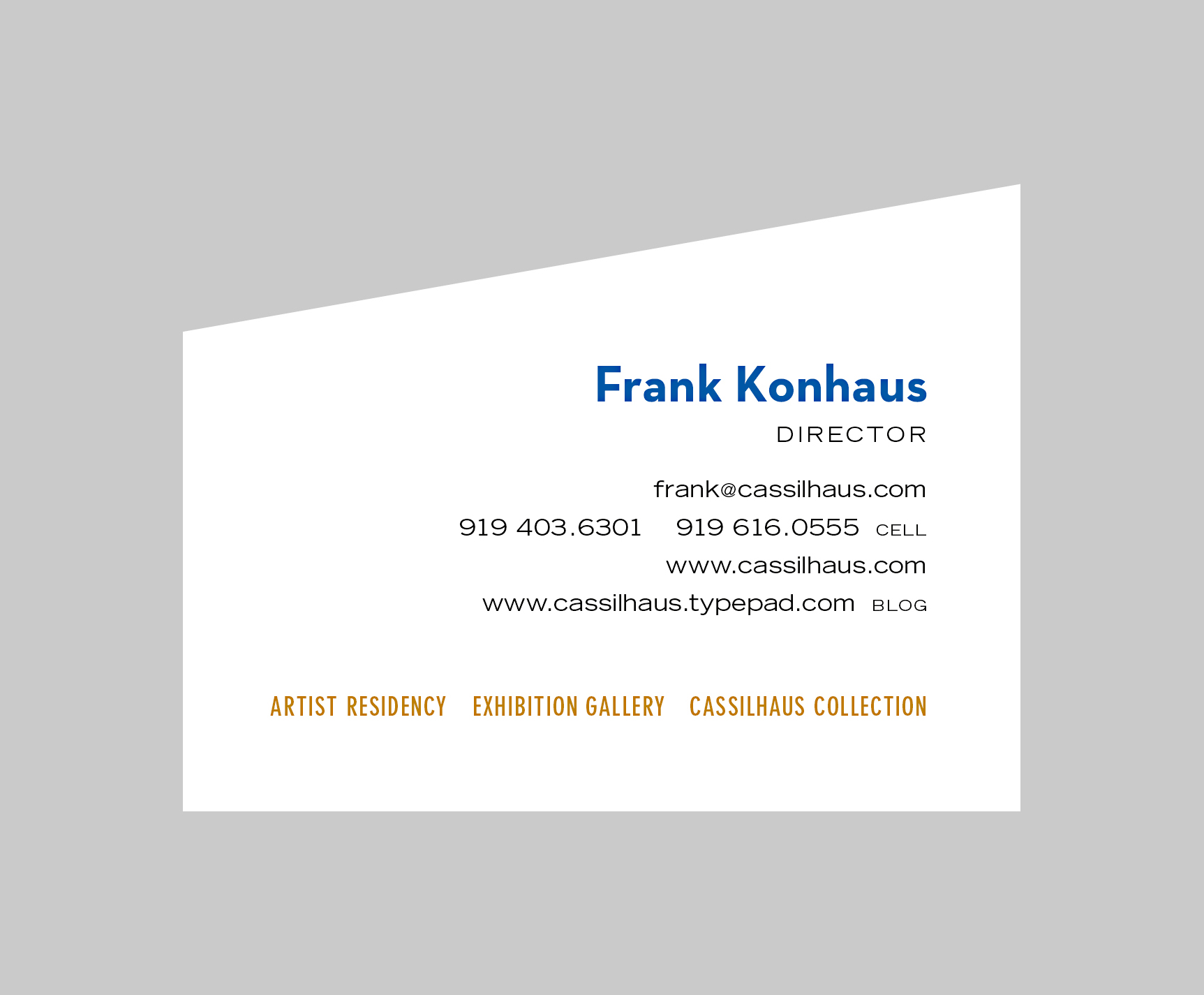
Oversize business card featured a trapezoidal shape to play off the building, which itself was based on trapezoids.
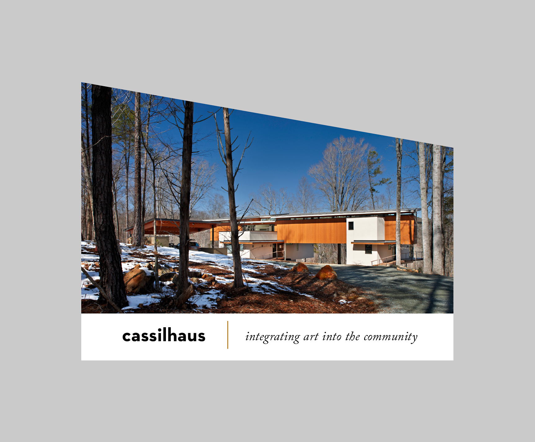
Oversize postcard project.
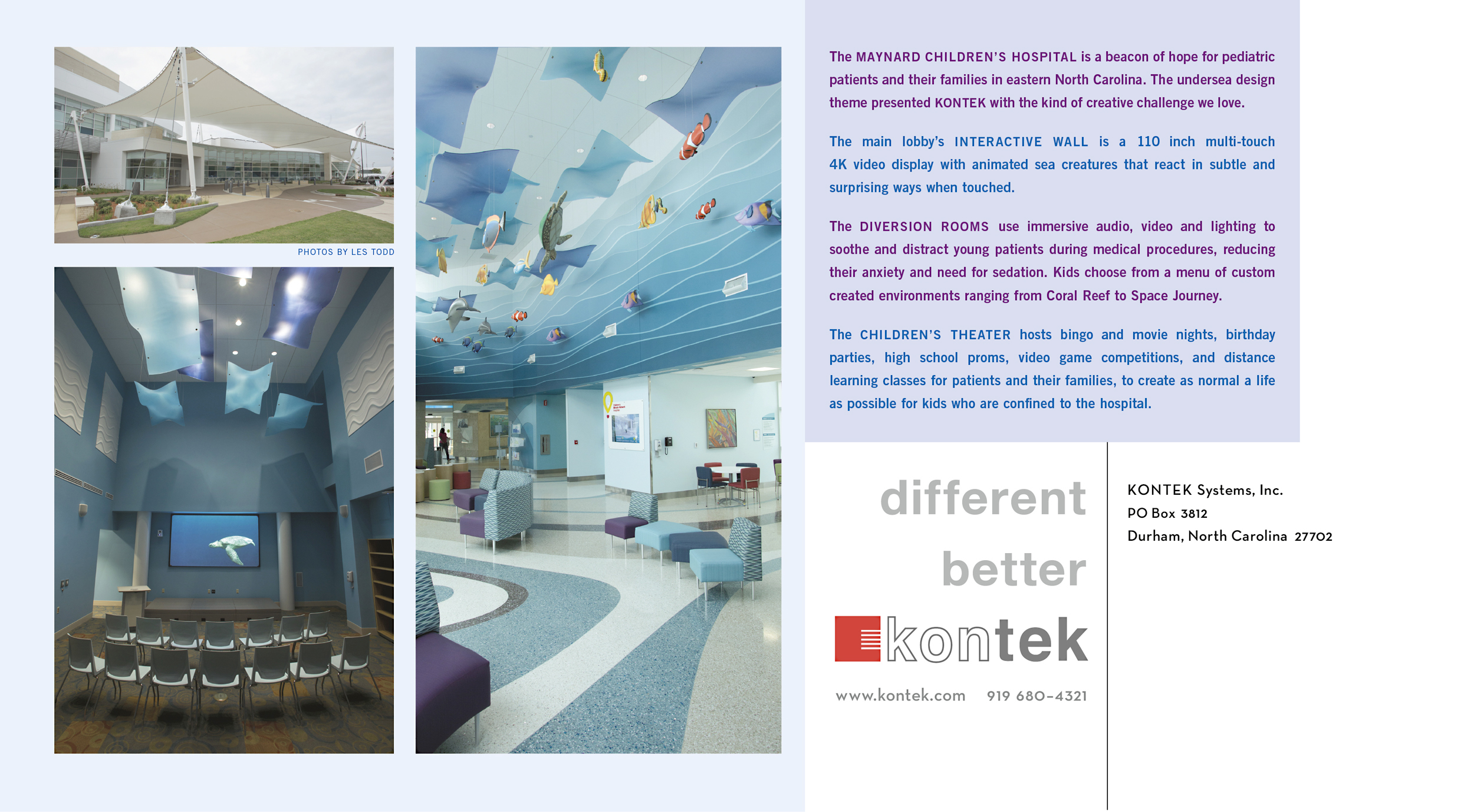
Pulling a color palette for the text blocks from the photographs for a harmonious overall design.
Postcard back.
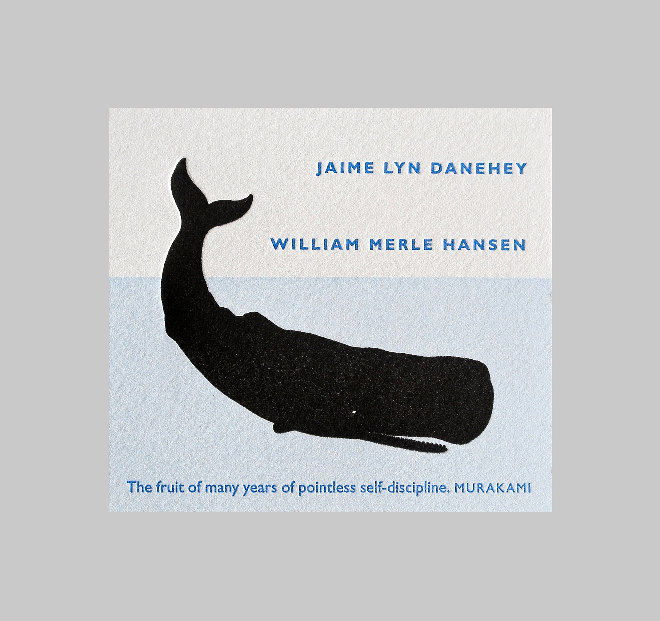
Bookplate for a librarian couple. They wanted to combine their love of classics (the whale is a reference to Moby Dick, one of their favorite books) with a quote from a contemporary author.
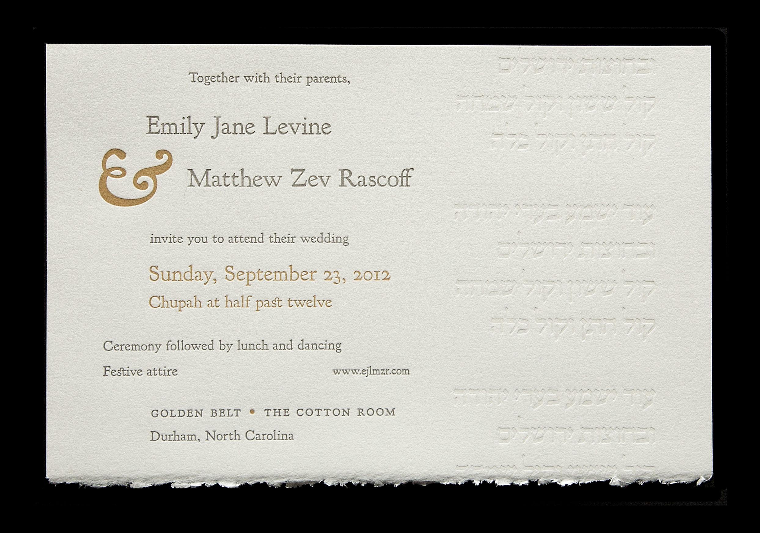
Hebrew text was blind debossed (printed without ink). The letterpress impression is accentuated by the deckle edge of a printmaking grade paper.
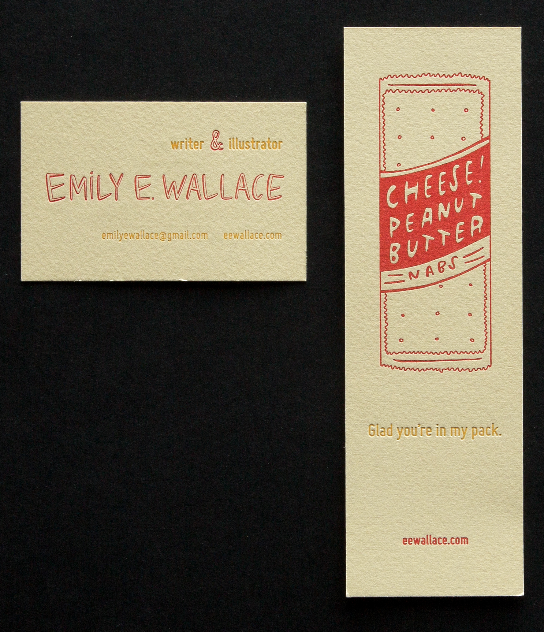
Business card and bookmark for a writer who is also an illustrator.
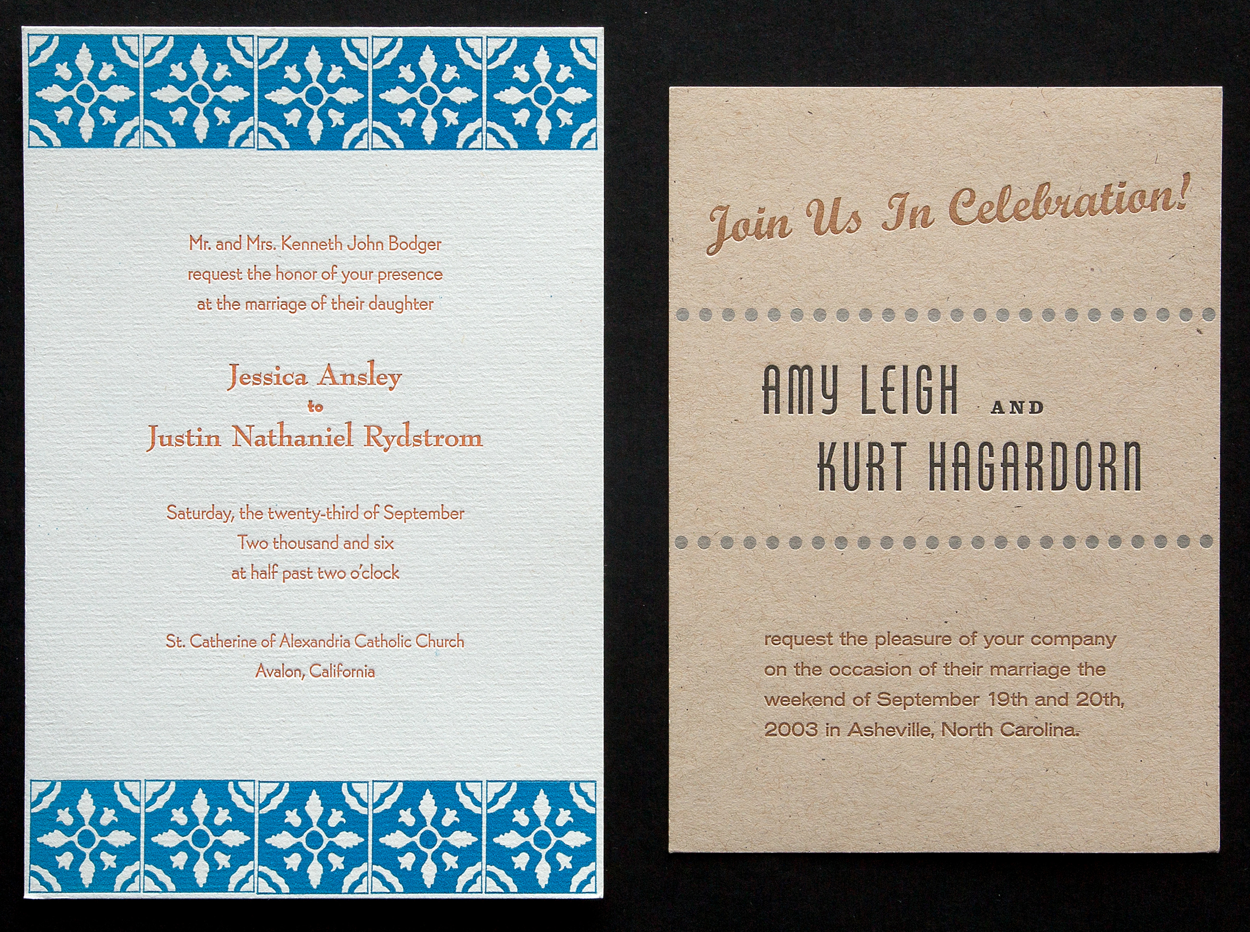
All letterpress wedding announcements are custom designs and tailored to the couple’s personality and/or some element of the wedding locale or theme.
Slightly oversized business card. 2.5 x 4 inches.
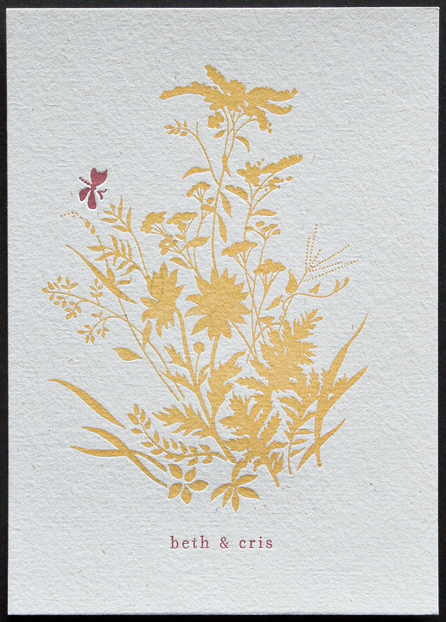
Purposefully letting the warm yellow background be mottled rather than a flat perfect solid. To show the beauty of irregularity/imperfection.
A thank you card that doesn’t say ‘thank you’ so it can be used for other purposes. Printed on a laid lines Hemp Heritage paper.
Typeface choice to accentuate the style of work of the client.
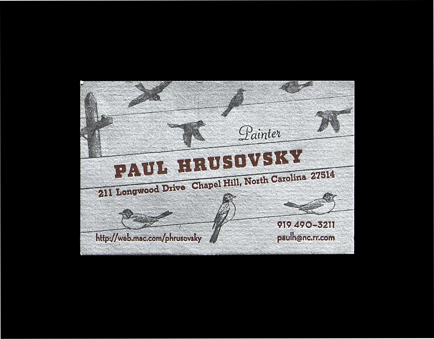
Paul and I collaborated on four different business card designs and this was my favorite. He wanted one of them to have a grungy feel so I used a halftone screen of a charcoal drawing for the background.
Front cover of a birth announcement (baby photo went inside along with date and weight details ).
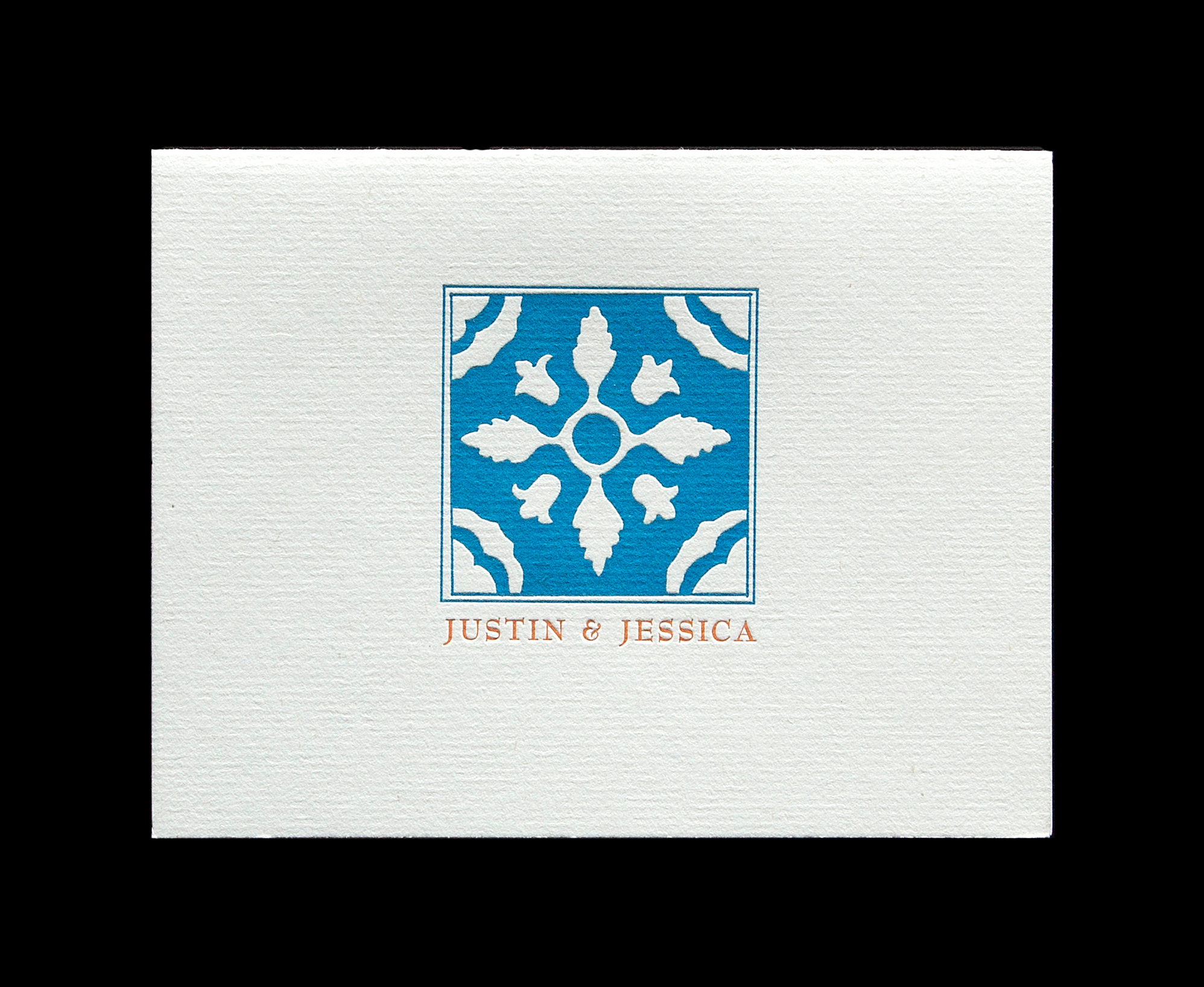
Thank you card was printed at same time as the wedding announcement.
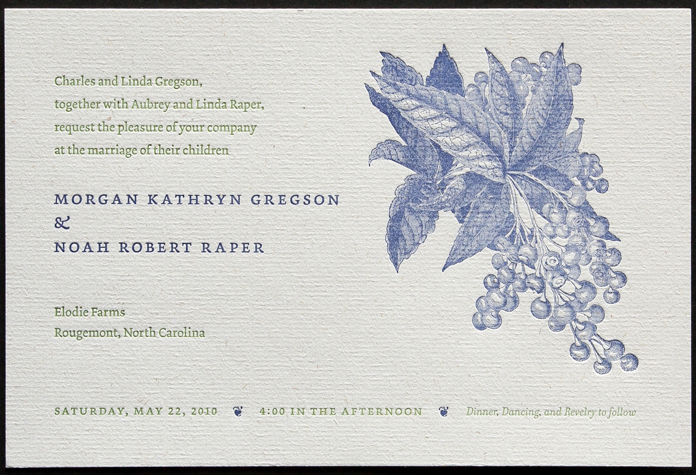
Wedding took place on a blueberry farm. Letterpress printing does a great job with line drawings.

Fun letterpress invitation for Bill Fick who runs Supergraphic screen printing lab.
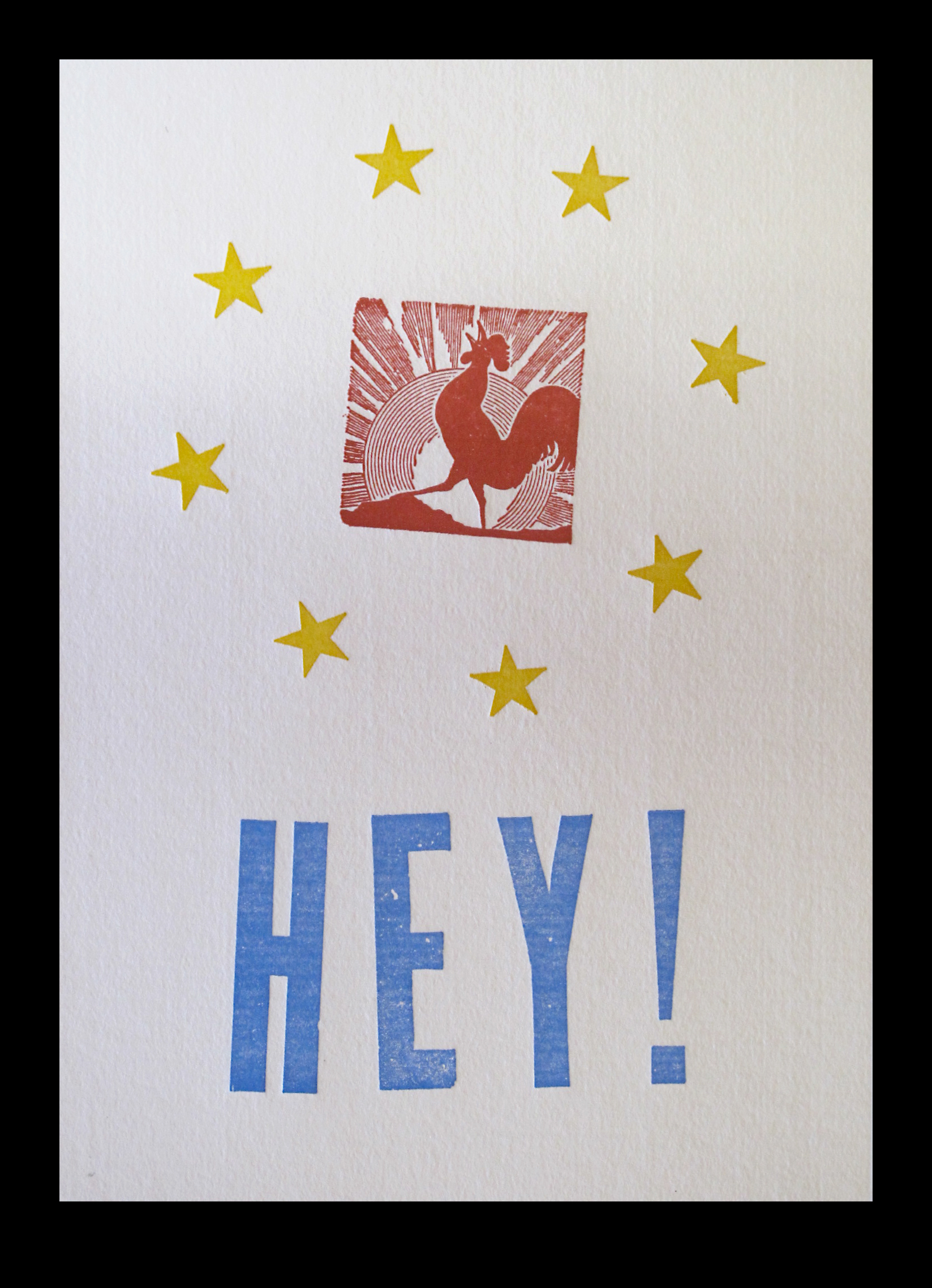
All purpose Southern greeting card.
Logo design for Zelda Lockhart’s publishing venture (see trade books section to see the Cold Running Creek novel I designed for Zelda).
We had fun with this logo project and made several variations of the logo featuring hand-lettering and a circle that implies the ring left behind by a cocktail glass . . .
. . . and sometimes the circle implies dinner plate and well of the plate.
Logo for the Ellen Cassilly designed Pavilion which was a block down from my Foster Street studio.
Logo. notice the bottle cap play with the green ring to play off the classic diner theme.
Restauranters wanted a logo for the catering company that utilized same color scheme as the diner logo.