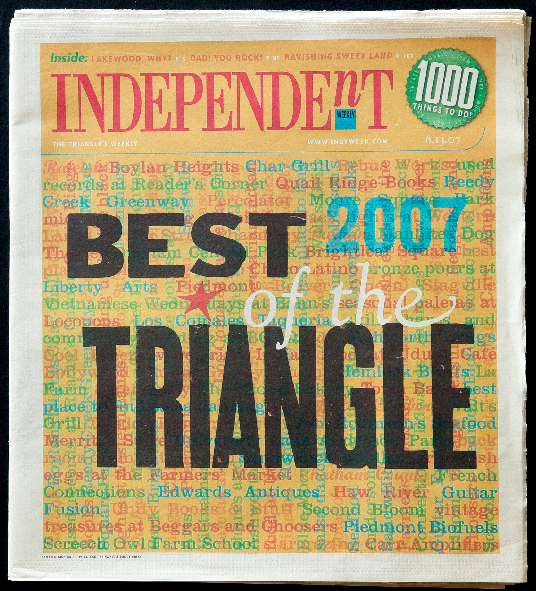
Typographic collage for the cover of the local newsweekly. The large black text is a scan of wood type proofed on the letterpress.
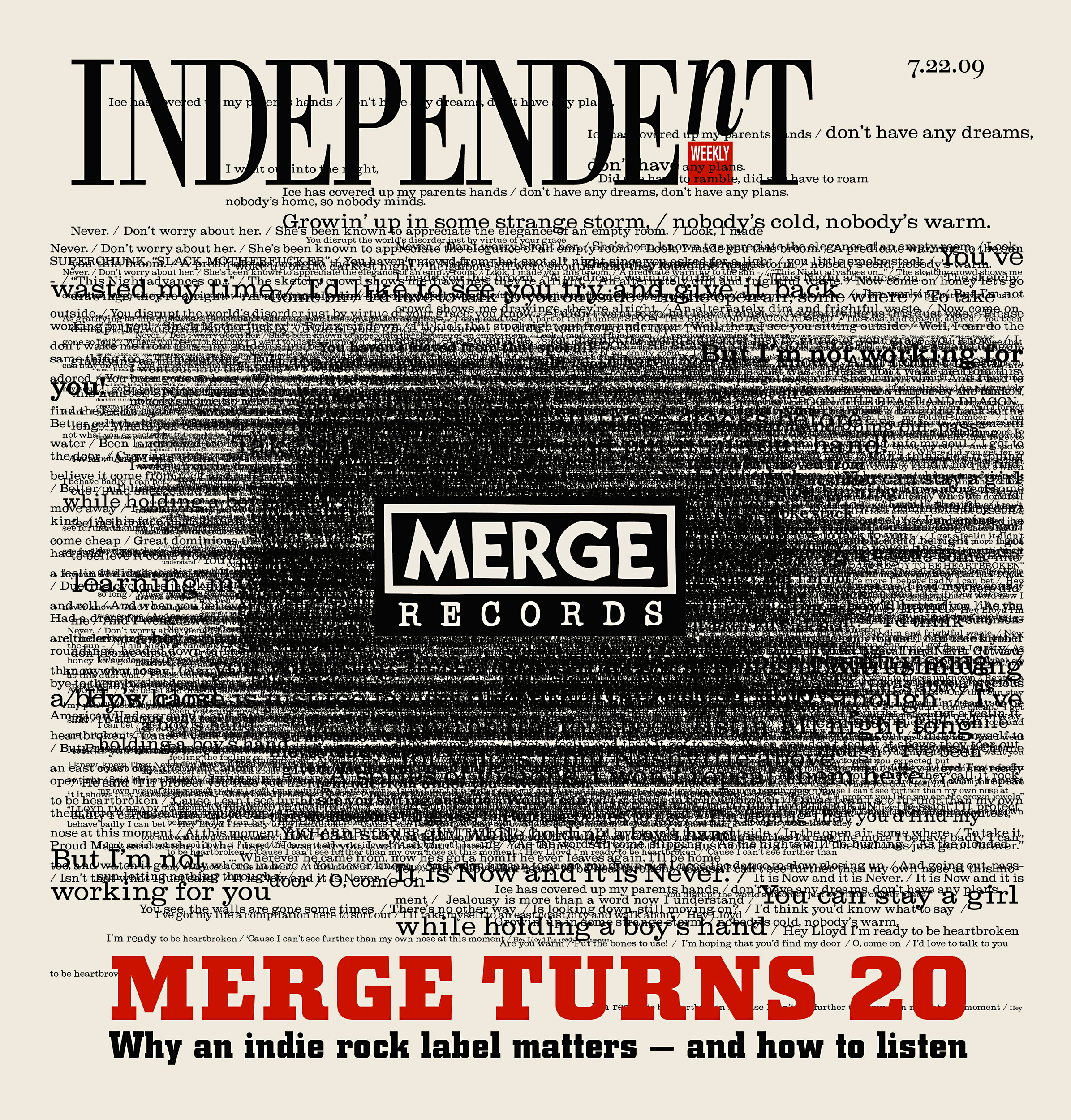
Cover for newsweekly featured a magnetic field of lyrics from various songs that Merge recording artists have released over the years.

I've designed the 100 plus page program guide for the Full Frame Documentary Film Festival since 2009. This project is turned around in only 3 weeks design time.
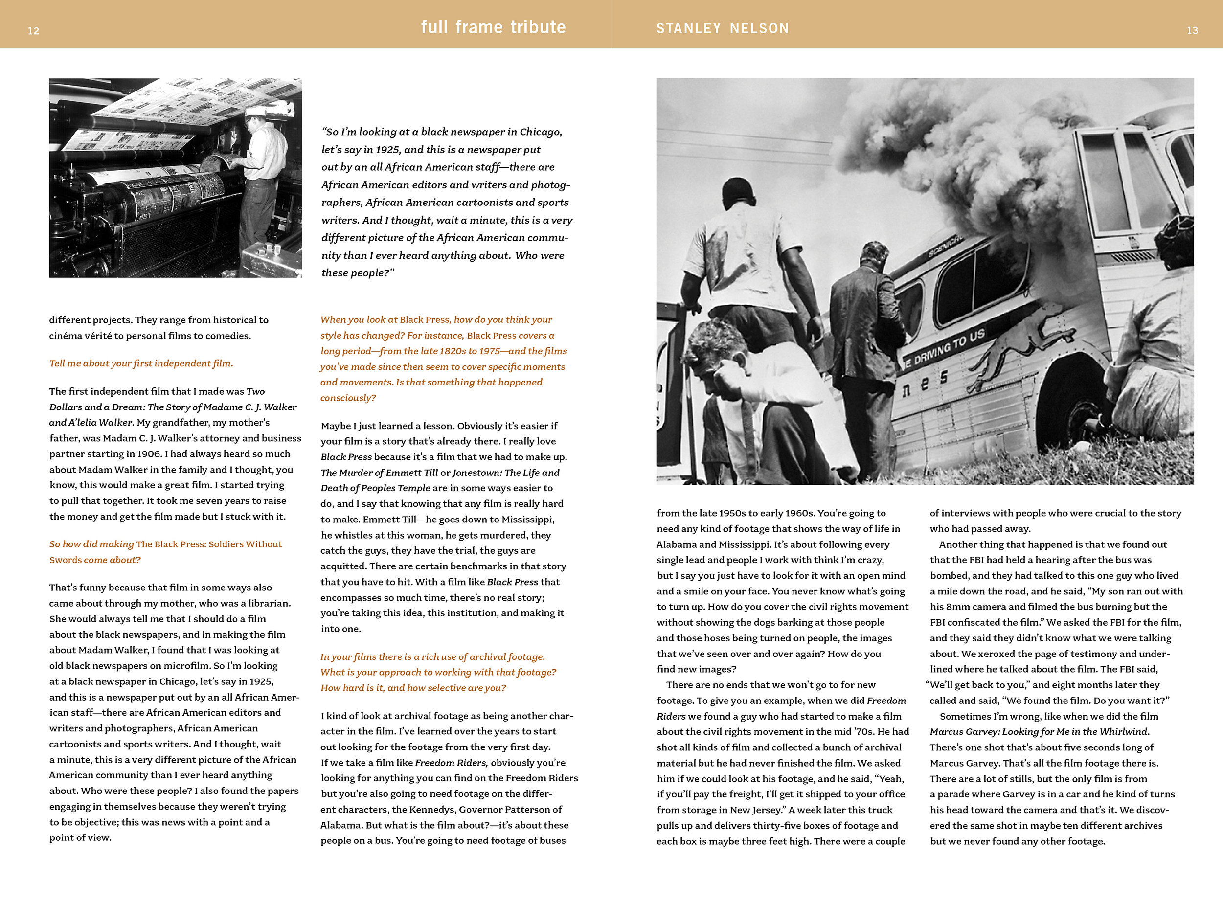
The program guide has several different thematic sections which are color coded for immediate differentiation. This is an interview from the career tribute section.
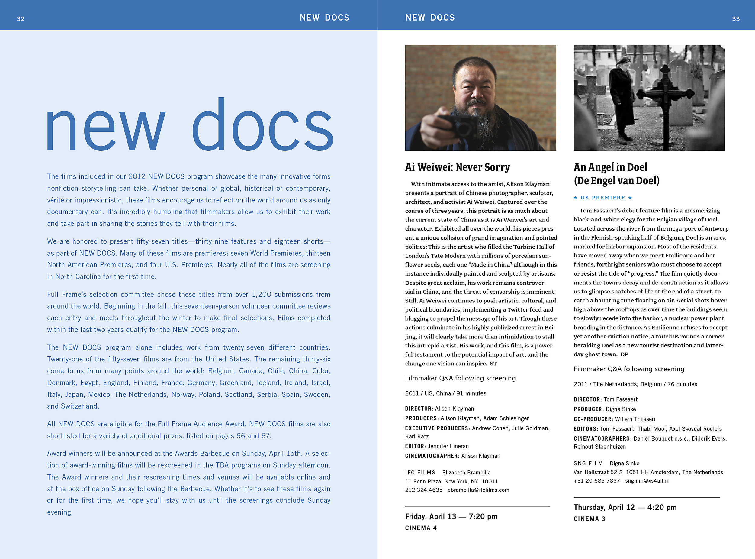
The heart of the catalog is descriptions of the documentaries debuting at the festival.
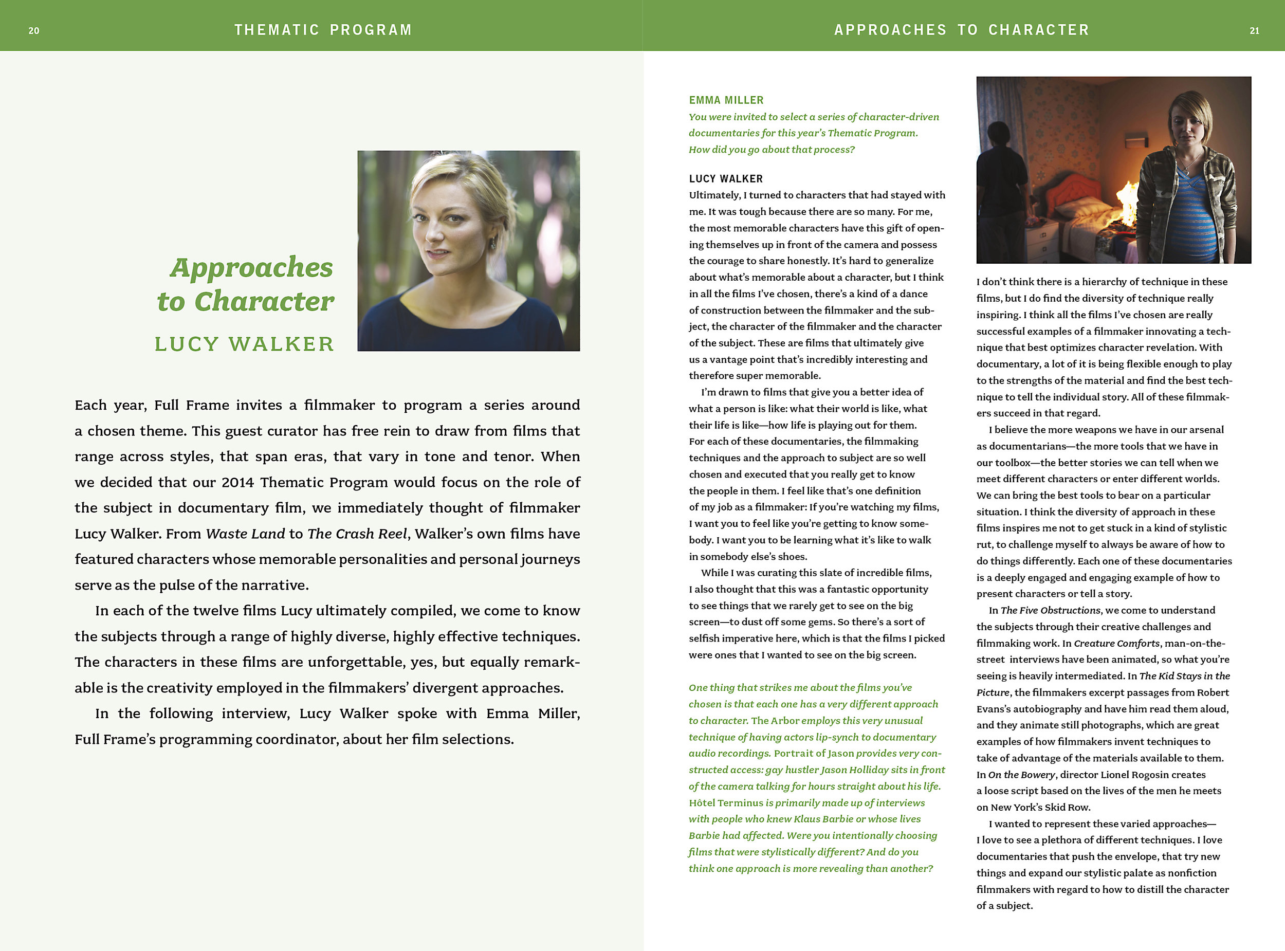
Opening to the thematic component of the festival which is curated by a different filmmaker/archivist every year.
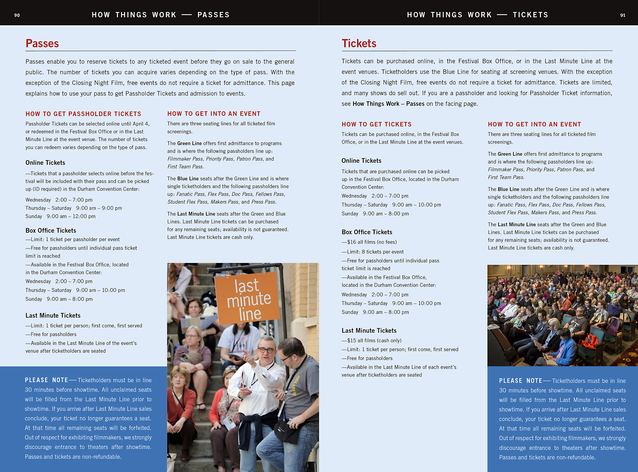
Detailing how things work to ensure that festival goers have a smooth experience navigating the four day festival.
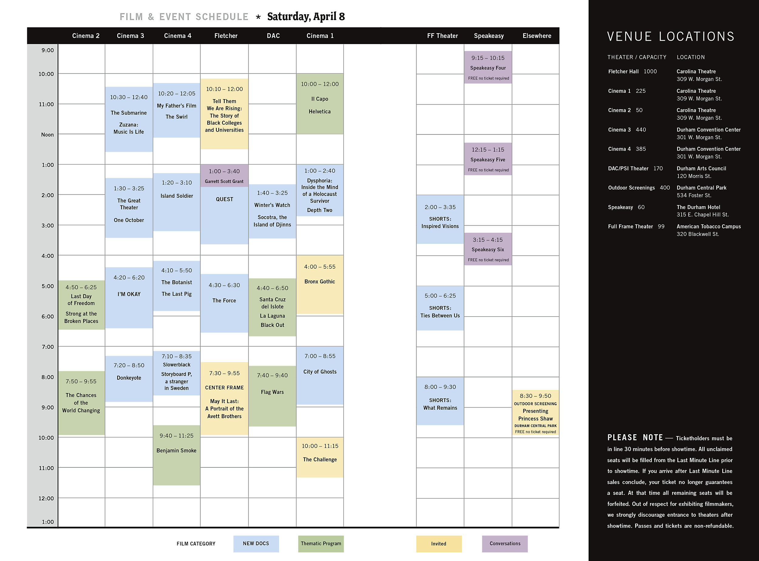
The grid provides a snaphsot of the film schedule.
Annual report cover.
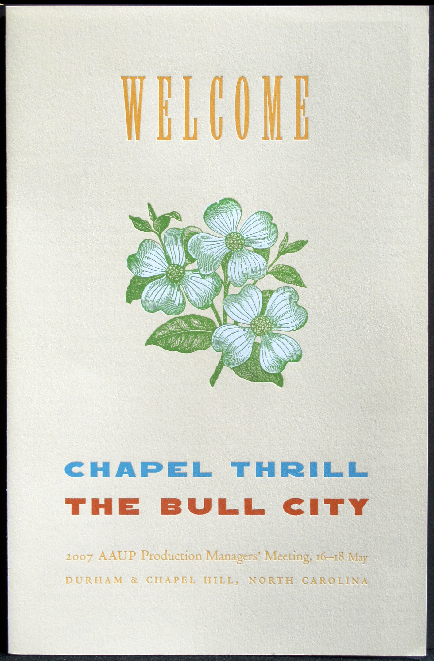
Cover of brochure for a design conference. The dogwood flowers knock out of the solid yellow background flood to show as the only white on the design.
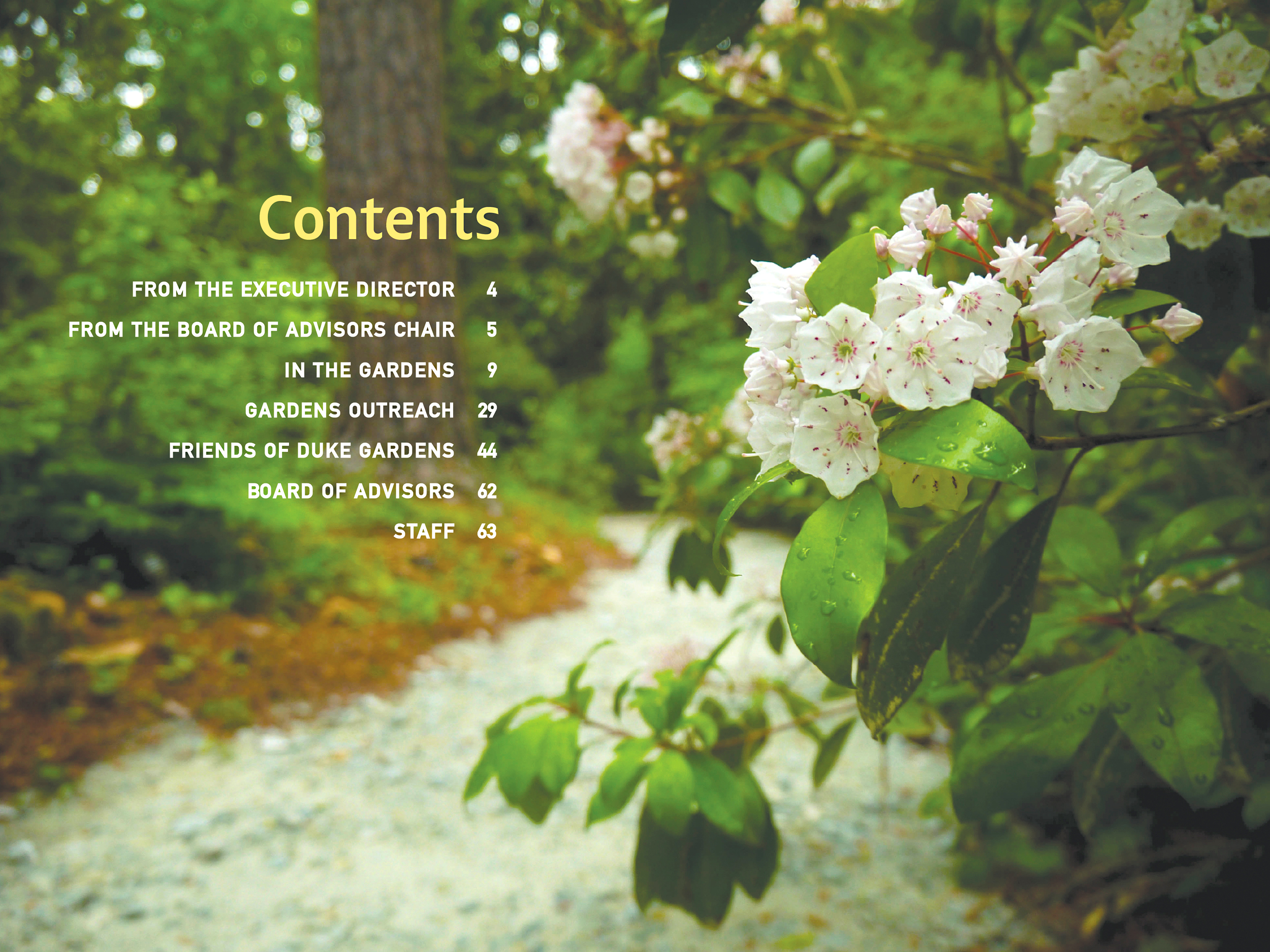
Contents spread. Listings can go on the left page and look good. Turning the page mimics walking down the path.
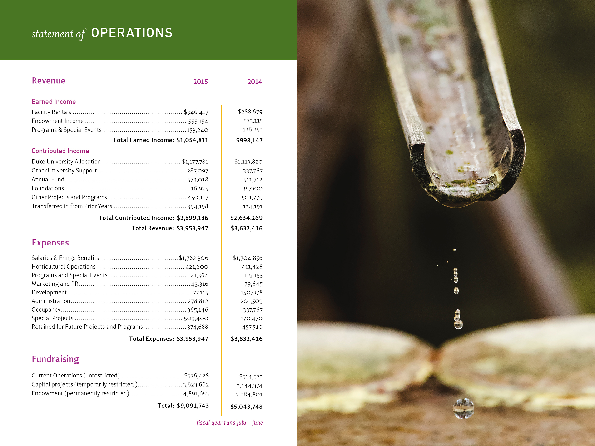
Making a spreadsheet visually engaging.
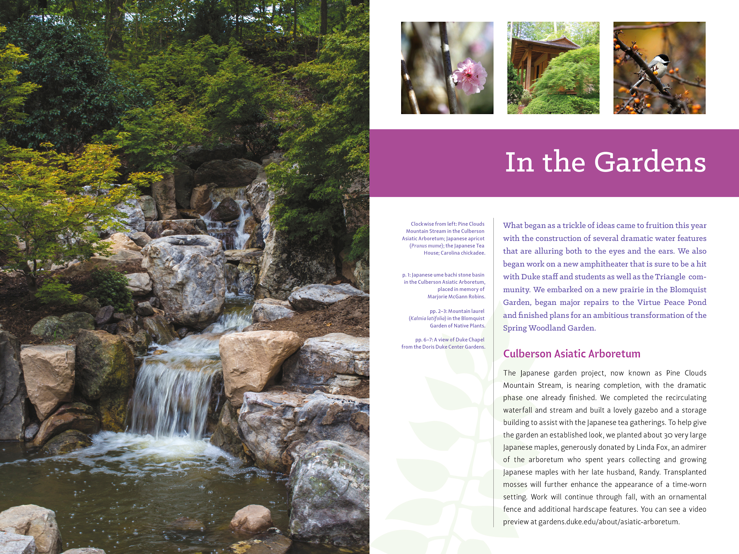
Chapter opener for the annual report. Shooting for an equal balance of photography and narrative text to make for an engaging read.
Typographic callouts to engage the reader who first skims the layout.
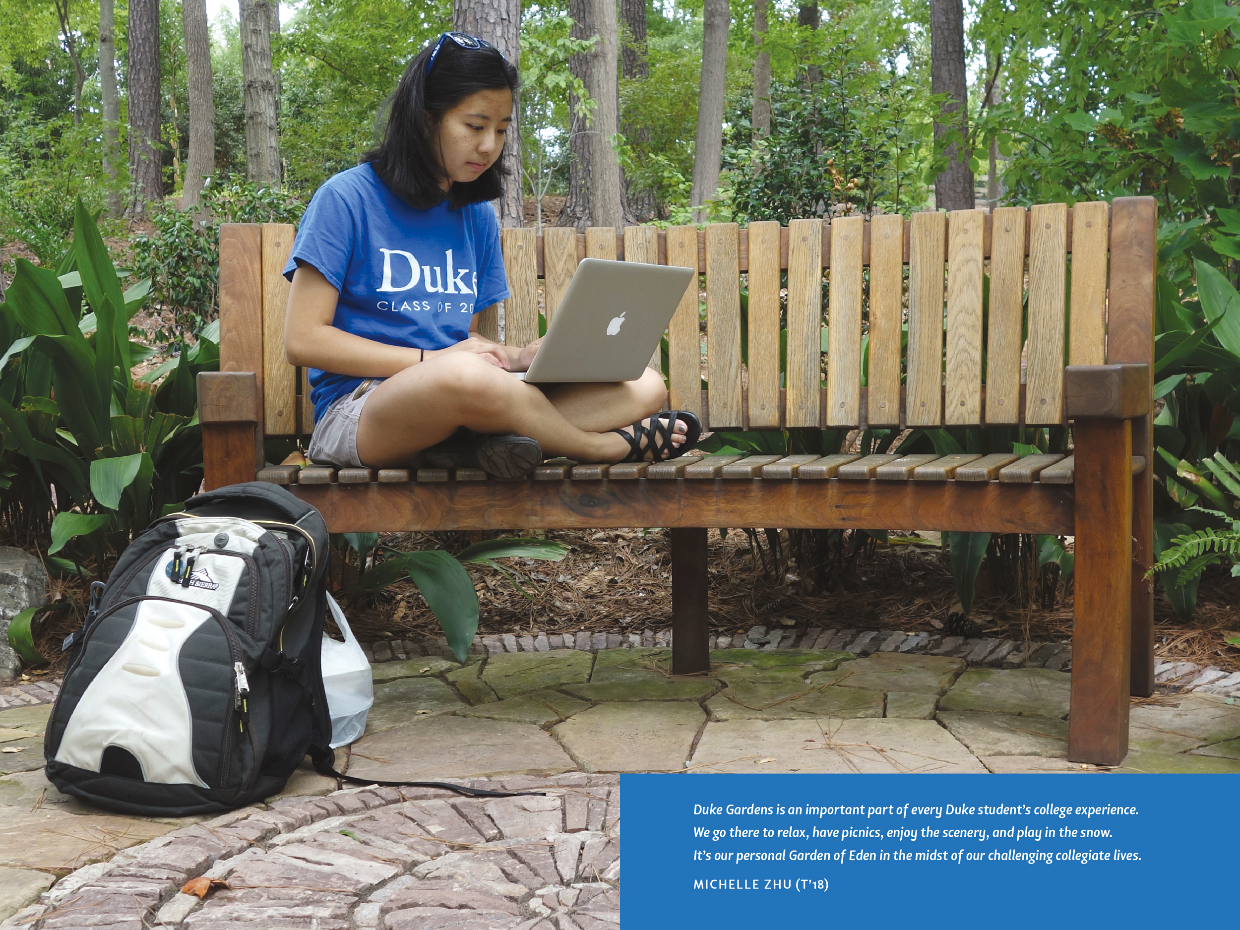
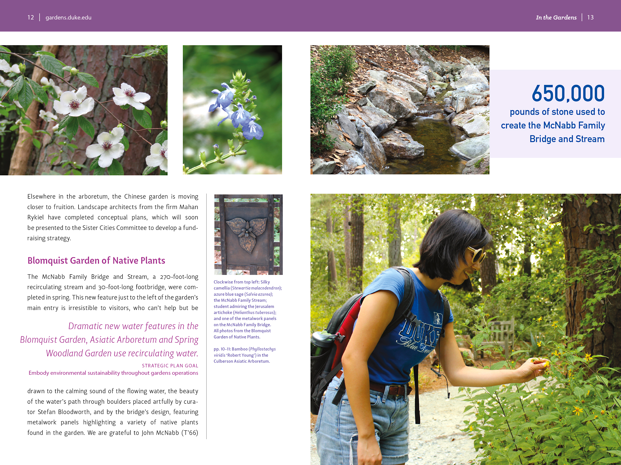
Several spreads feature text from students using the gardens as a study center.
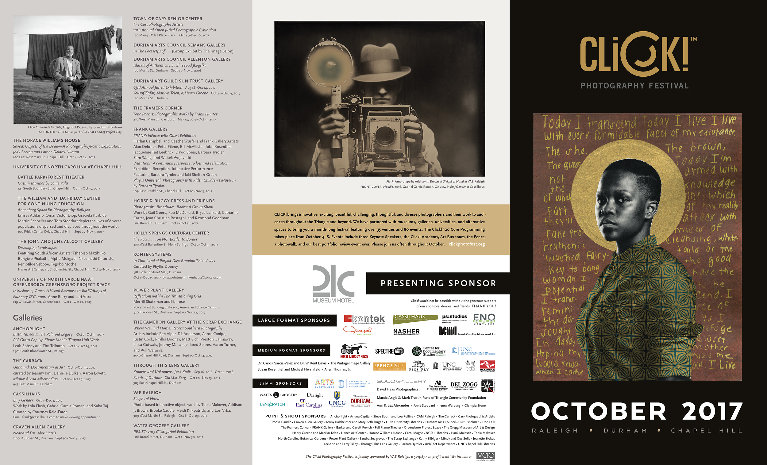
Unfolded program guide from the photography festival (which we co-sponsor).
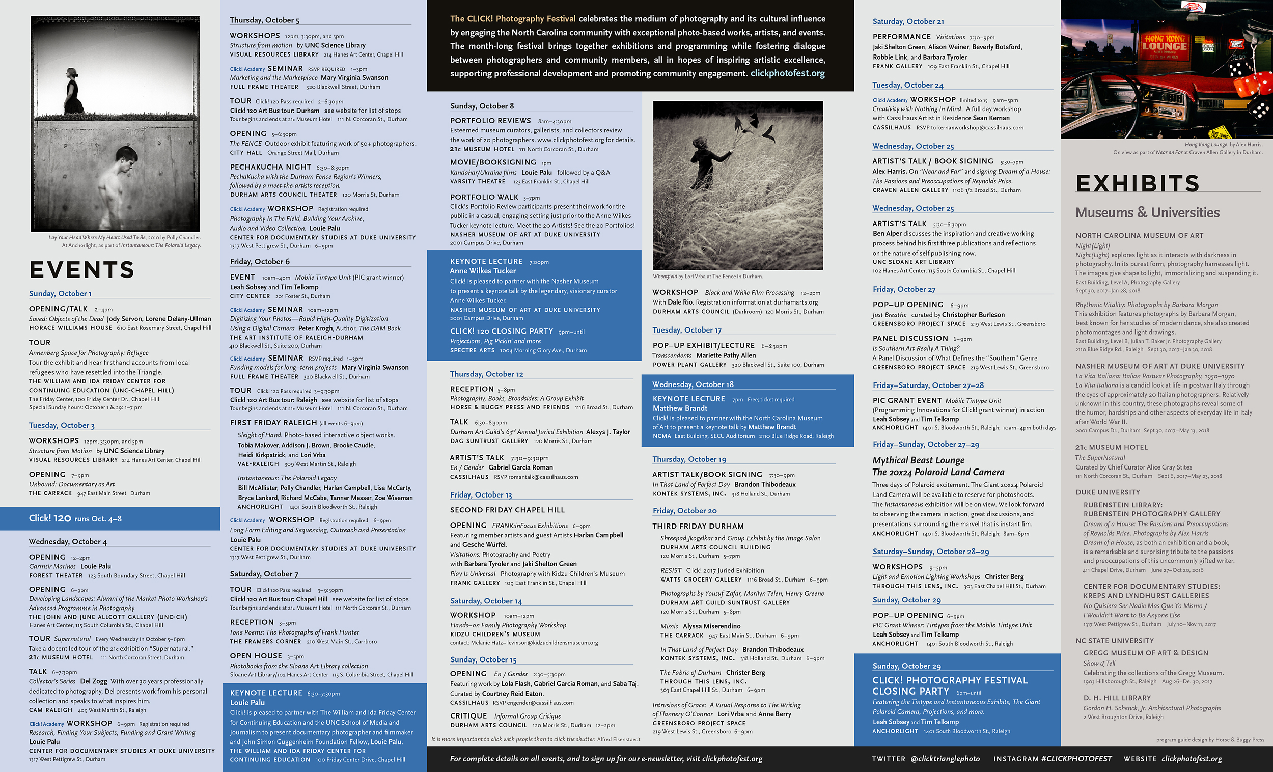
Blue color coding denotes keynote speaker, opening and closing main events, and the Click 120 component of the month-long festival.
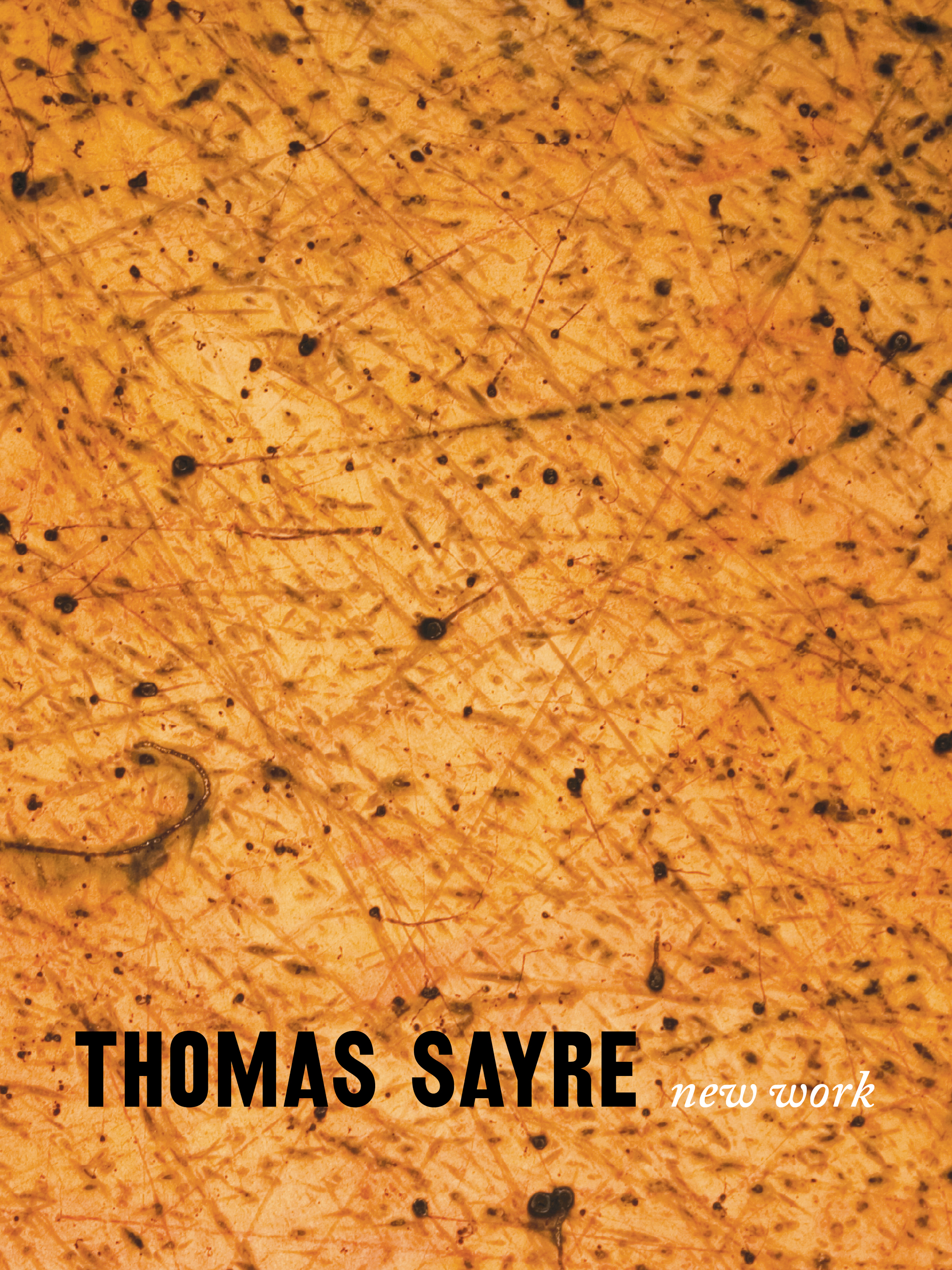
Cover for the Gregg Museum exhibit catalogue.
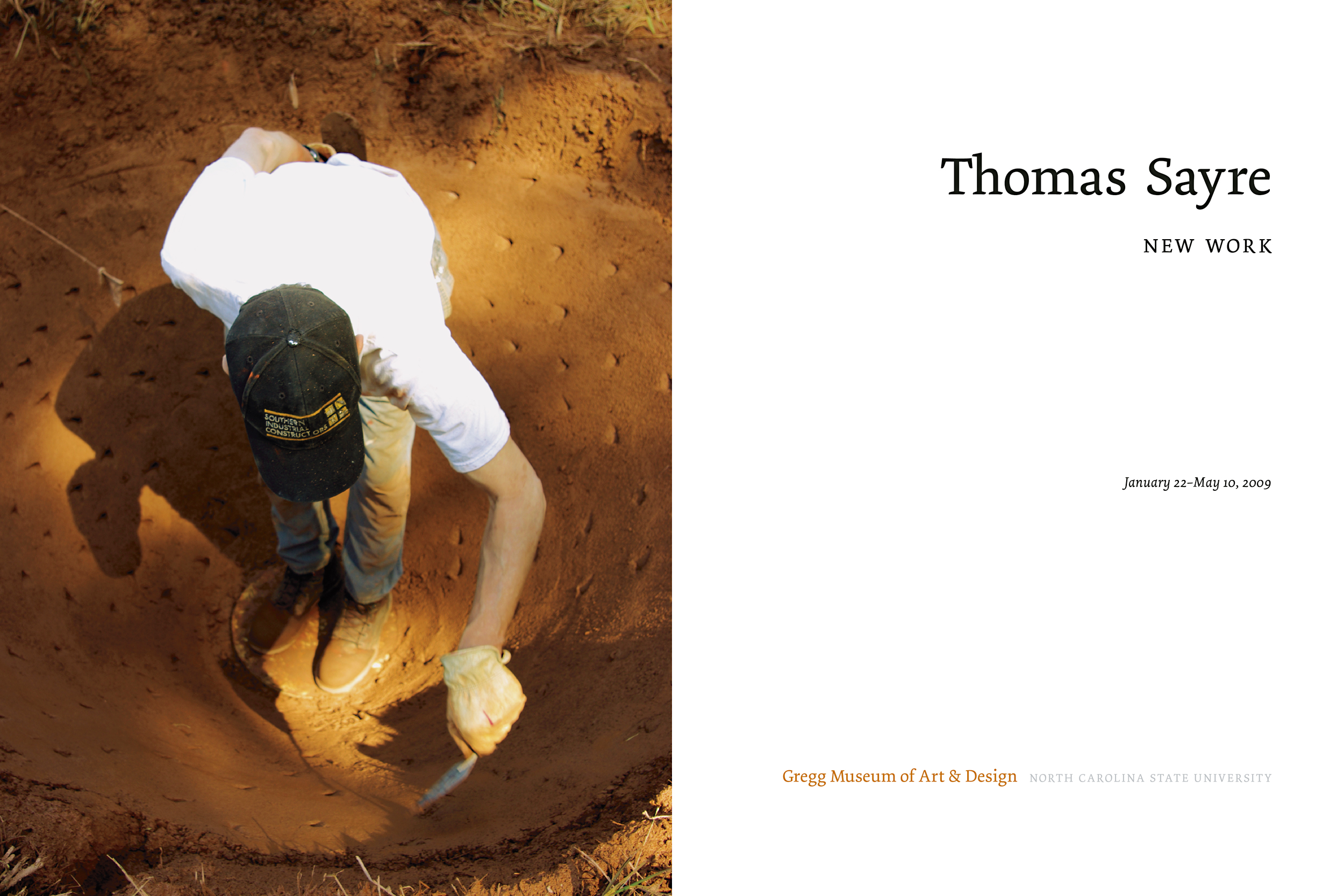
Title spread.
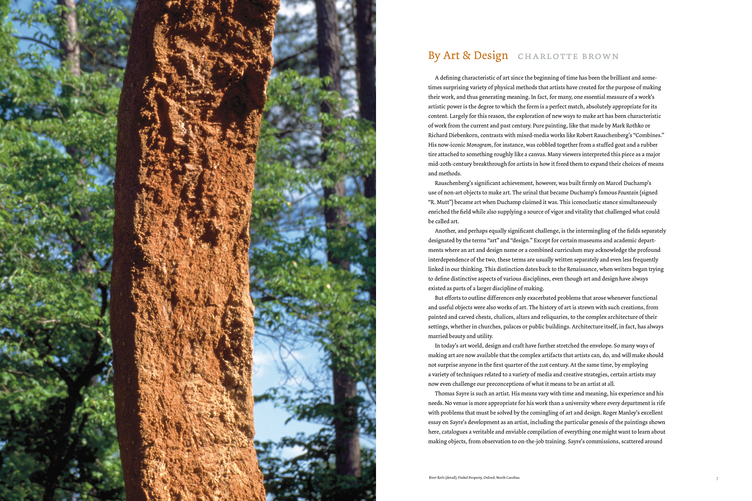
Opening spread to the museum director’s introductory essay.
Essay continues.
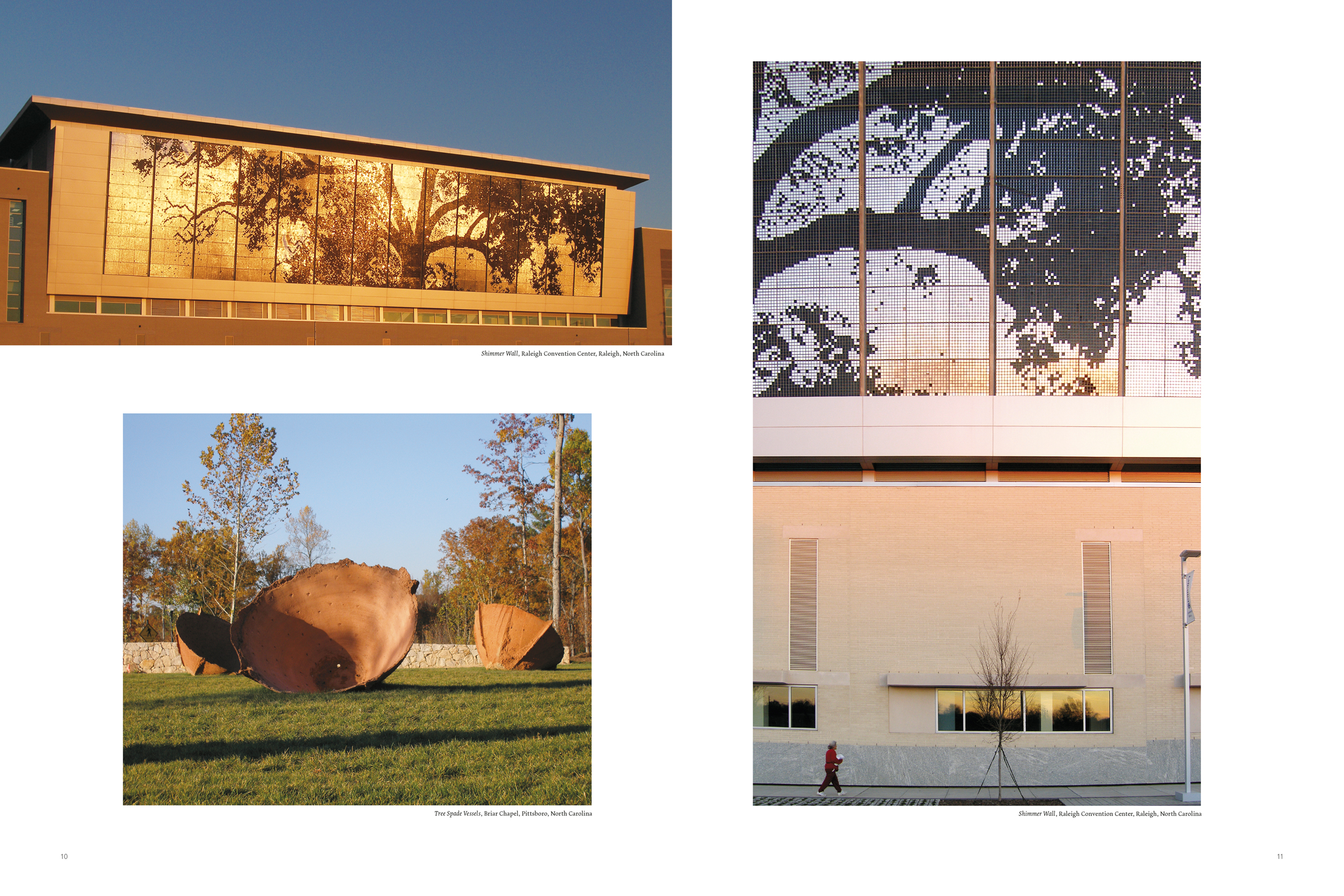
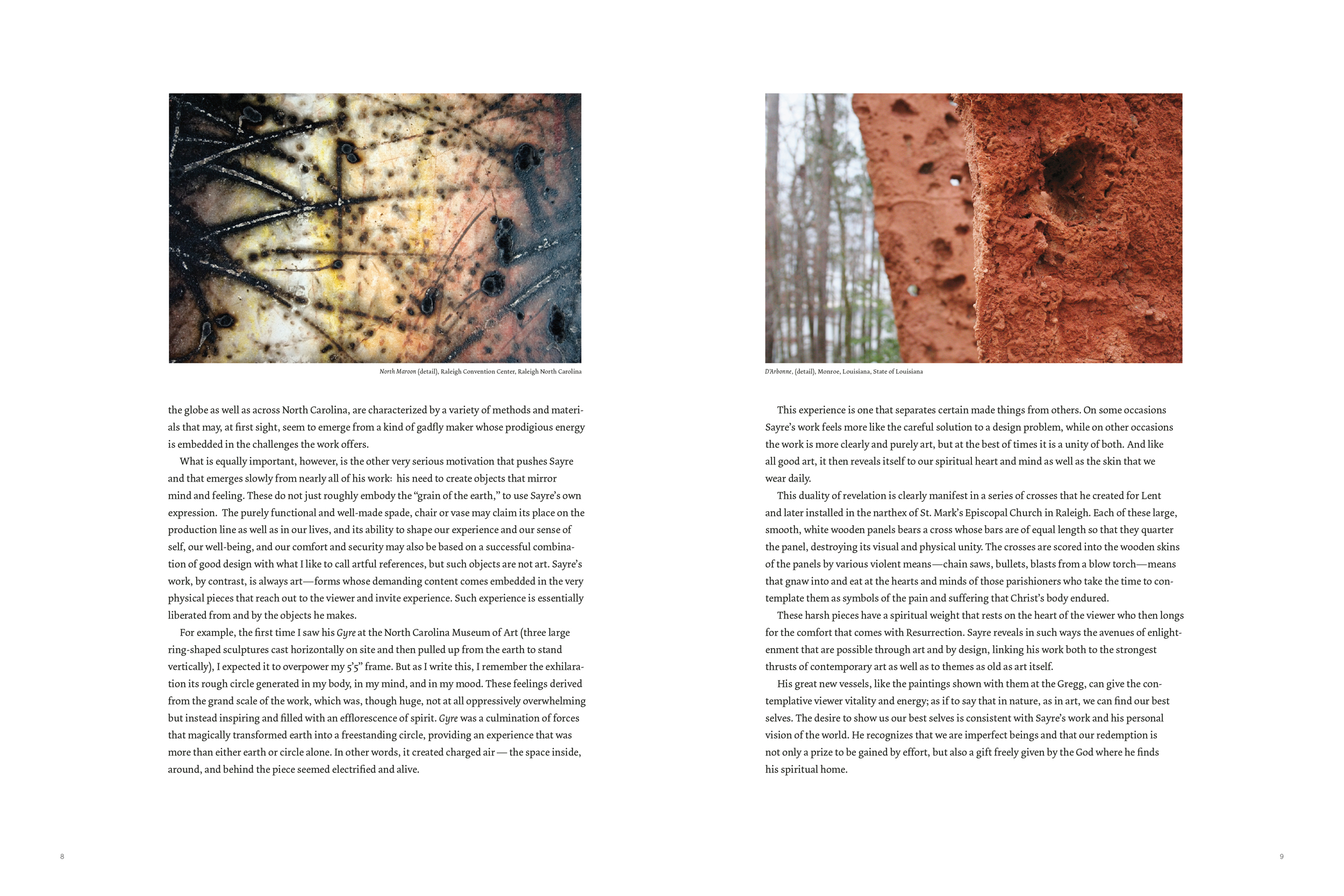
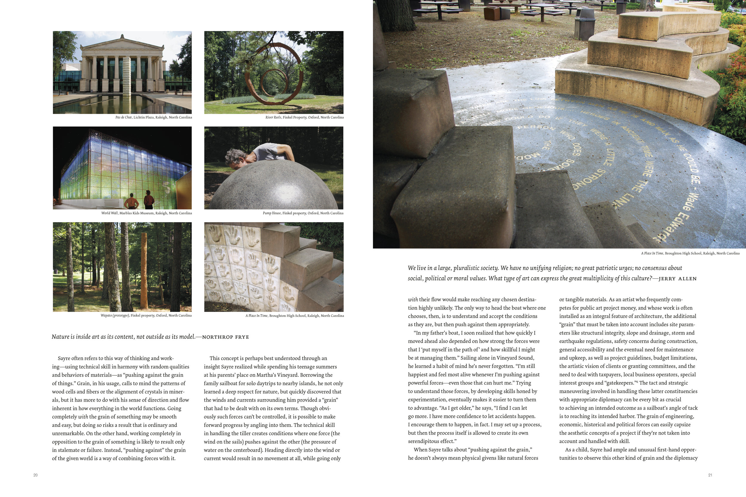
Spread from the section of photographs from site-specific installations across North Carolina.
Opening spread by guest scholar (who is now the current director of the Gregg museum).
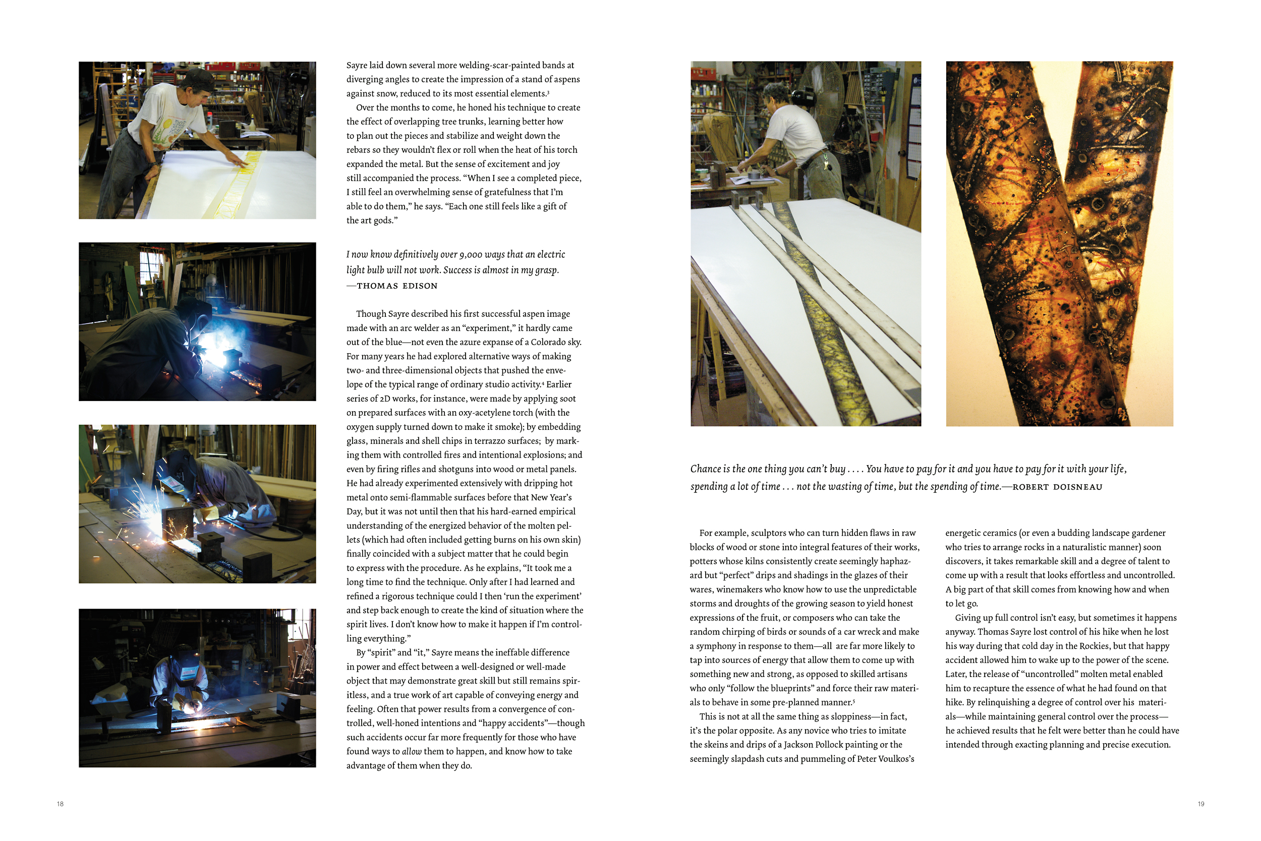
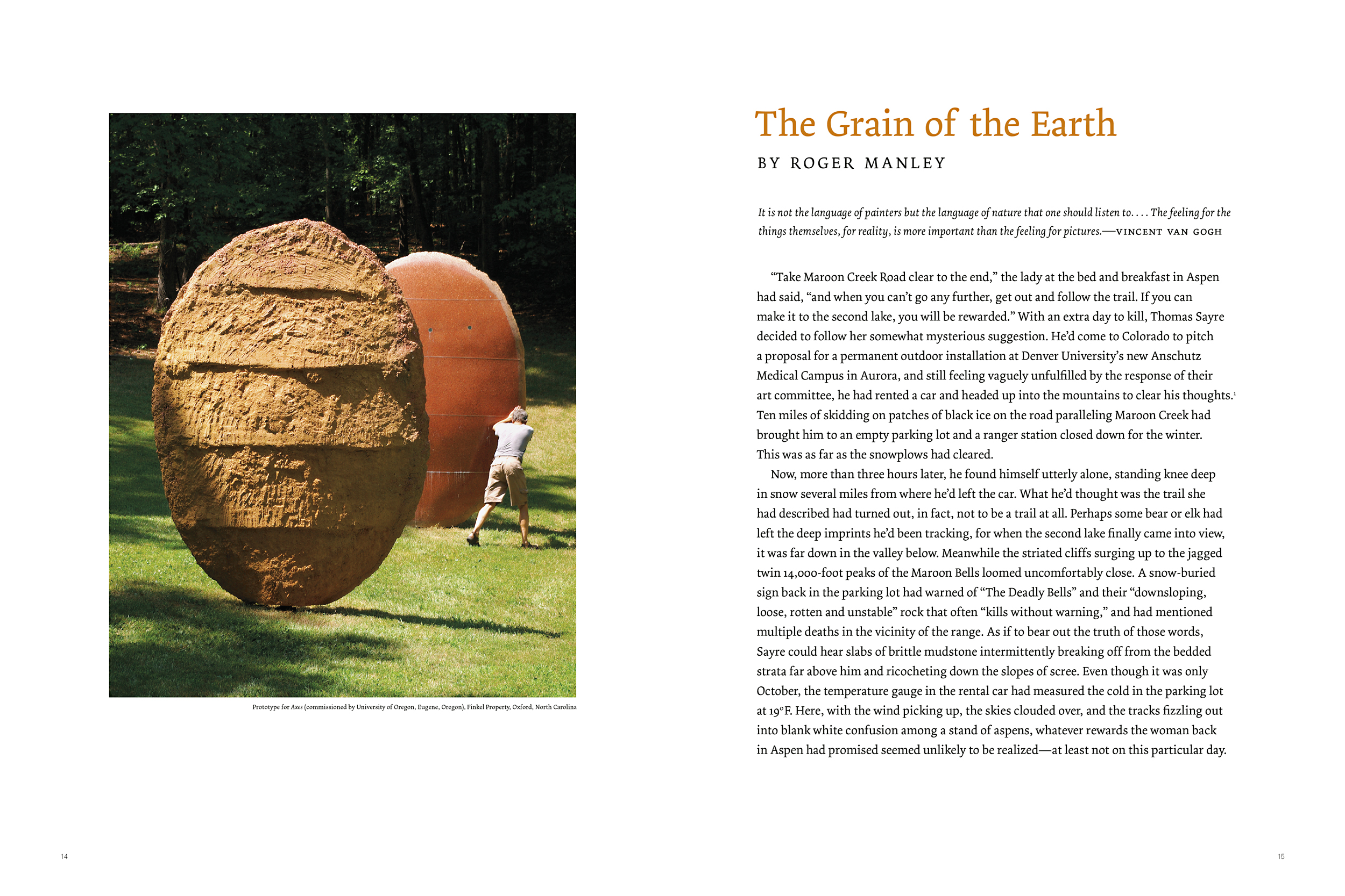
Spread detailing the process behind Thomas’s ‘paintings.’
Spread integrating Thomas’s writing about his work with examples of projects discussed in the text.
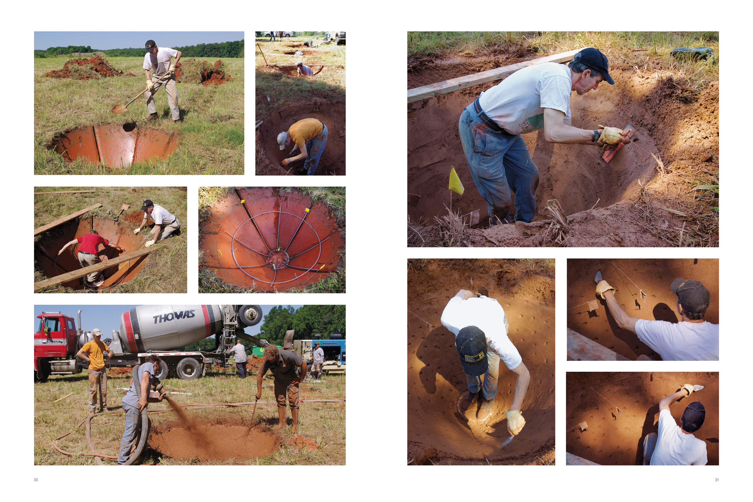
The back of the catalogue features a detailing of the earthcasting process used in the sculptures on display in the gallery.
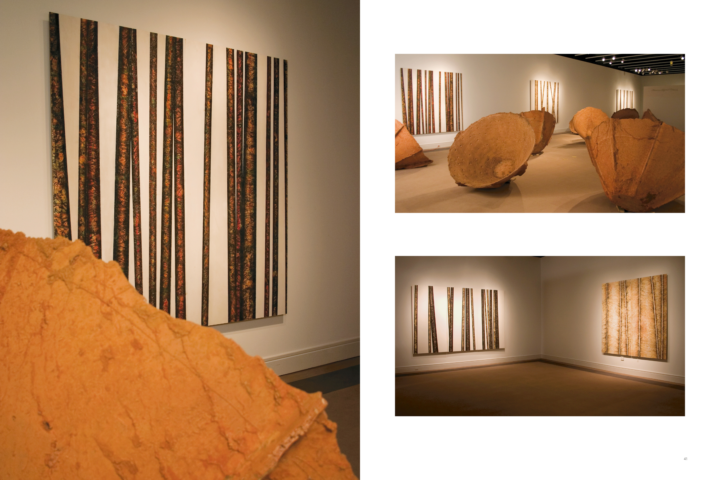
Photographs from the gallery exhibit.
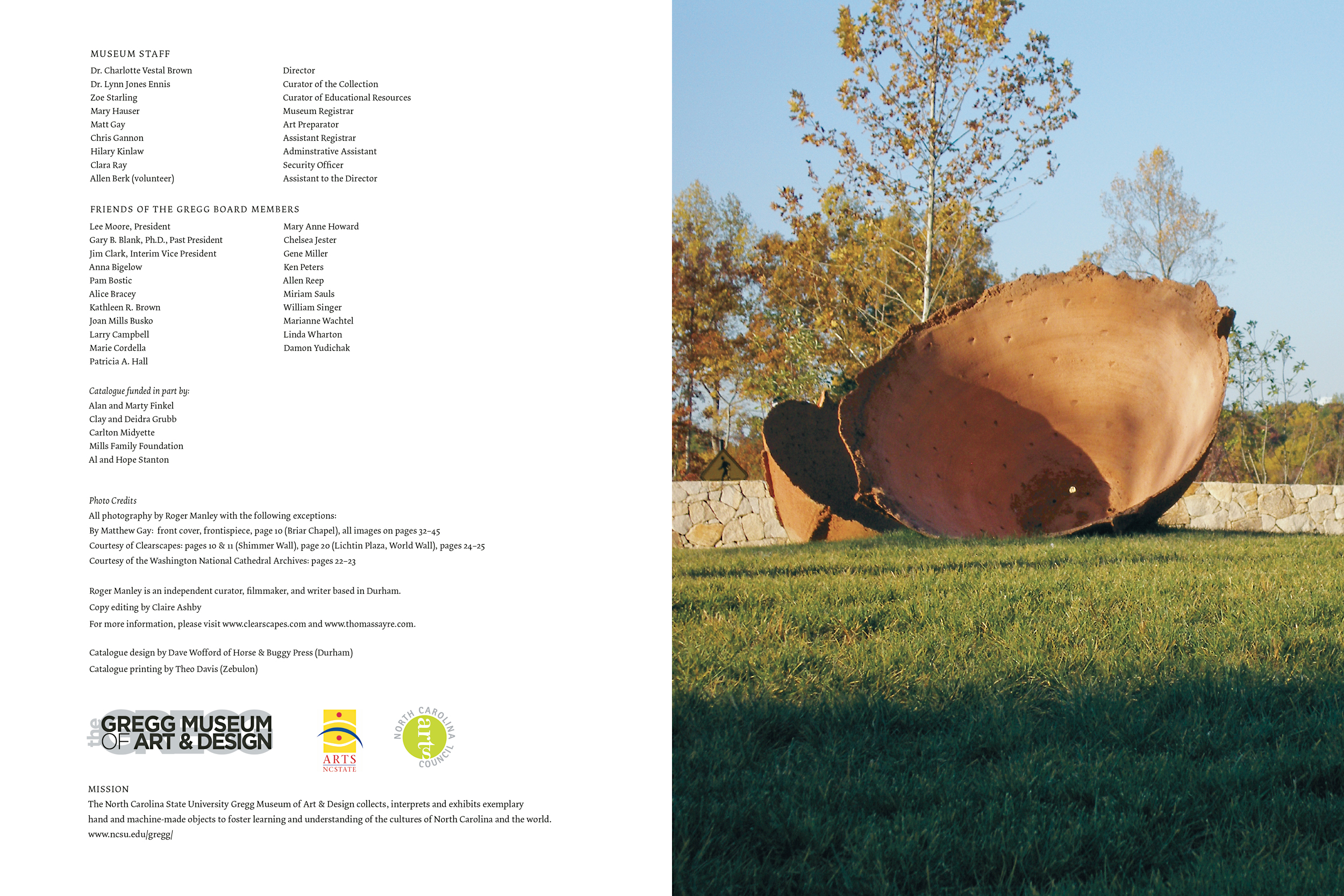
Closing spread to the catalogue.
Brochure cover.
Brochure interior.
Cover to an international touring exhibition catalogue. Metallic inks on brown cover stock.
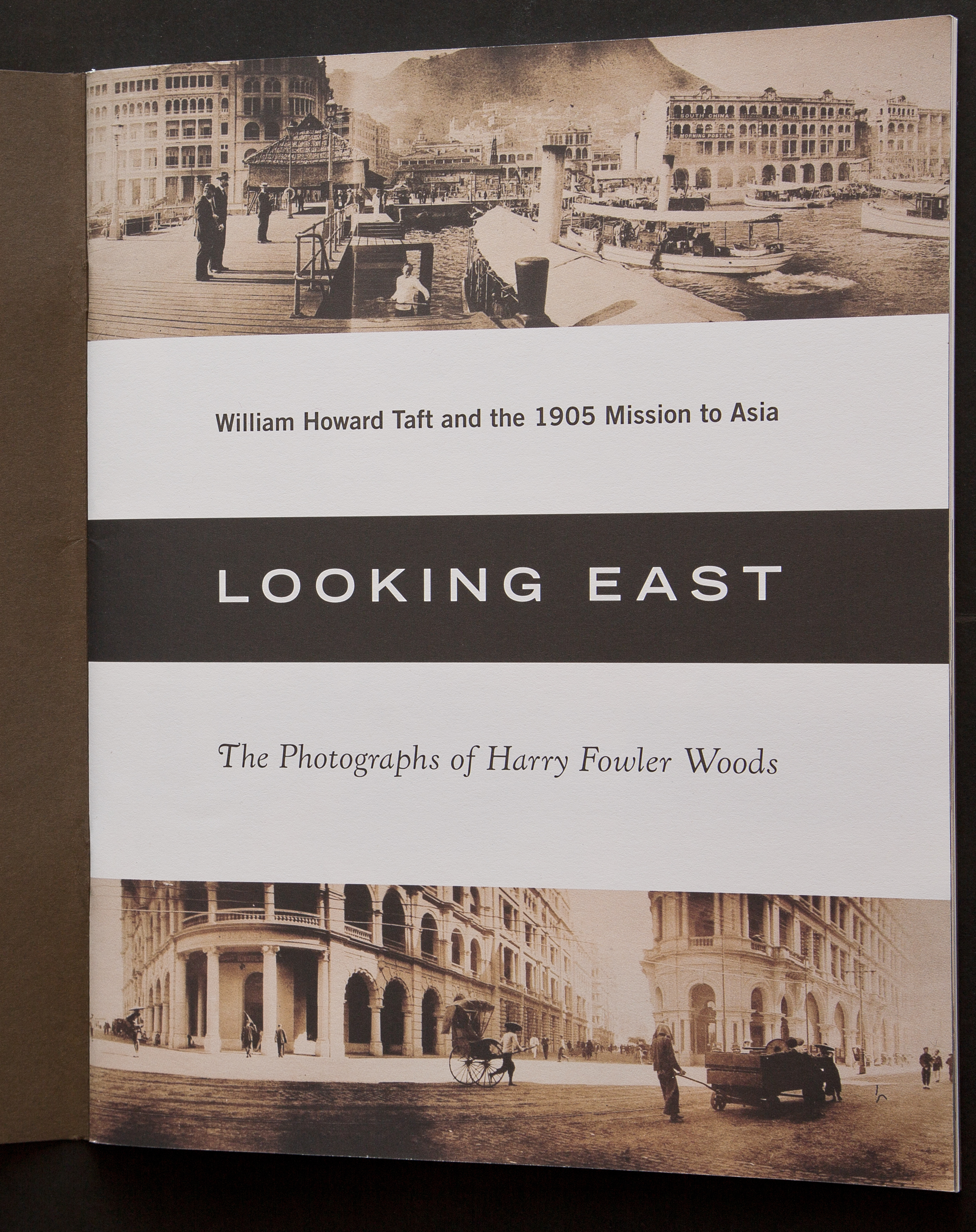
Title page.
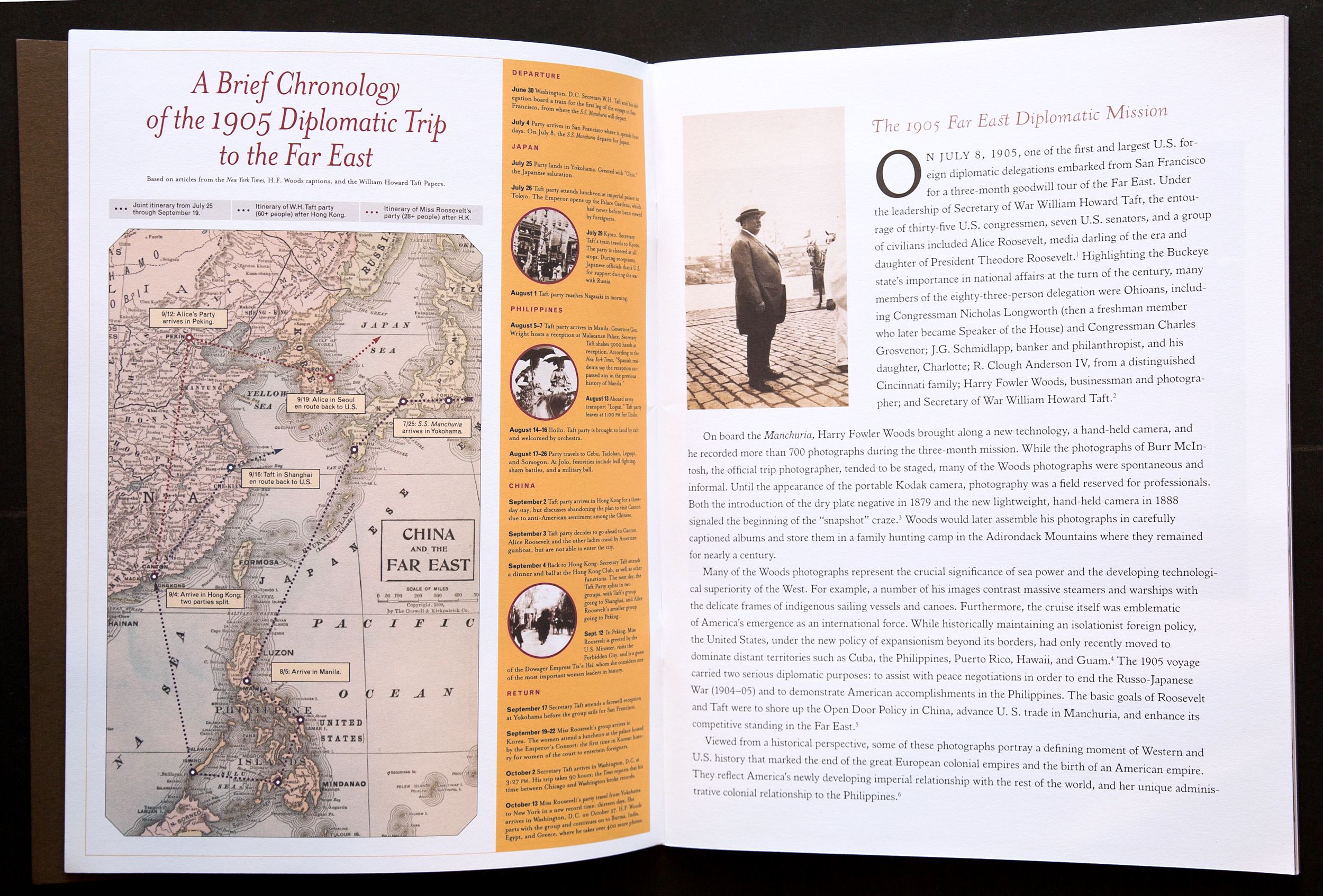
Interior spread.
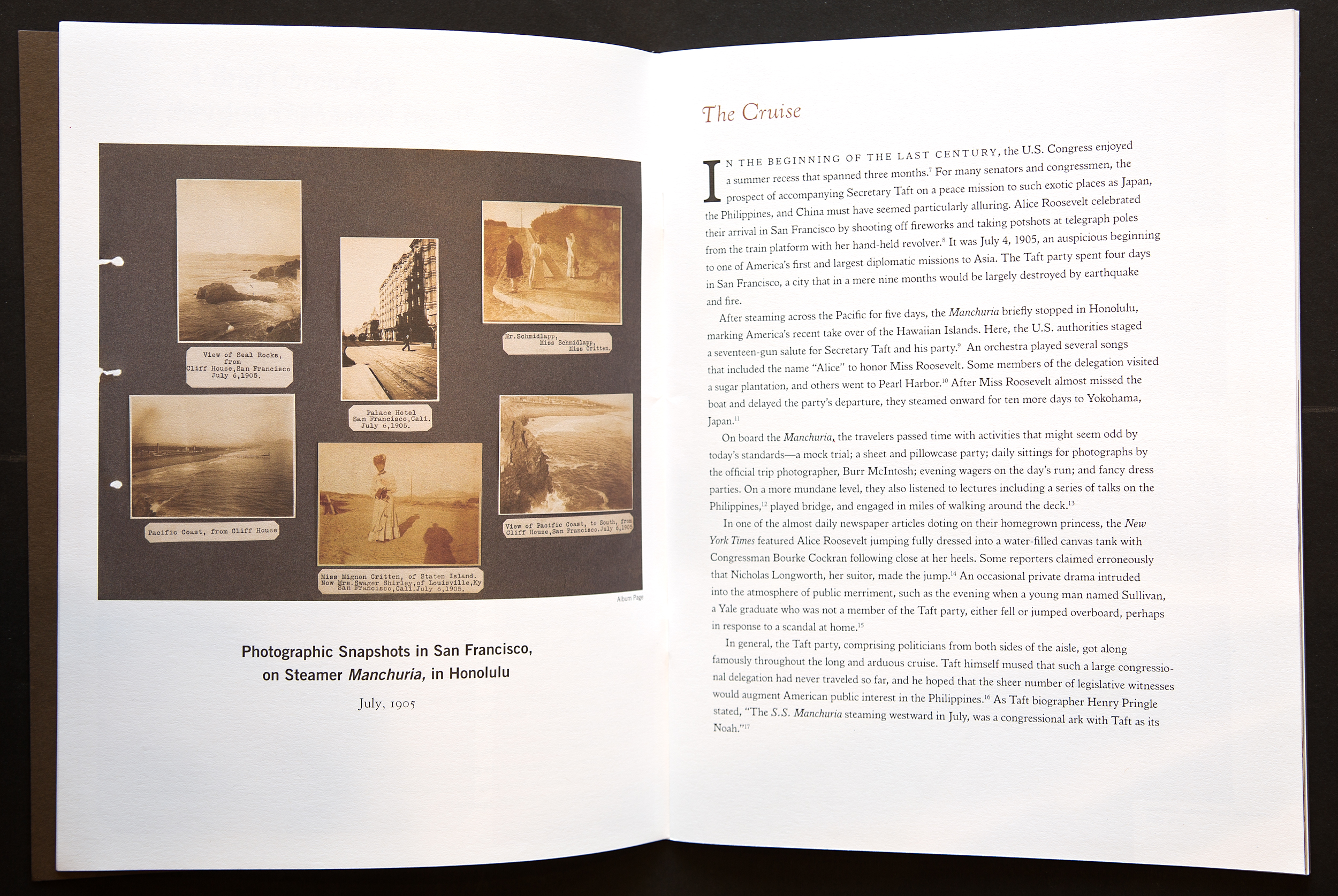
Chapter openers display a page of the photoalbum where the images were originally placed (these albums and the first images of the Far Eastern world by a Westerner were not discovered until after the photographer's death.)
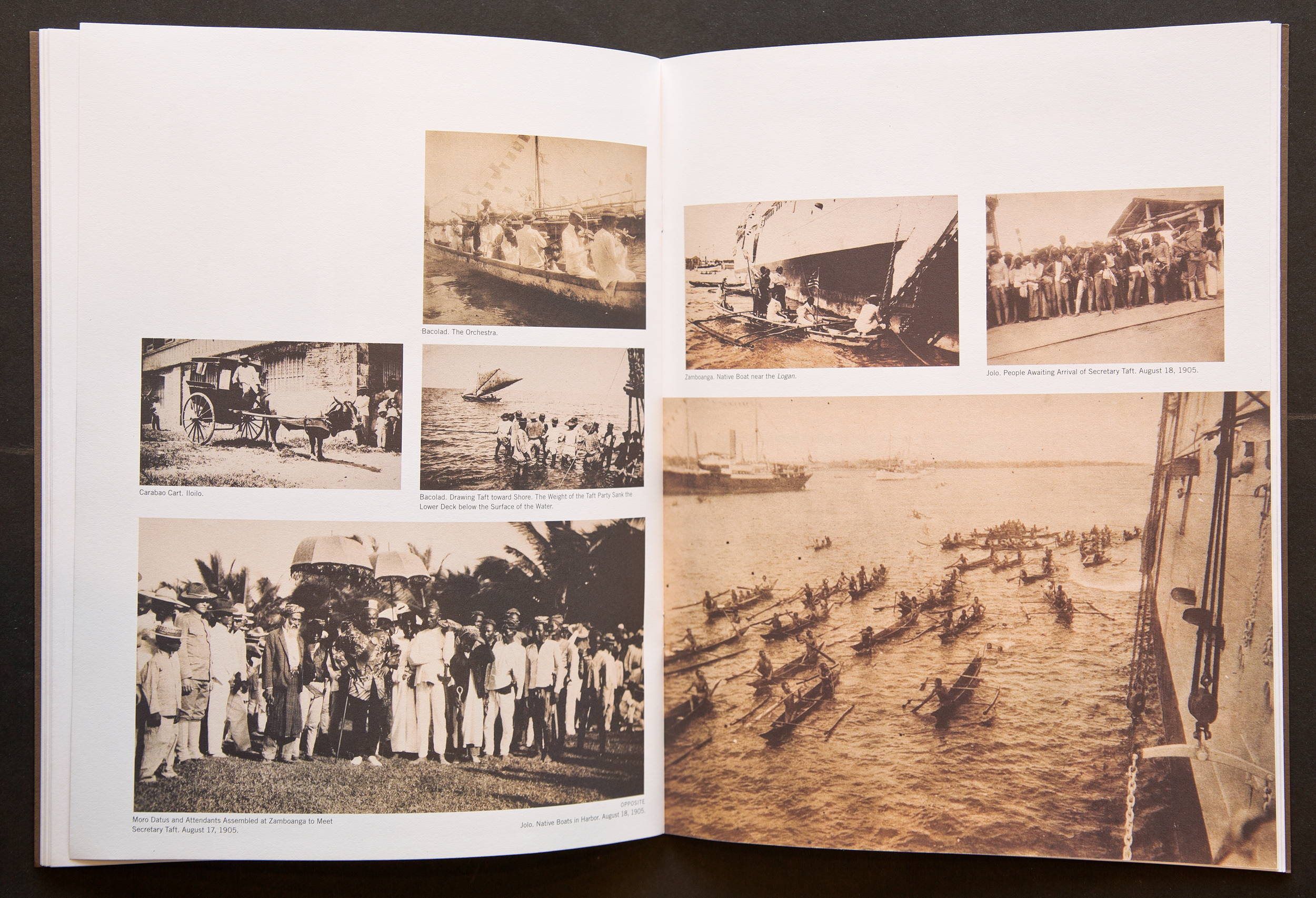
The curator and I decided to allow the different colors of the photographs to remain to be historically accurate to how the images were originally created (as opposed to making them all have the same tone).
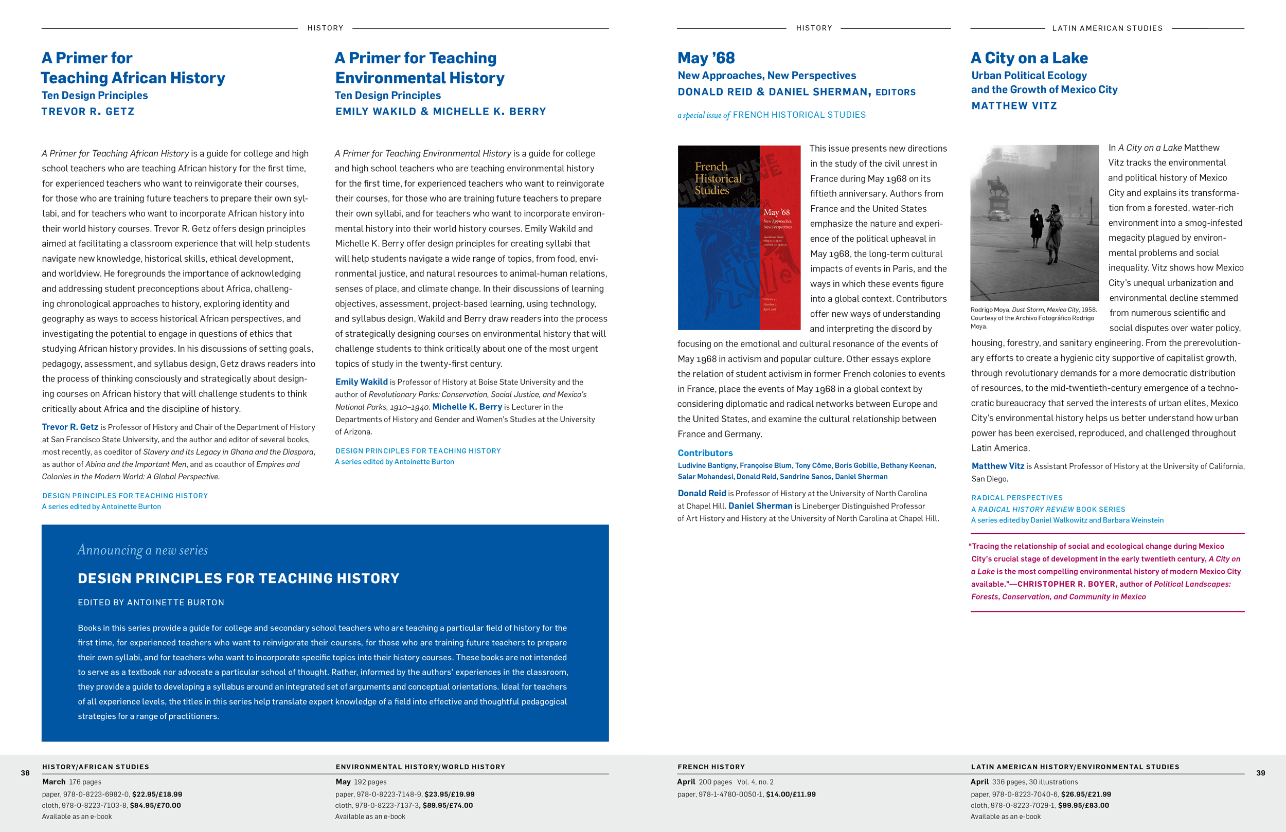
I designed the Duke Press seasonal catalog from 1998 through 2017.
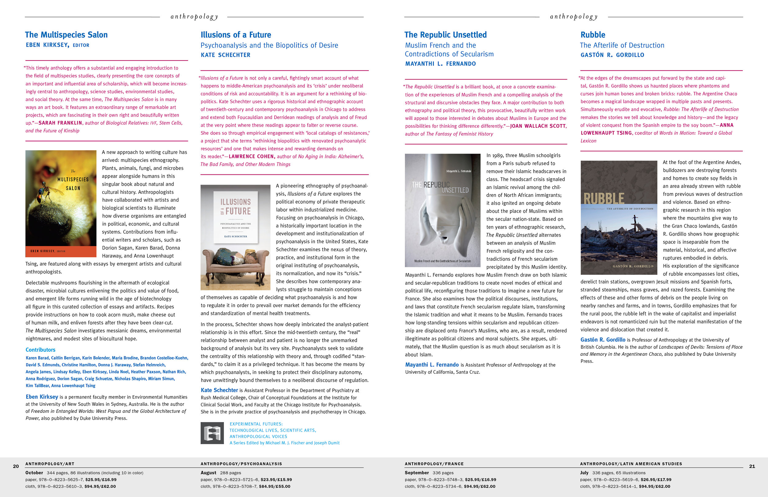
Each issue of the DUP catalog featured 50plus new titles as well as a journals section and a backlist section. New titles section consisted of descriptive copy, book covers, blurbs about the book, author bios, and biblio information.
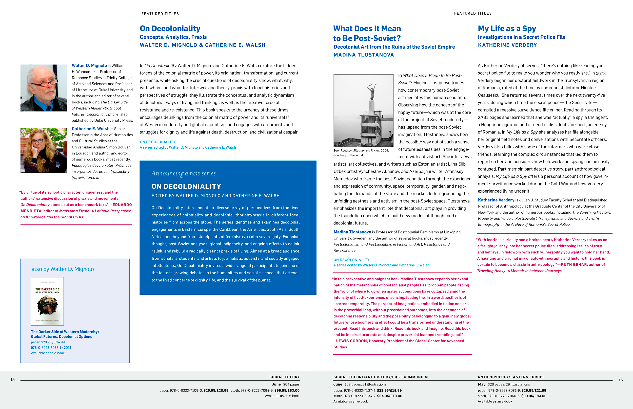
DUP catalog spread.
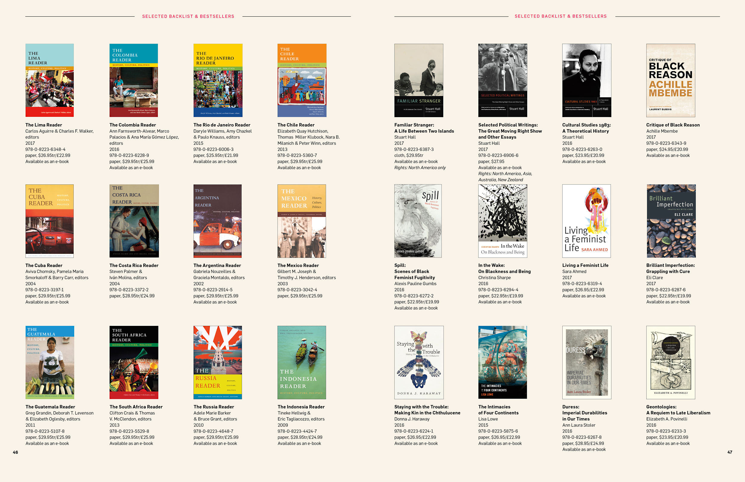
Backlist section.
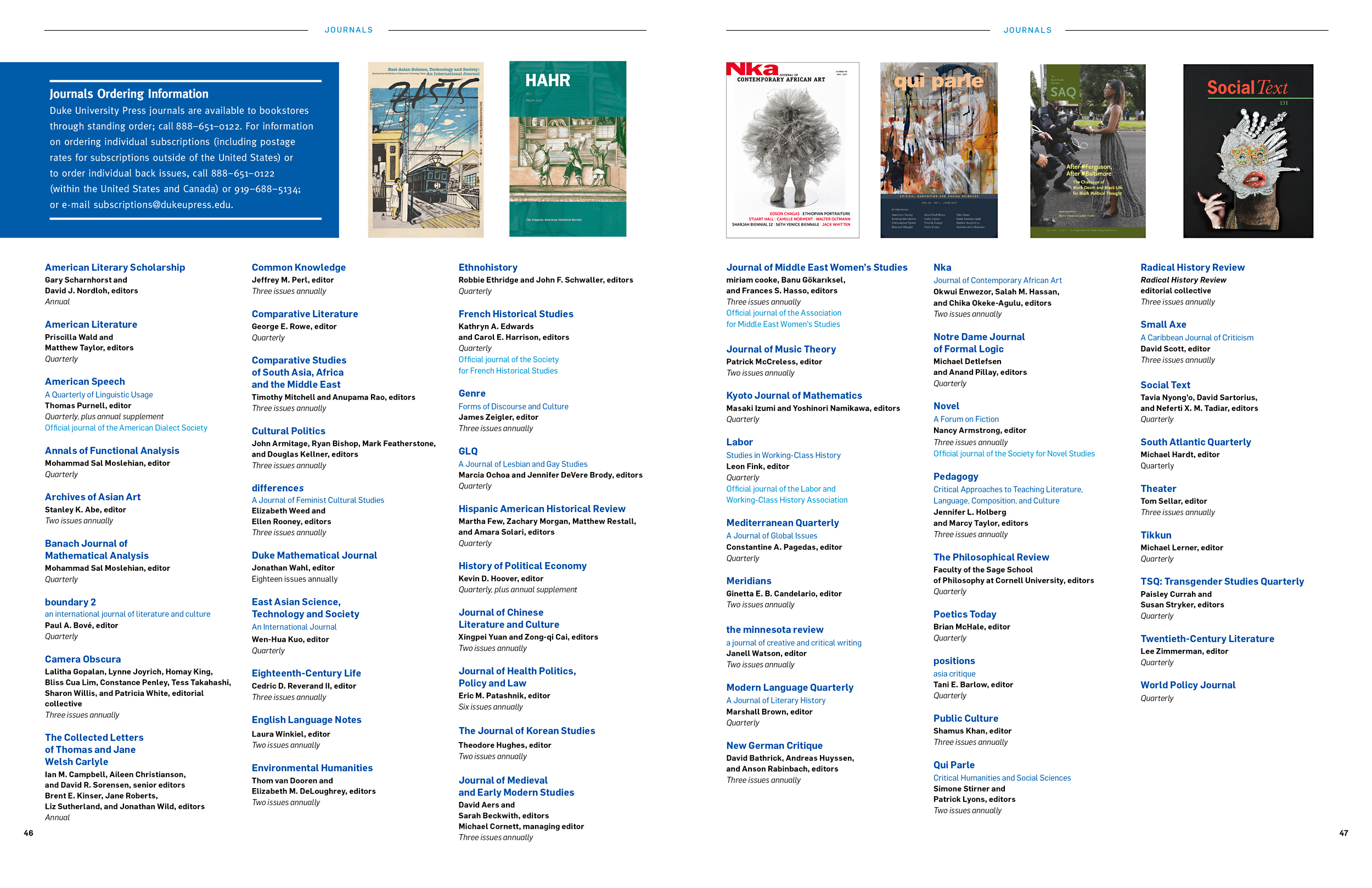
Journals section.
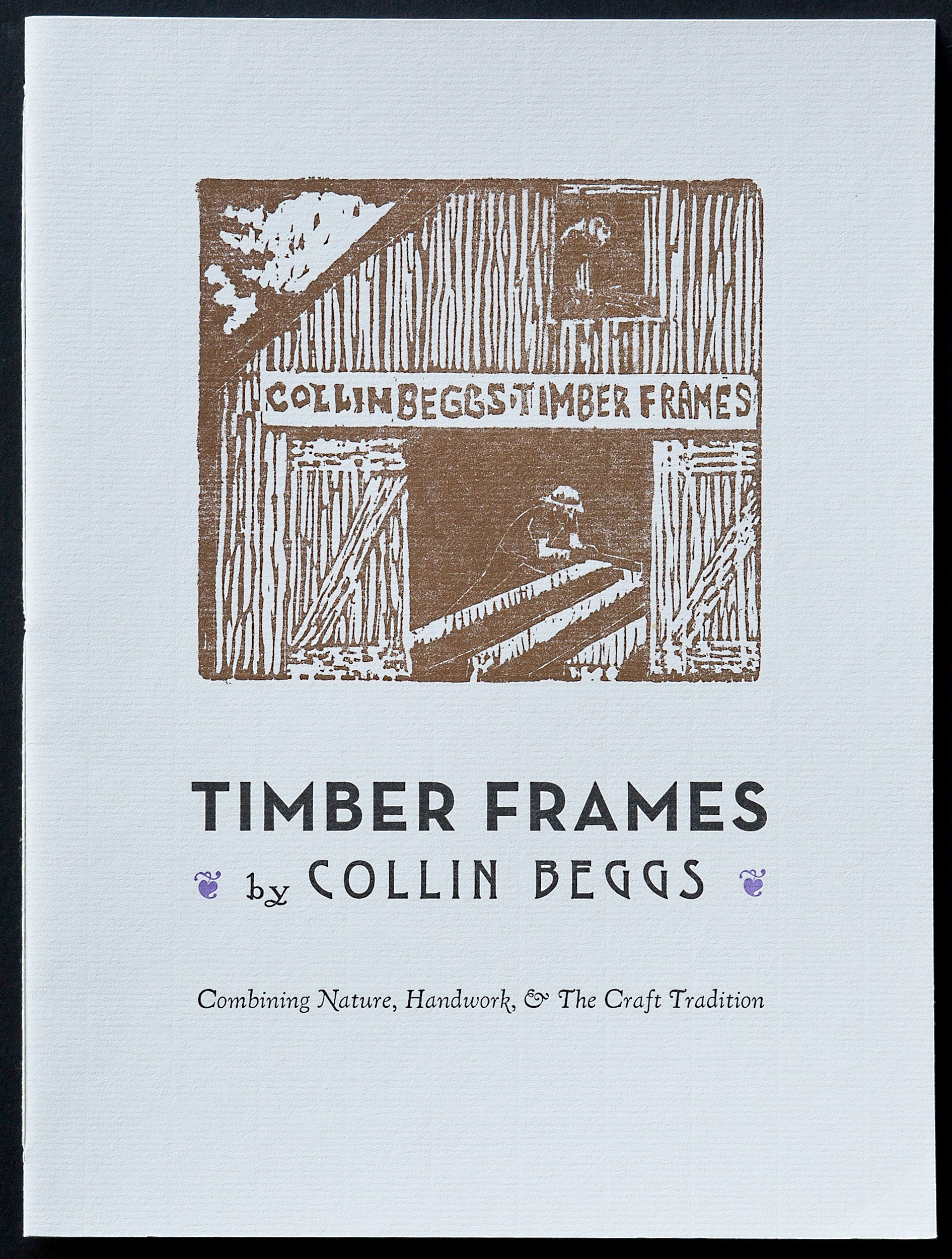
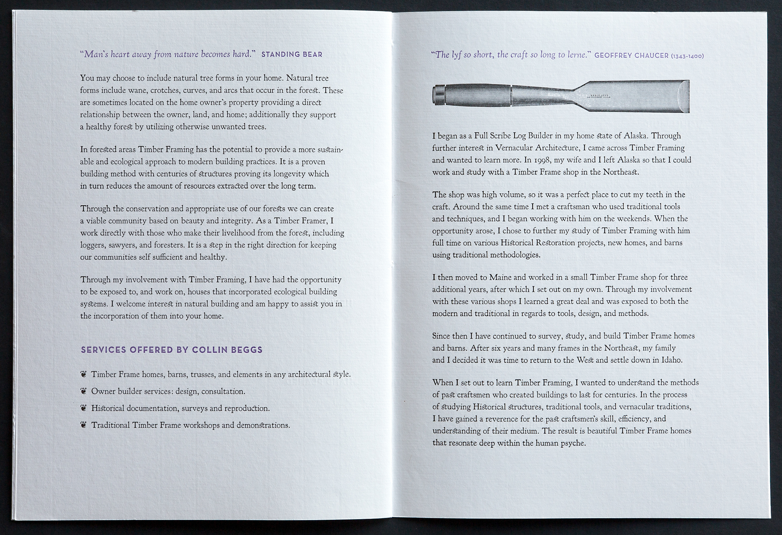
Letterpress printed brochure for a timber framer who was just starting out and wanted an entirely hand-printed eight page brochure. The image is a woodcut by a friend of his.
TItle page for four-way scholarly conversation which took place via email and social media over several months. I was hired to turn that into a printed book.