Cover for the local newsweekly, knocked out on a two day turnaround.
Title spread for a book which layered together documentary photography with lyrical prose (from journal entries). There was only one black and white photograph so we used it here. This book was undertaken because the author/photographer/scientistwas unsatisfied in many ways with the blog she had created to document a year and a half scientific sojourn to the Amboseli region of Kenya.
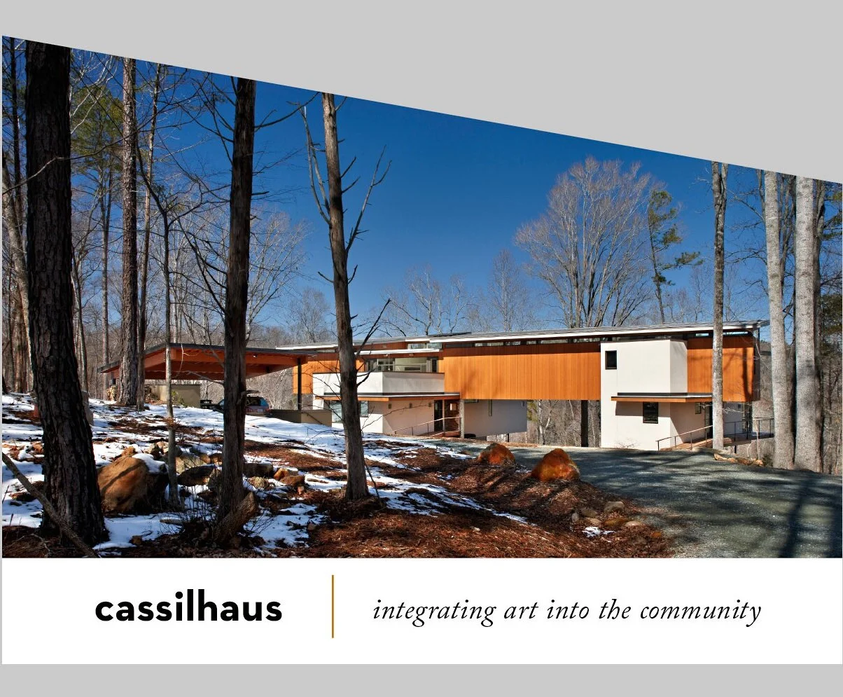
Business card. The building is based on trapezoids so naturally we created a trapezoidal card. Honestly, this was the client’s idea. We know how to work collaboratively to ensure good ideas come from all directions. The gallery within Cassilhaus was the first stop for our 20th anniversary retrospective.
Dave Wofford has been doing commissioned design work under the Horse & Buggy Press moniker since 1996.
This work includes a wide range of print projects from bookmarks to 300 page book editions printed in the thousands, to environmental signage.
Creating contemporary work in a variety of contexts and styles, the studio has won national design awards while working for a diverse range of clients and from near and afar. There are a legion of satisfied collaborators who enjoyed the process, and end users who appreciate the artifacts produced with a keen attention to detail.
PHIILOSOPHY
As John Dewey reminded us, aesthetics is not just an issue for the often provincial and esoteric world of fine art. Bringing consideration of aesthetics into our interactions with everyday objects allows for additional meaning, purpose, and pleasure to be brought to our daily lives.
We approach projects in the tradition of a craftsperson. This results in intimate, tactile artifacts that reward readers and end users with a true aesthetic experience; something of a rarity in today’s fast-paced culture that often favors constant noise and slickness over subtlety and focused, quiet space.
Every project has a unique context with specific goals and parameters, and we spend the time needed with clients to fully understand them. This allows us to find solutions that work aesthetically and financially and meet specific goals.
Ink on paper has lasting power. Truth. We believe print is an amazing medium that often does things more powerfully than digital devices, social media, and the various gizmos that increasingly take over the interactions in our lives. And yes, we are aware we just told you that through backlit pixels on the internets.
Mistakenly dismissed as a technophobe Luddite operation by some (perhaps it has something to do with our name?), Horse & Buggy Press is actually adept at utilizing the best qualities of both yesteryear’s mechanical technologies and today’s digital technologies to create engaging design work. This allows us to create contemporary artifacts in a variety of styles and the works of the press stand out for their visual clarity, quiet directness, and sustained appeal.
Truth be told, ‘we’ is just ‘me.’
As a one-person design studio, I ensure hands-on attention at every step, bringing creativity and clear communication to all facets of a project. An enjoyable and efficient process evolves without delays or confusion.
I’m able to speak with offset and digital printers and binderies on a nuanced level to ensure production coordination achieves optimal results, whether it be a short run of digitally printed postcards, or exhibit catalogues and artist monographs printed in runs of thousands on a six color offset press. Attention to detail matters in projects large and small. The world has enough mediocrity and crassness in it. Our work serves as a powerful and refreshing antidote.
One of our first book publications. Like many of our book projects it won awards for both content and design. It was recognized as one of the 50 most outstanding book designs of the year by the American Institute of Graphic Artists. Since this time, we have collaborated with poet Jeffery Beam and illustrator Ippy Patterson on a number of other projects.


