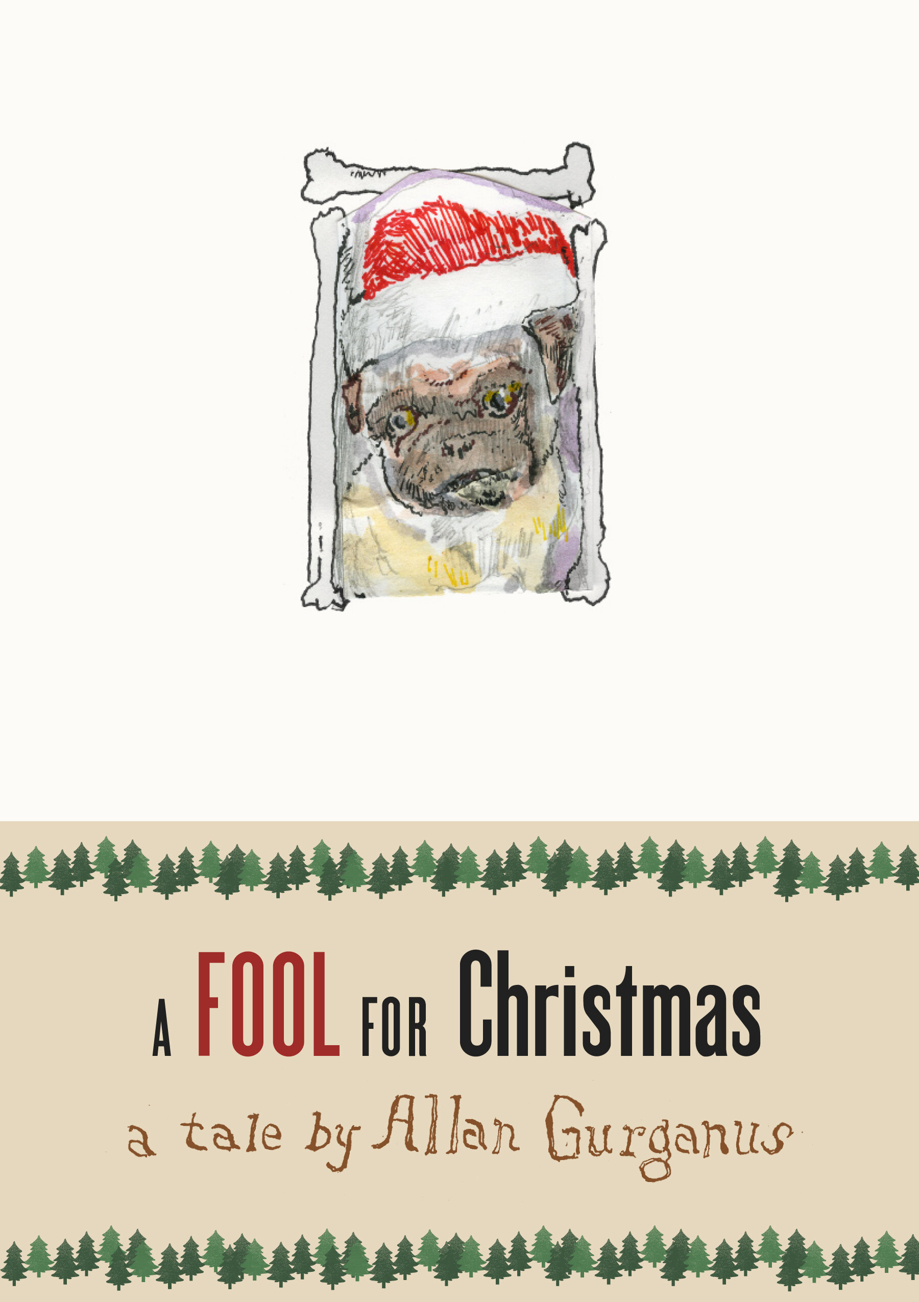
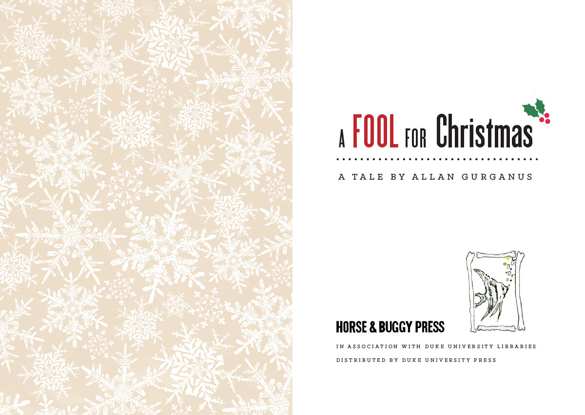
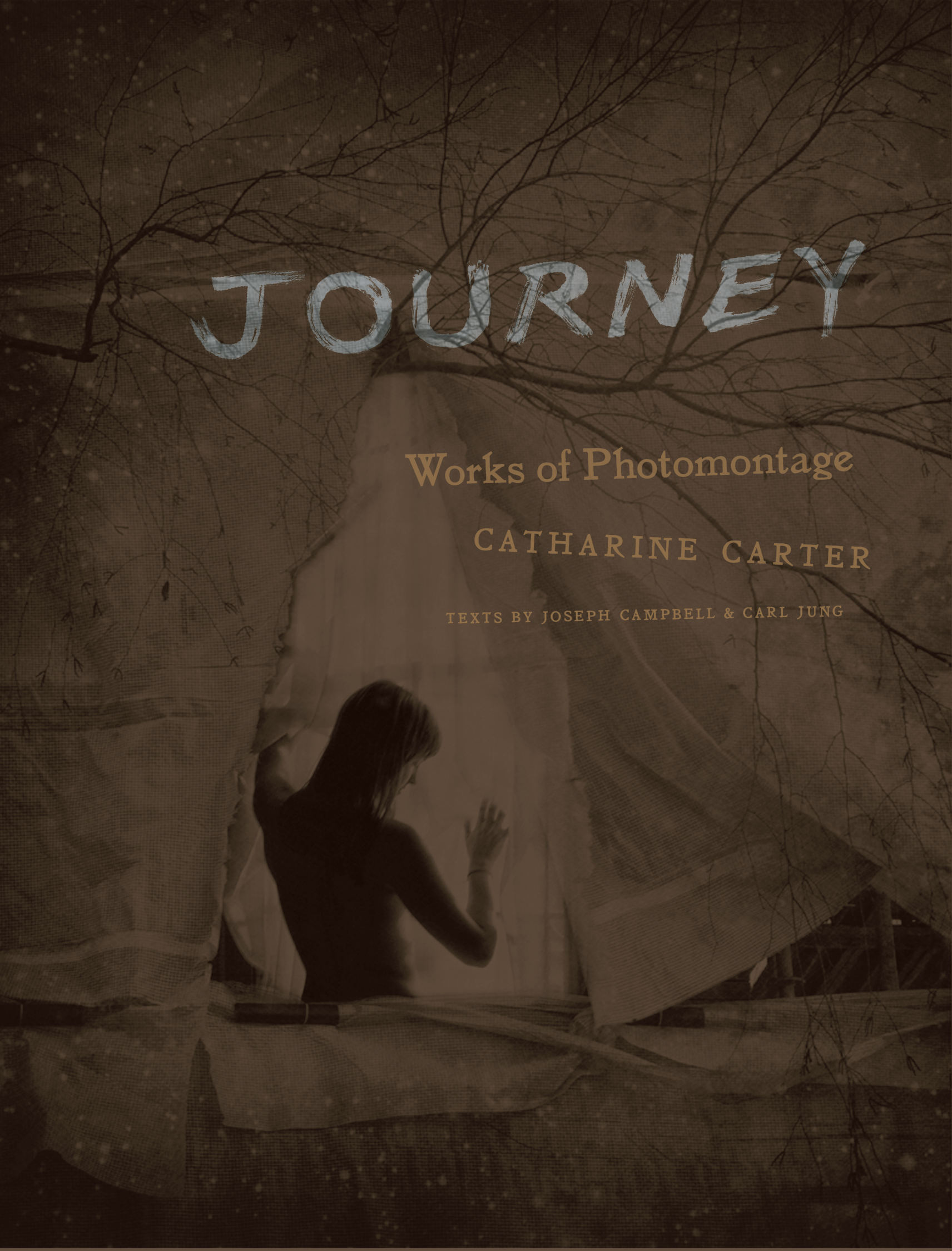
A Fool for Christmas
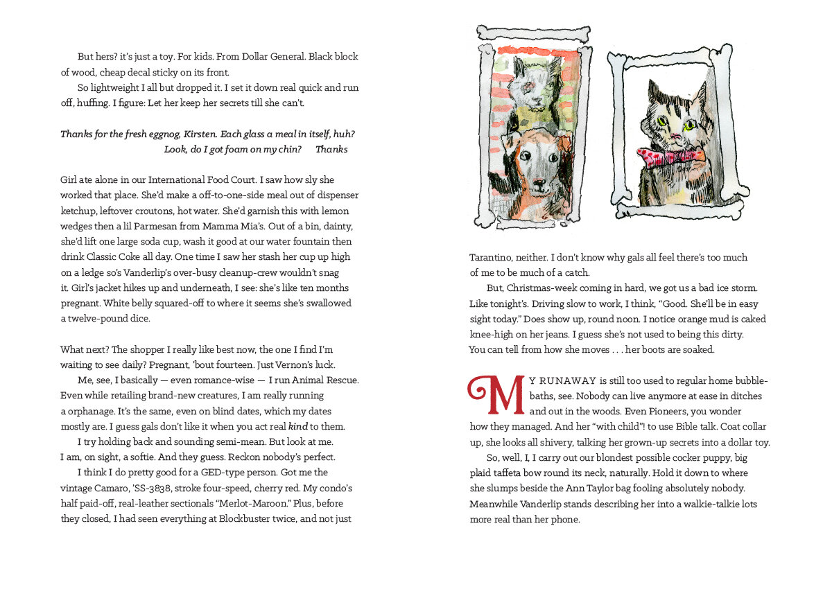
Interior Spread.
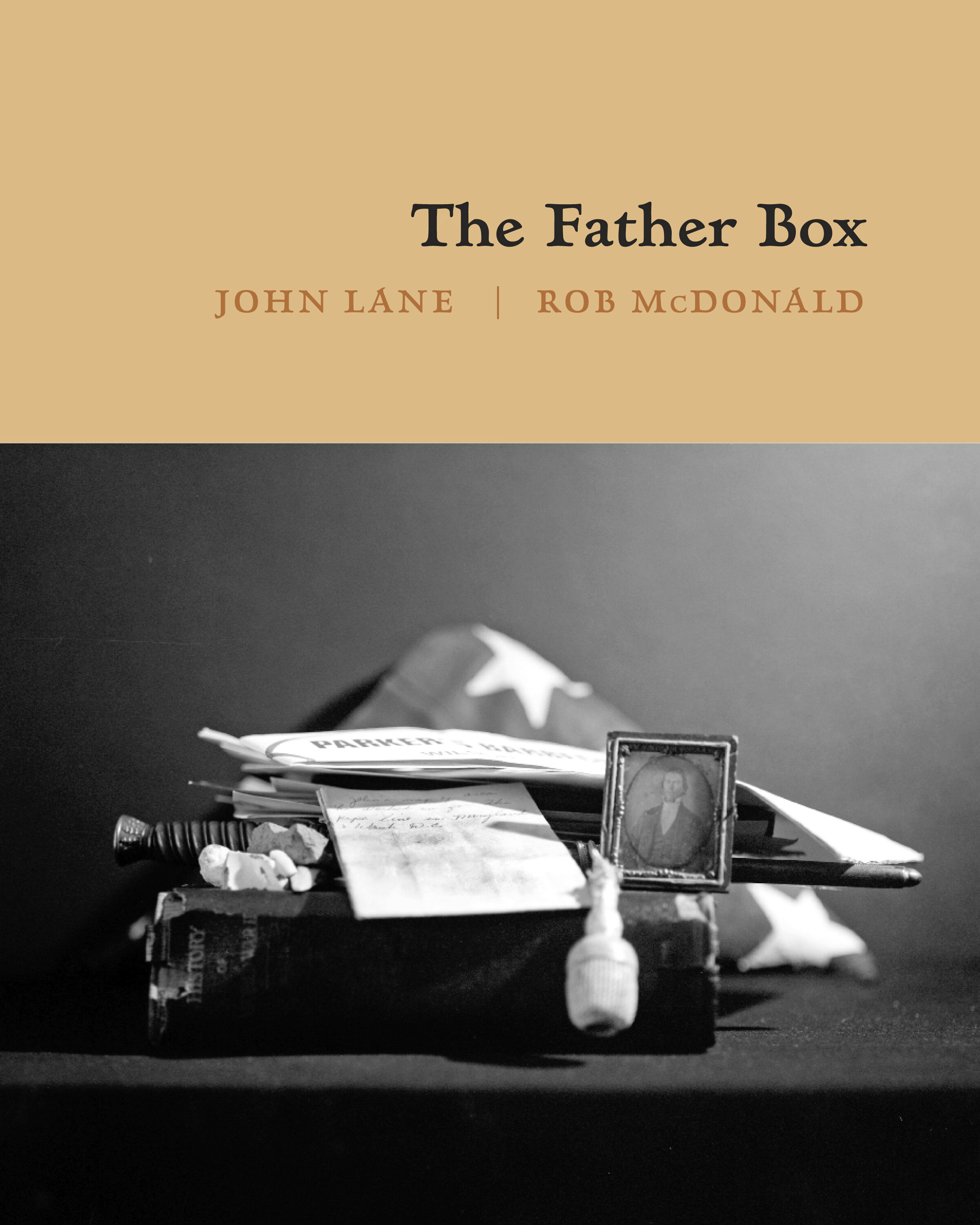
Cover was created by printing one of the photos on a rich brown cover stock, and then printing the titles with metallic silver and copper inks.
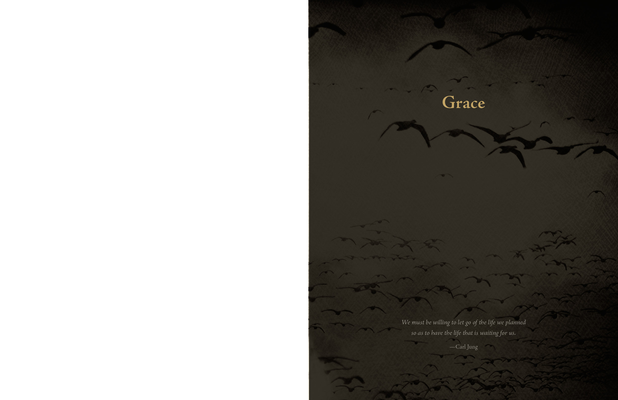
Chapter openers combine a text excerpt with a low contrast detail of one of the images to be seen later on in the unfolding image narrative.
. . . and every once in a while an image extends across the guitar to create an element of surprise, and this reinforces the central theme of the book (in that one's journey is not something without twists and turns).
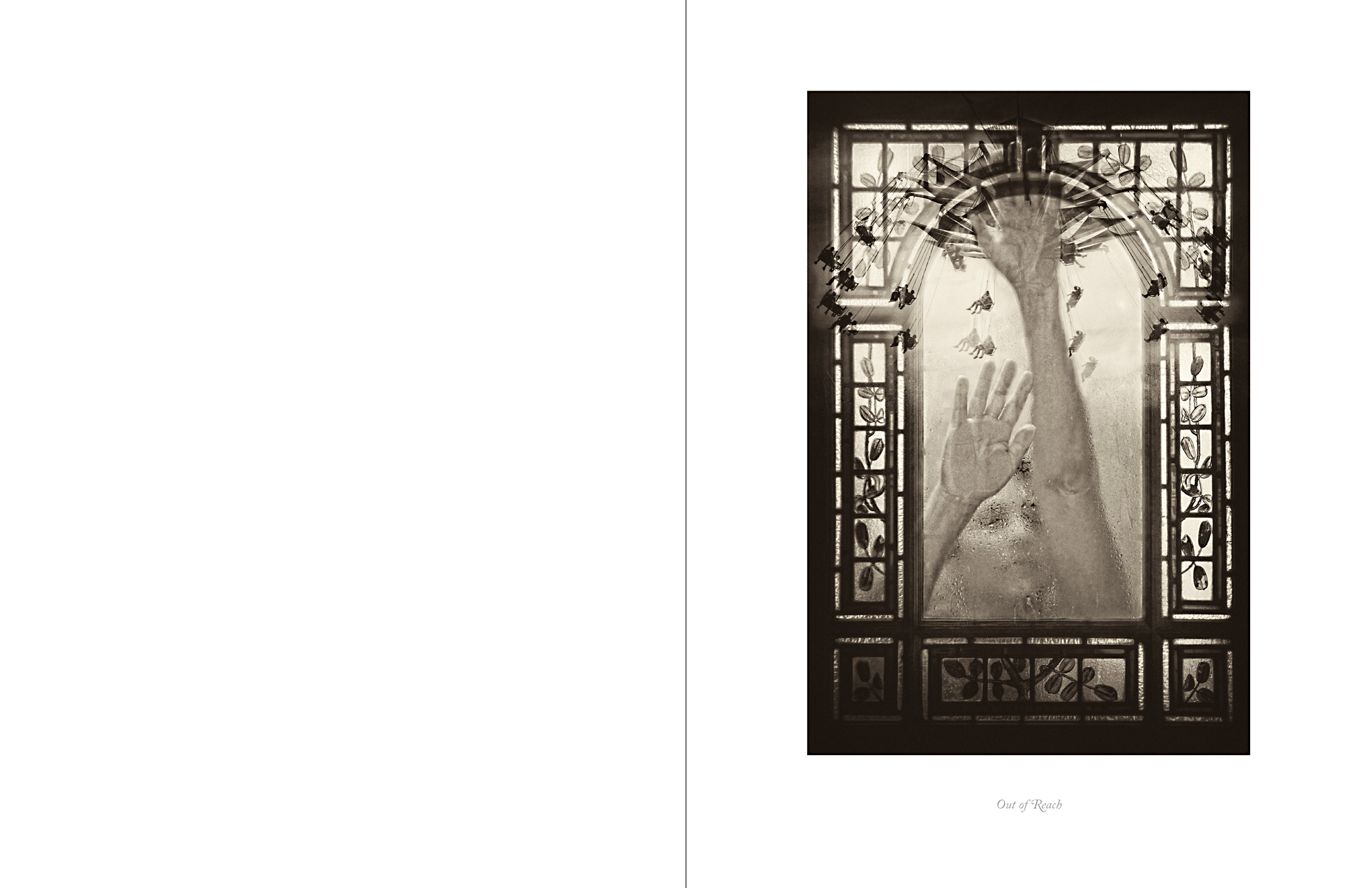
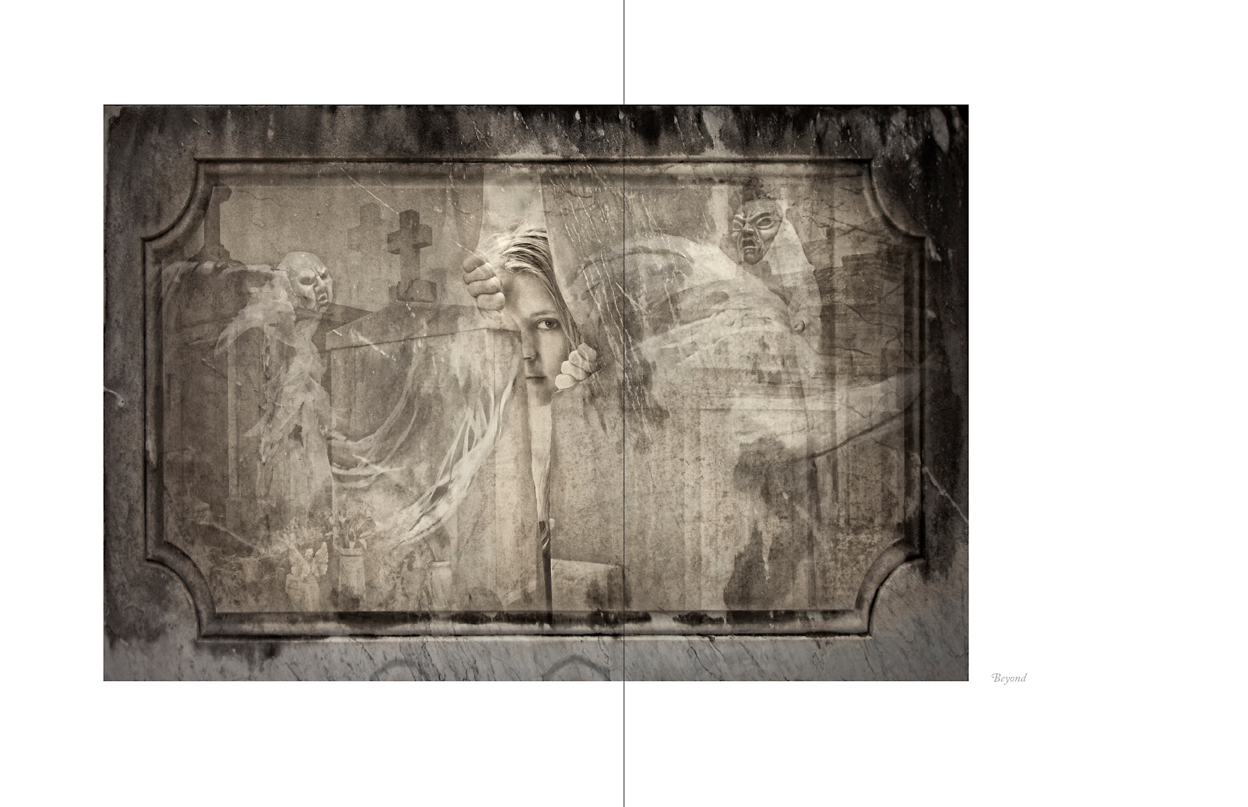
Each of the 12 chapters featured three spreads, with an image shown on the right hand page . . . setting up a predictable rhythm for the viewer to move through the unfolding narrative . . .
Over-the-shoulder-hollow hand binding allows the bookblock to move independently of the spine, ensuring the book lies flat and can be opened all the way.
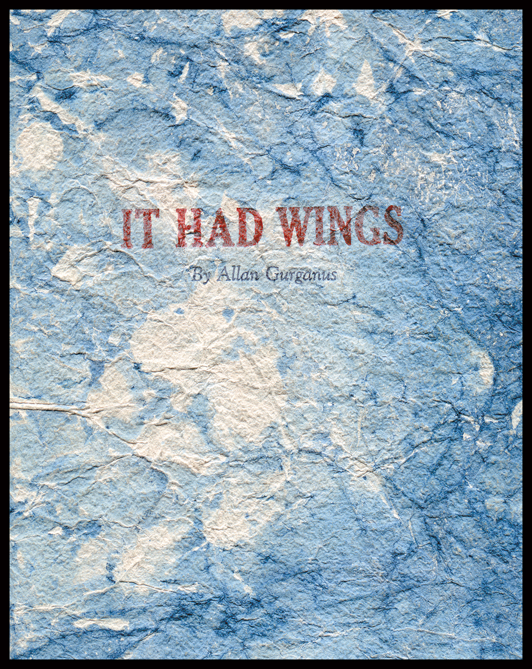
Cover made of handmade paper (abaca fiber) which was then dyed in an indigo vat. To create the look of a sunny Tuesday afternoon sky (which the story takes place during), and the feel of an angel’s wings (which is a central element to the short story).
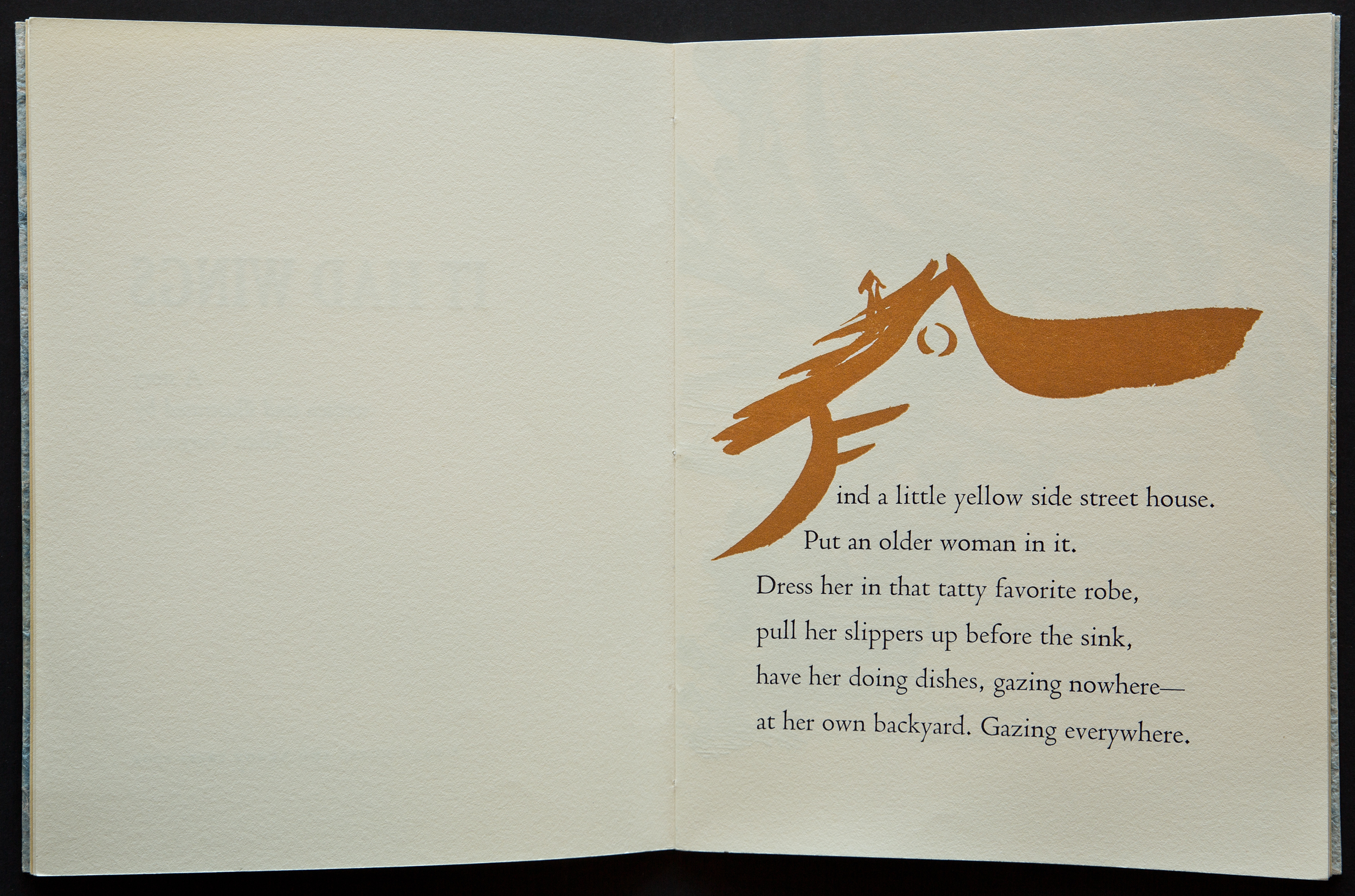
The fable-esque story begins.
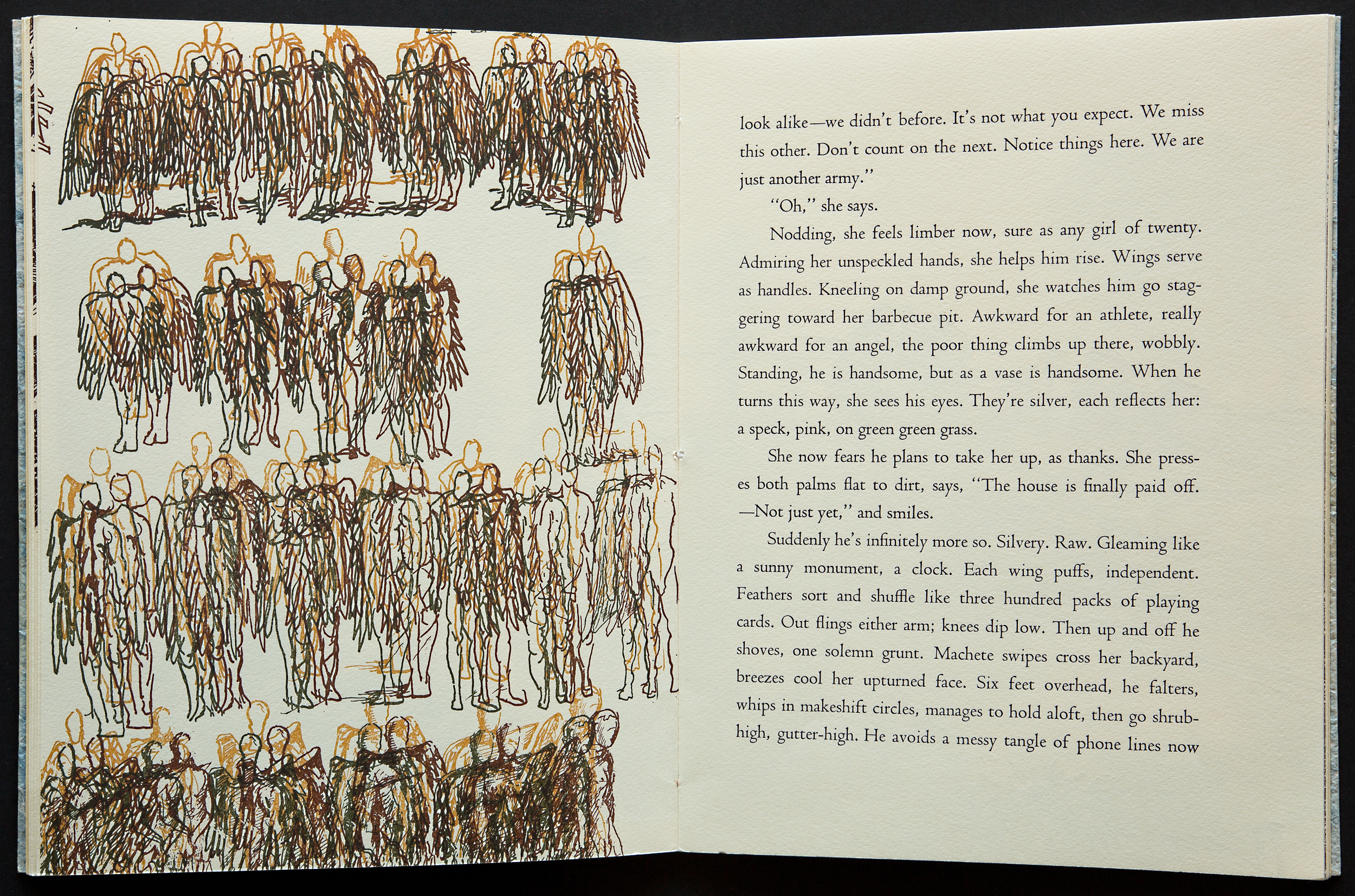
Printing a drawing off register in three colors to emphasize the dizzying multitude of the army of angels.
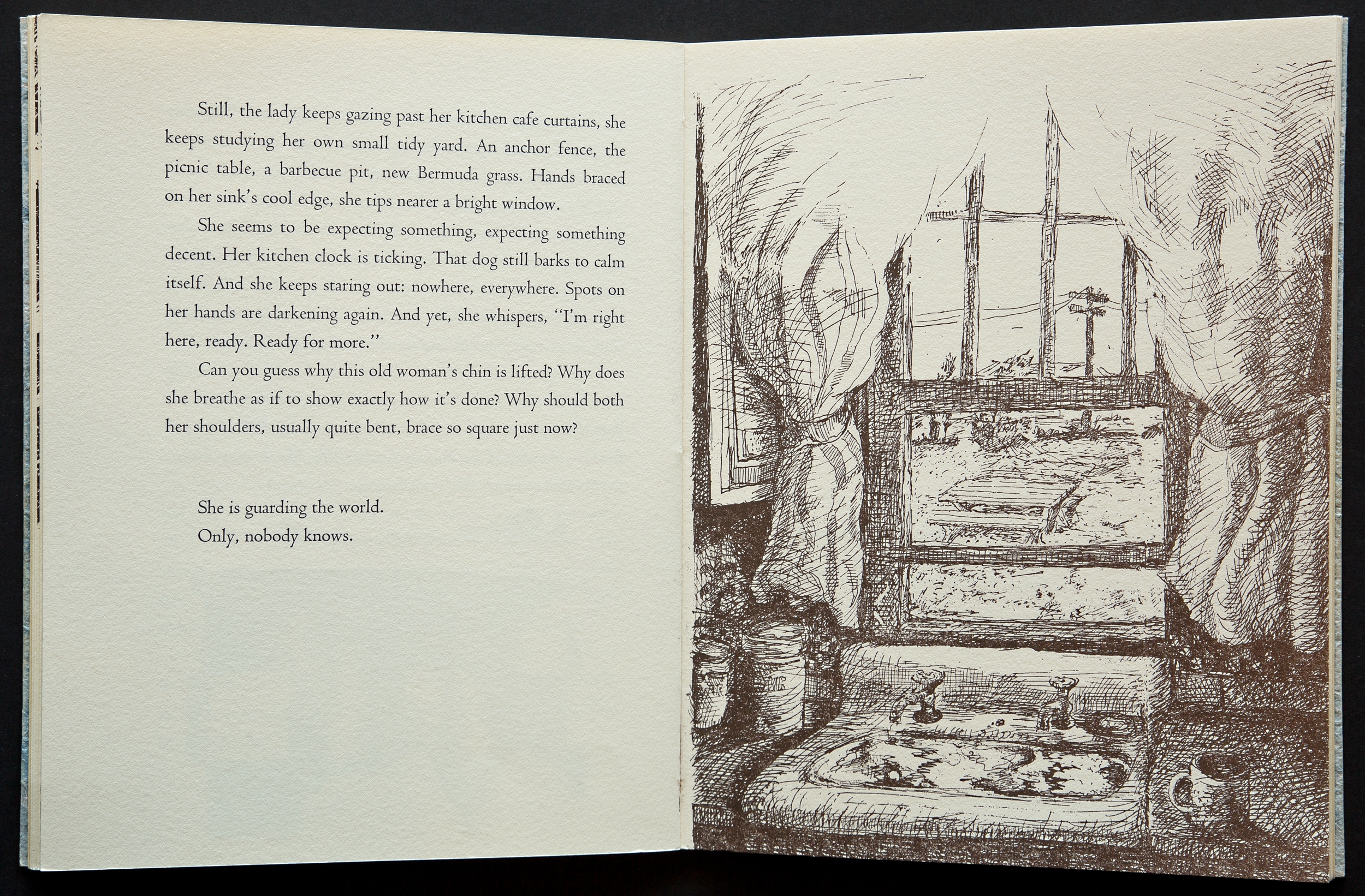
The story ends as the main character looks out her window and reflects on the magical events of the afternoon. Rather than show the character, we put the viewer in her shoes looking out the window.
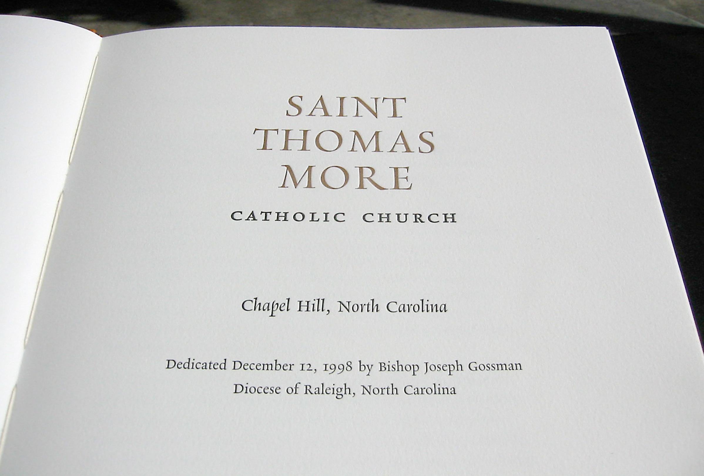
Title page for book that celebrated donors’ gifts and provides a history of the church’s founding.
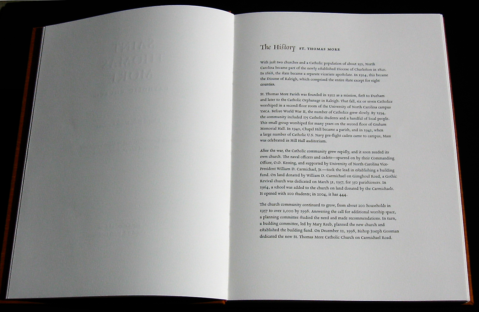
The Rialto typeface used shows influences of calligraphy integrating with a classic Italian renaissance typeface and seemed like the perfect choice for for a church book to be entirely letterpress printed.
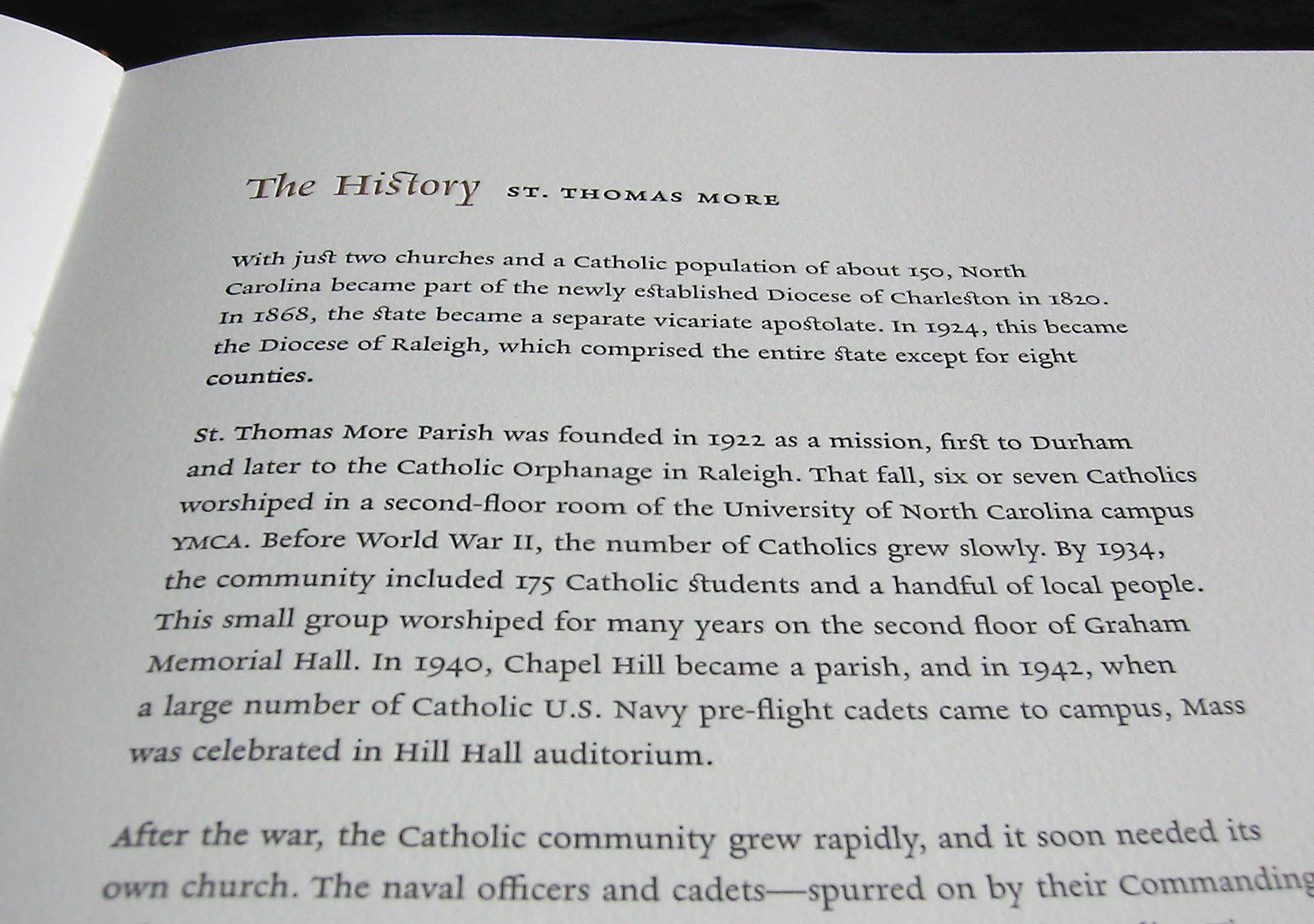
The 175g Somerset printmaking paper feels luxurious and shows off the letterpress impression.
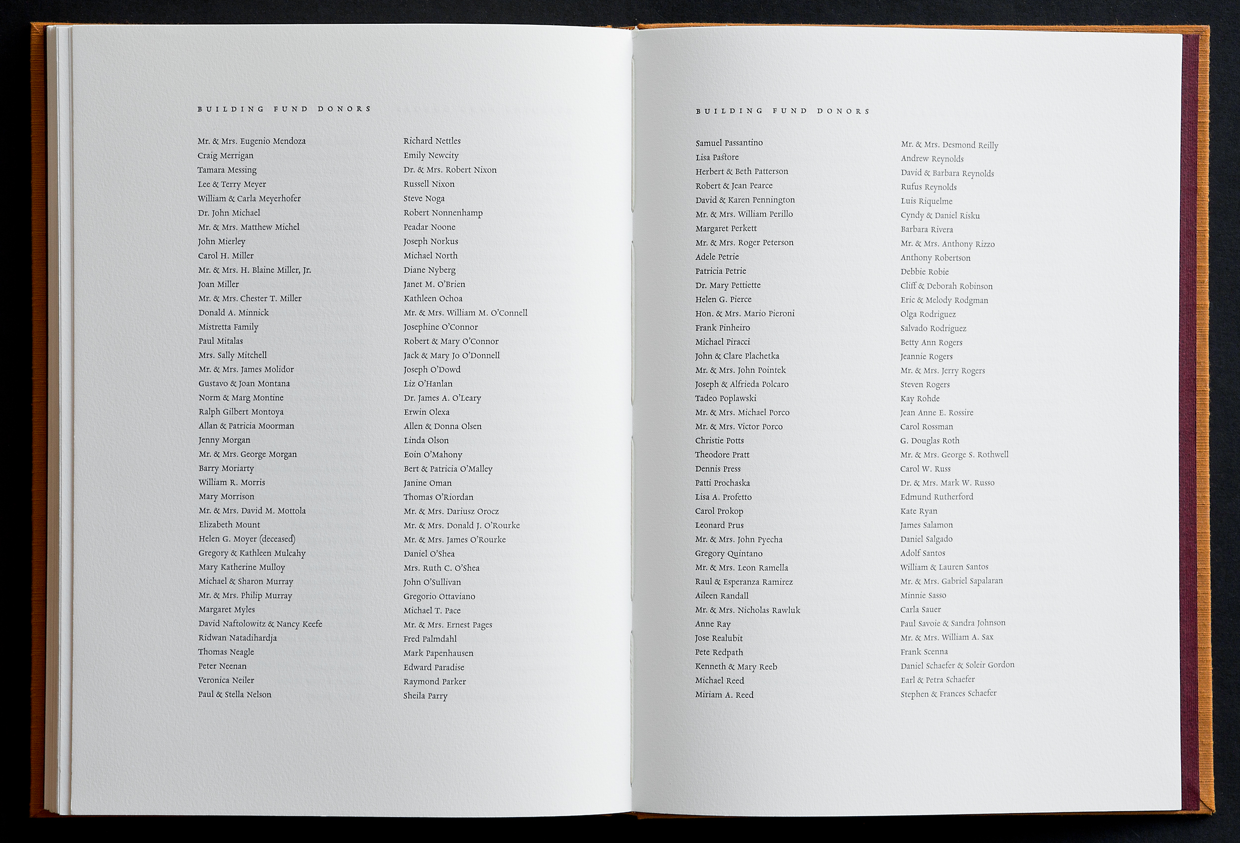
The back of the book features an alphabetical listing of the church donors.
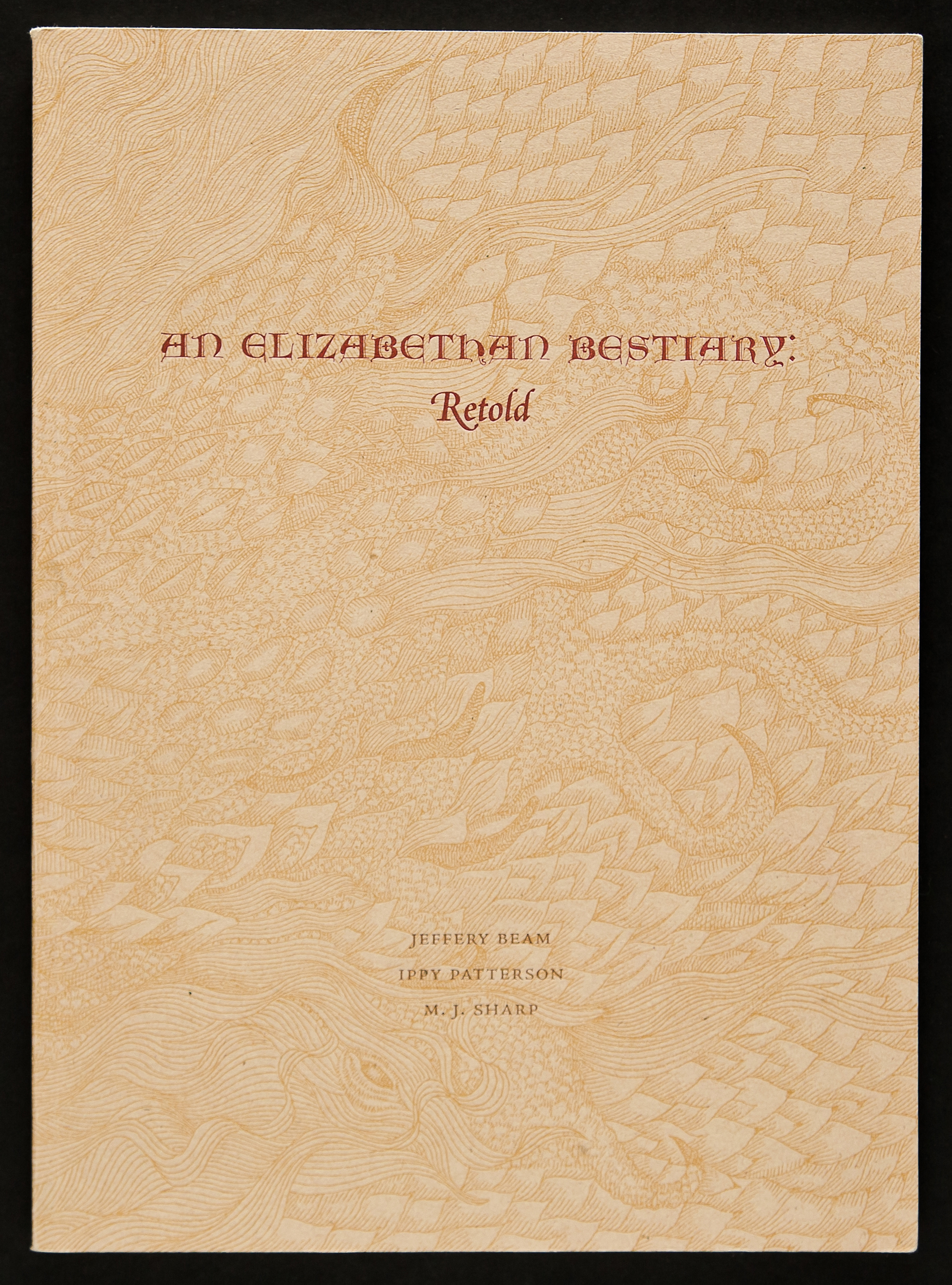
Cover features an offset printed drawing detail underneath the letterpress printed text. Edition of 1,000 books quickly sold out.
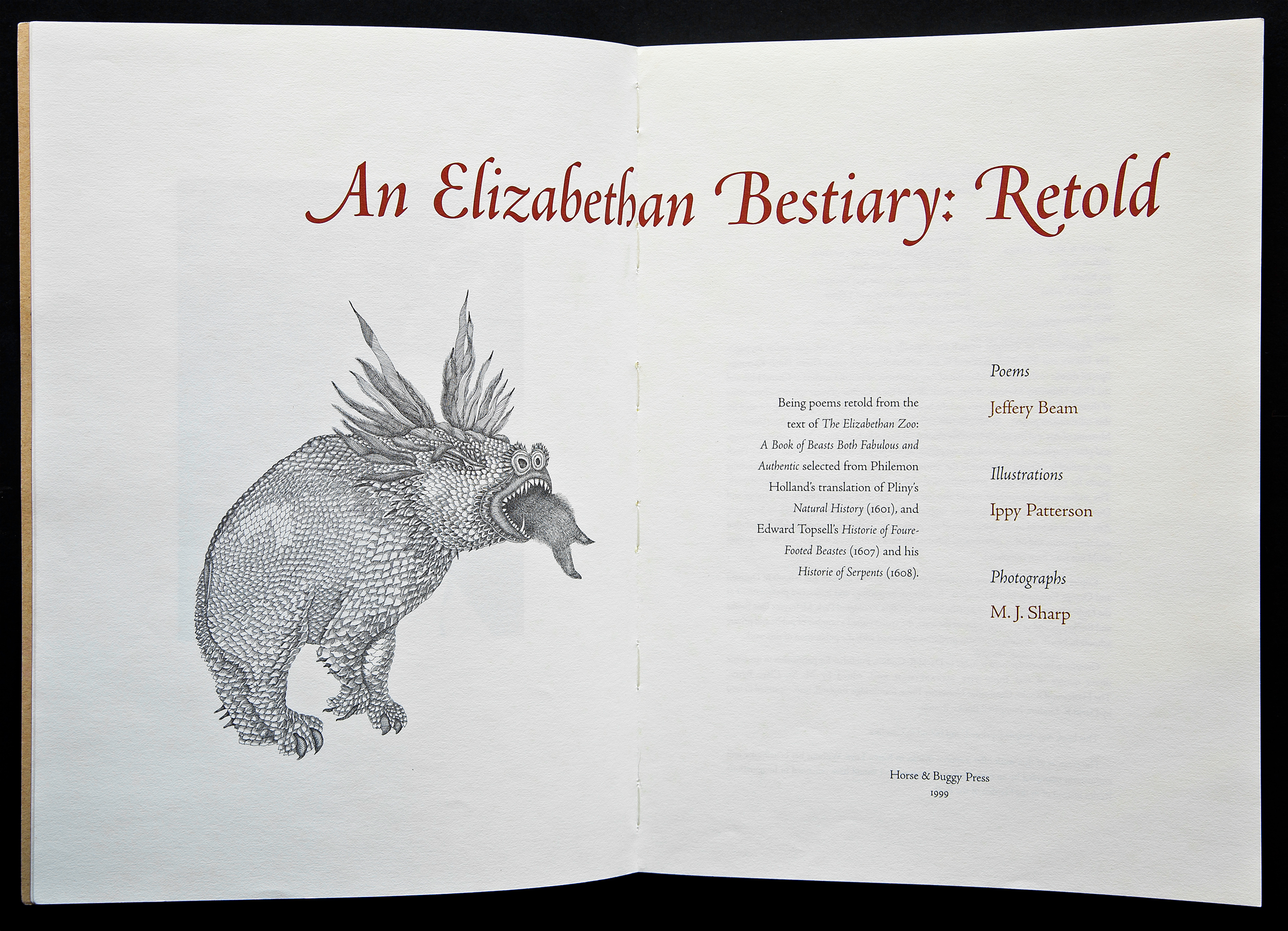
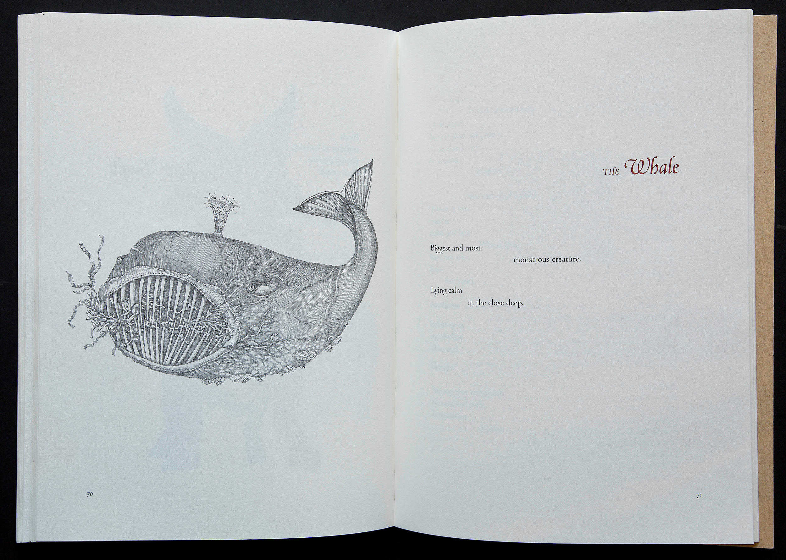
Title spread shows off the swash caps to be seen on successive pages and readers will notice a congruence between the shapes of the serifs and the details in the drawings of the various beasts.
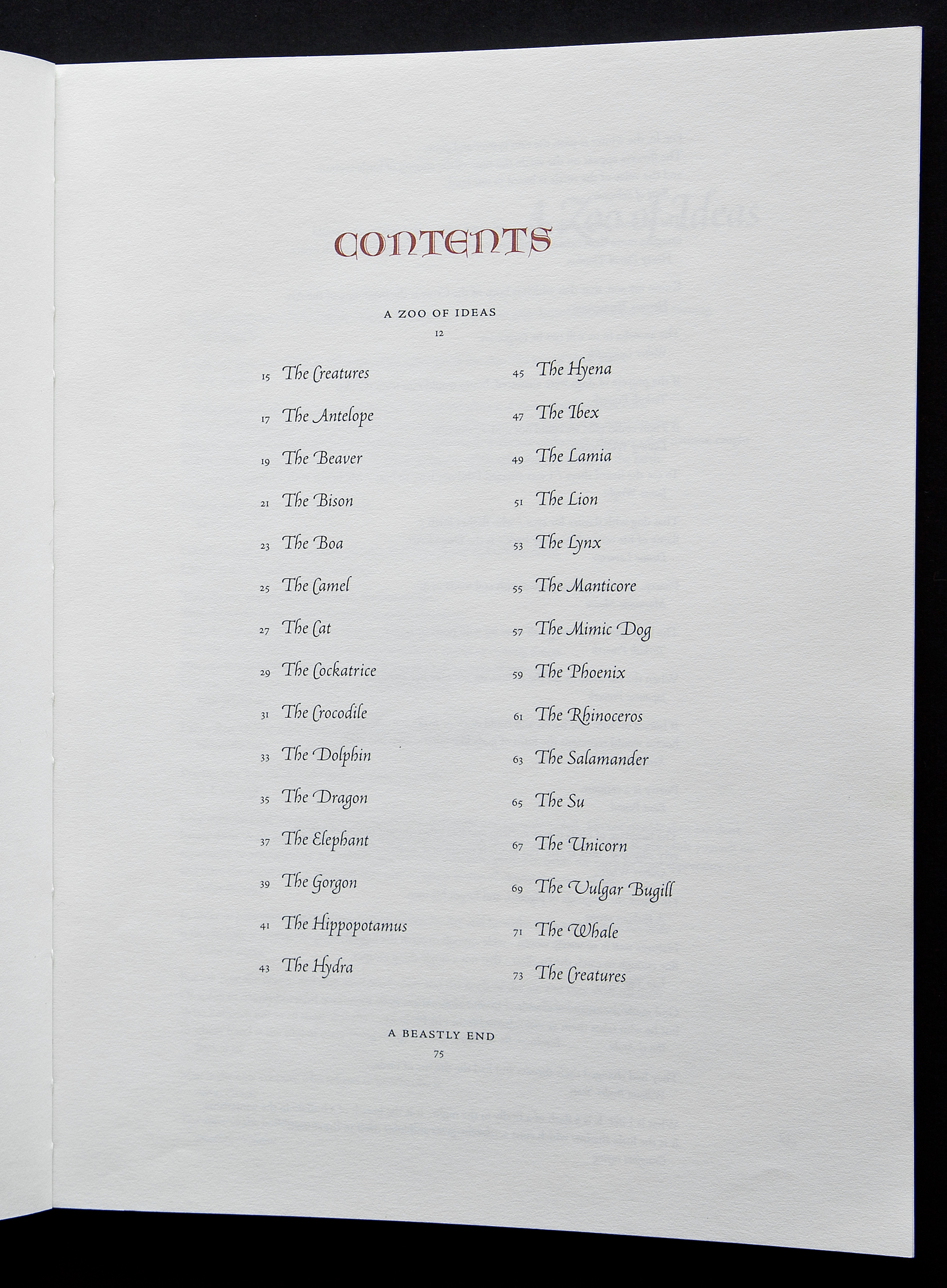
Lombardic Capitals used for the Contents page.
The amazing drawings were created by Ippy Patterson. . . who happens to be the poet's next door neighbor.
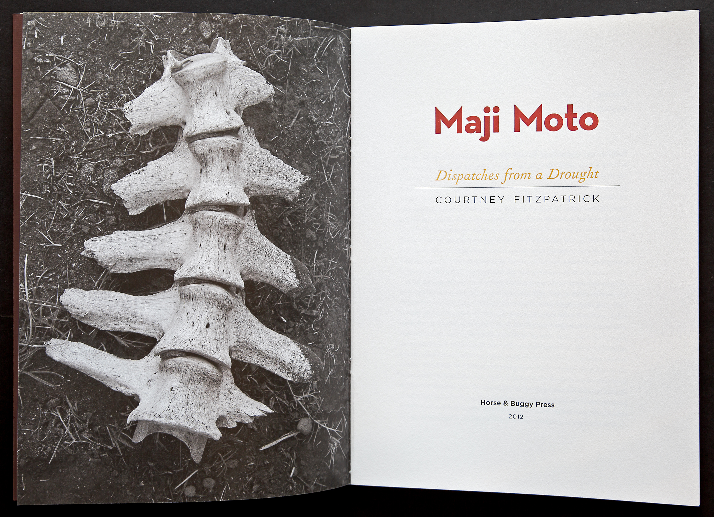
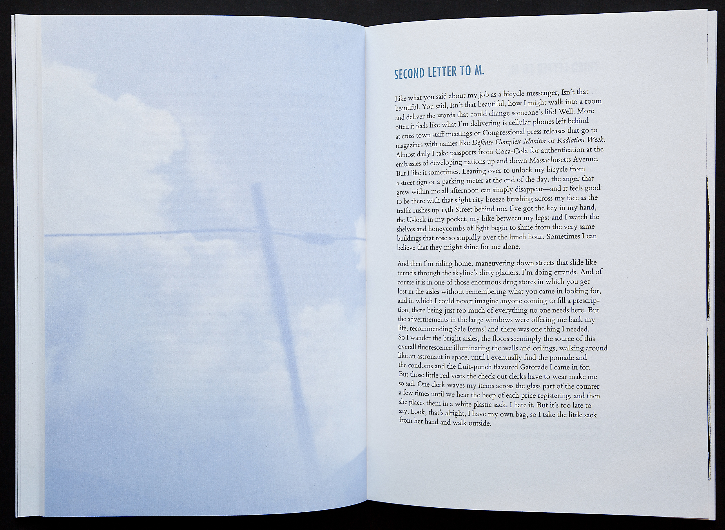
Title spread for a book that was an equal balance of writing and photography. Courtney commissioned me to make this book edition as she didn't feel the blog she had published did an effective job carrying her content to readers.
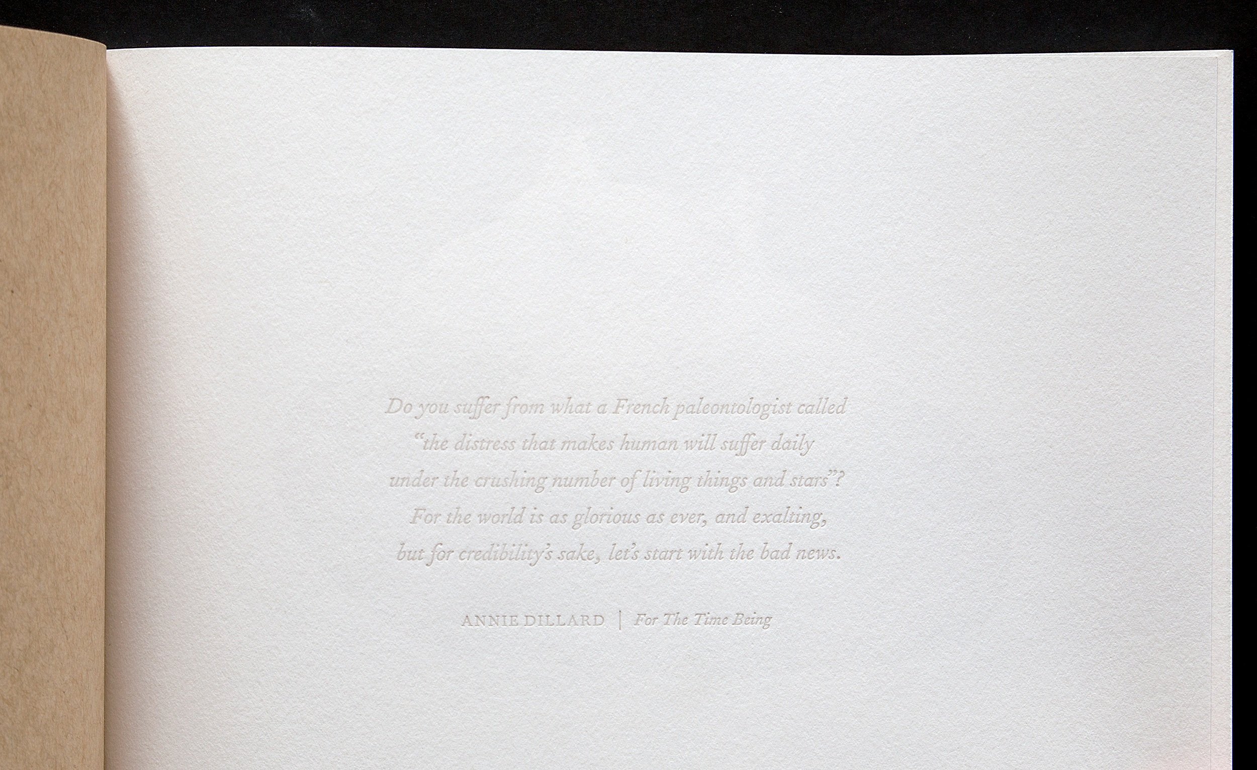
Detail of Annie Dillard excerpt that immediately sets the tone for a book with tough content.
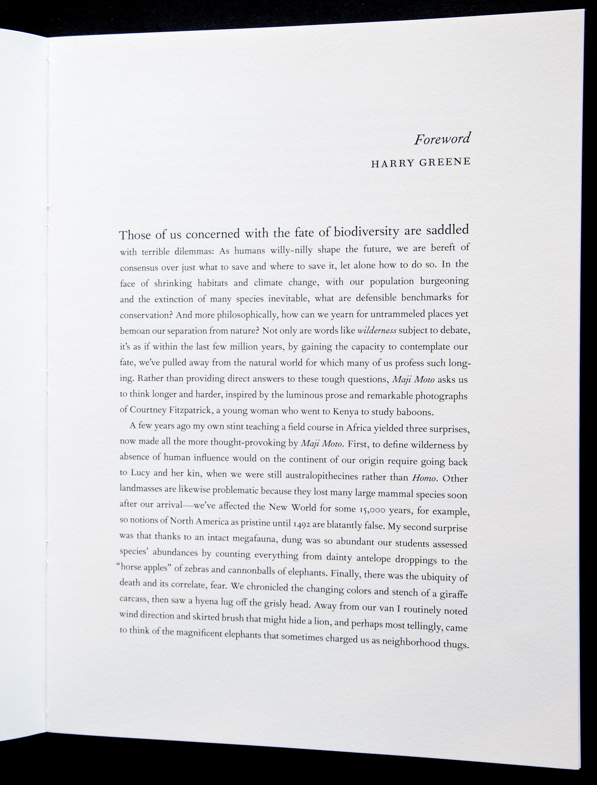
Great essay by guest scholar contextualizes Courtney's work in a larger setting and discusses envirnonmental issues we are facing in the 21st century.
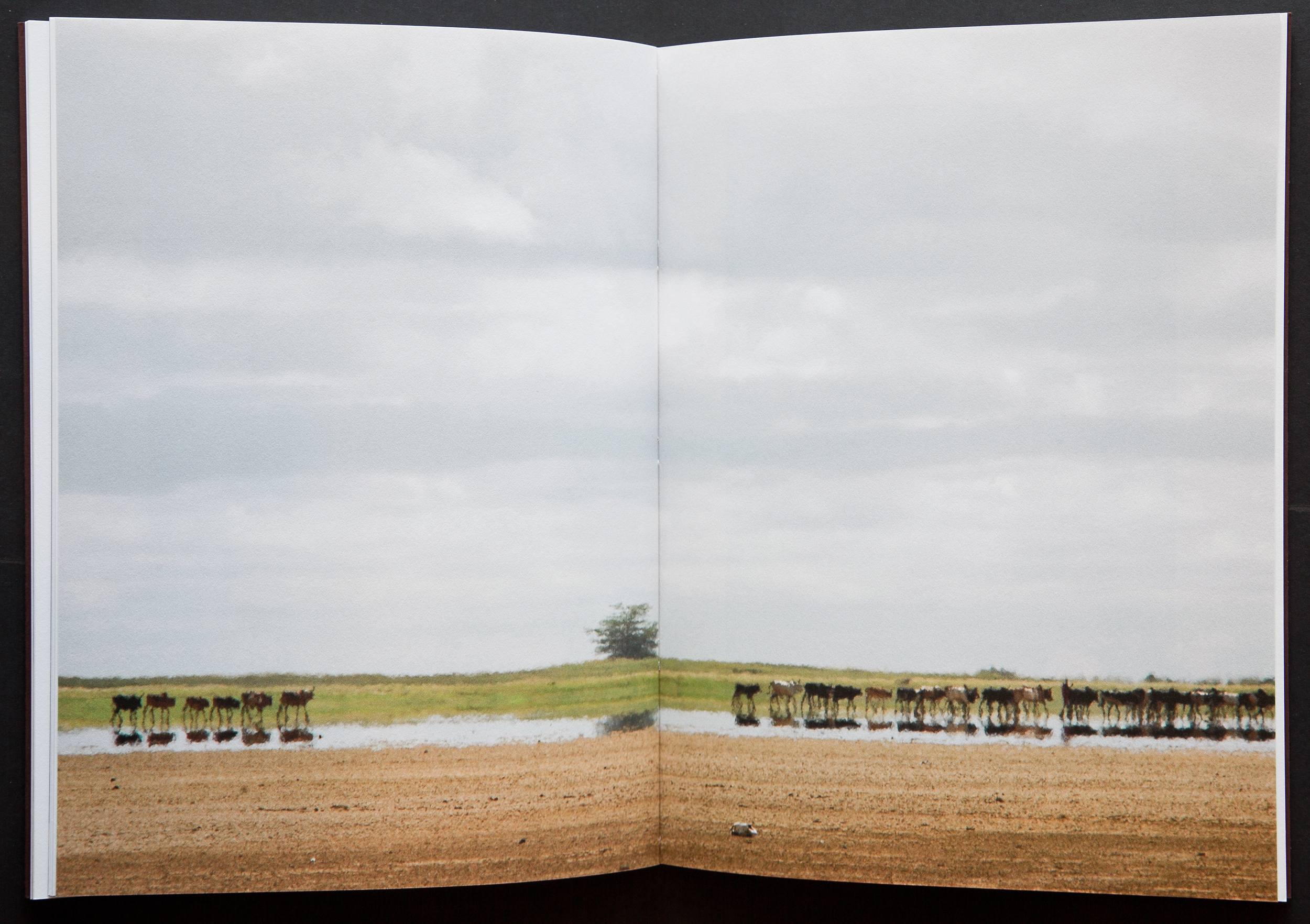
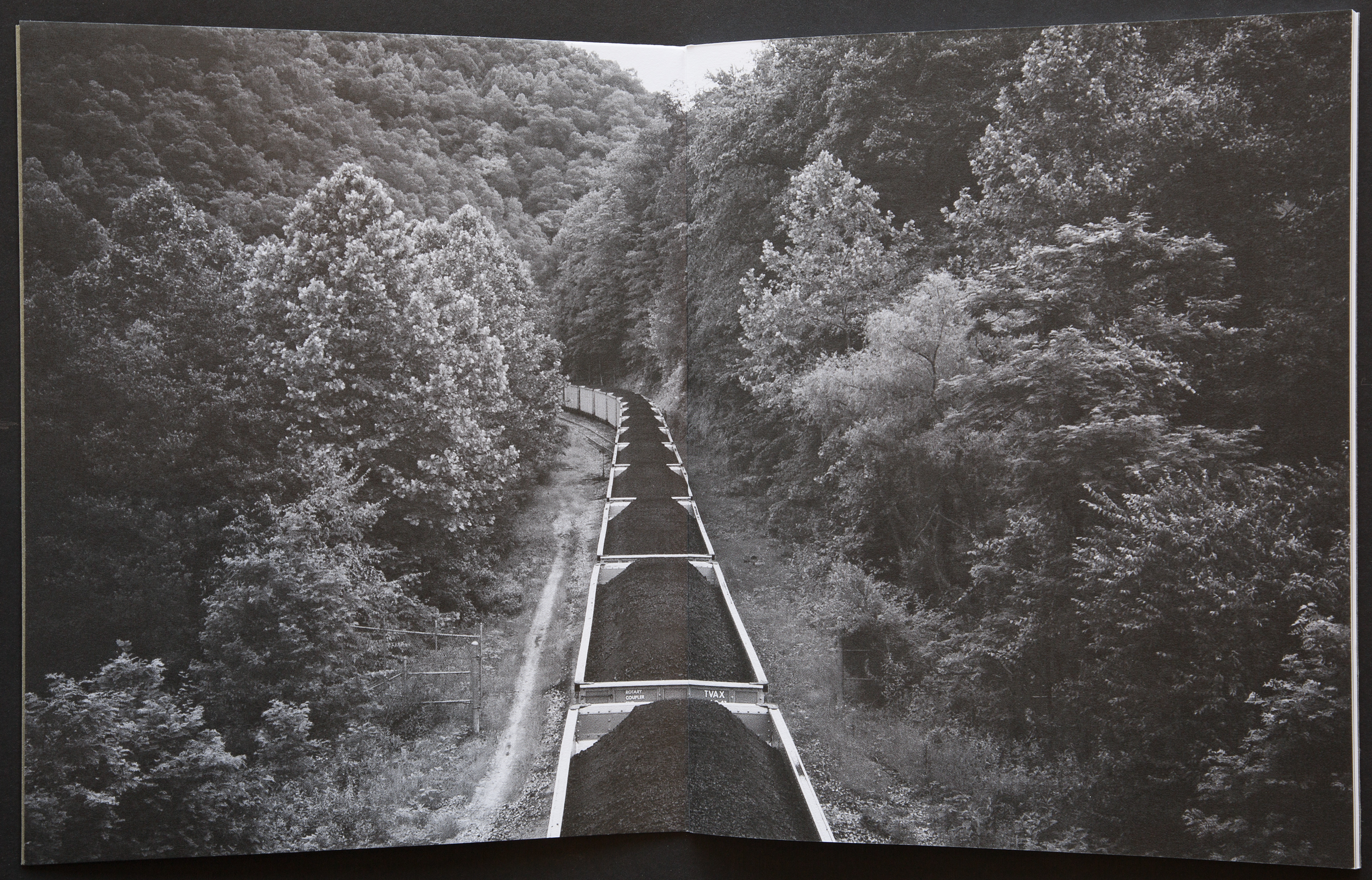
Some of the landscape photographs were printed as two page bleeds to powerfully put the reader in the scene.
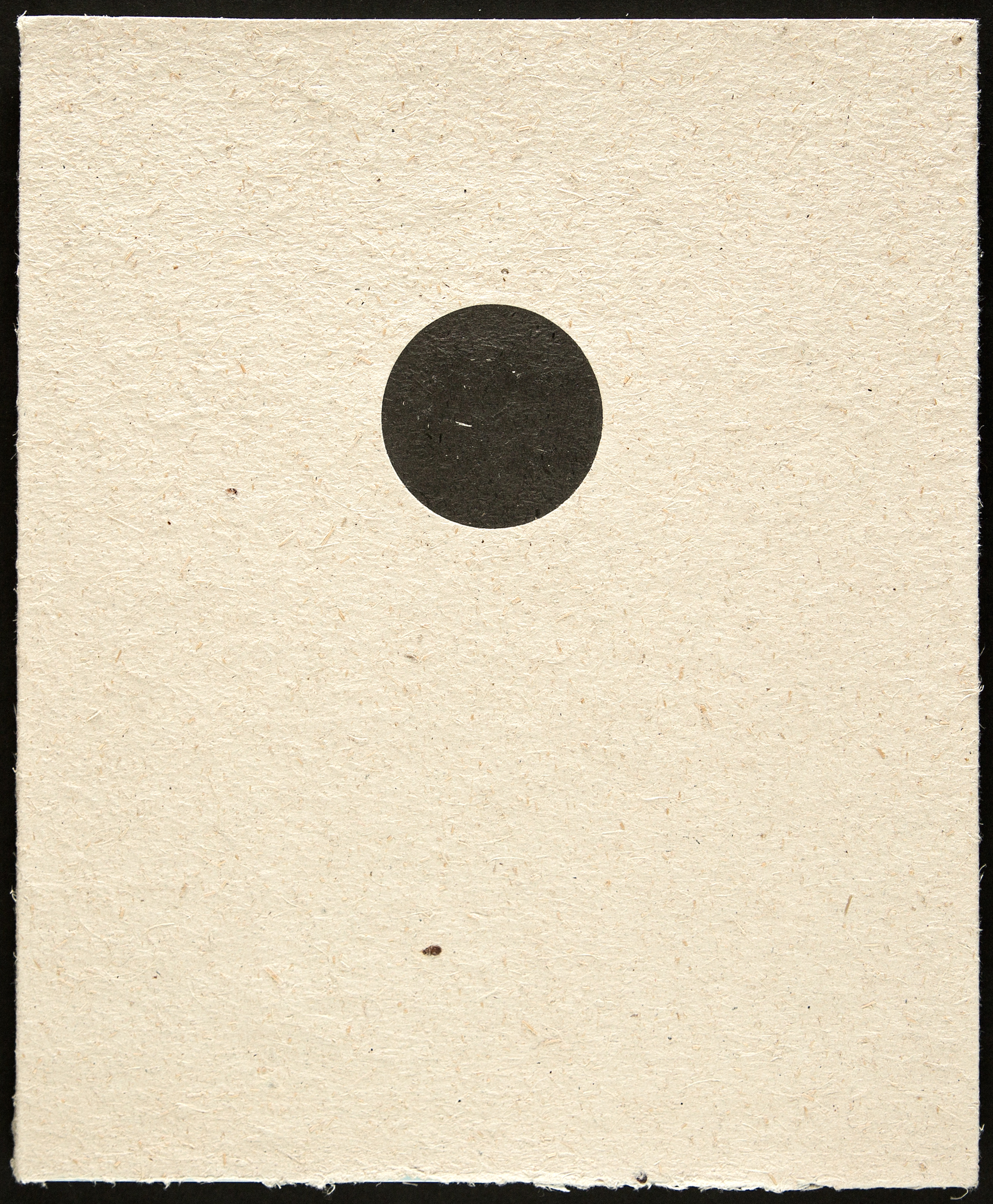
Cover to Birdhouses photography book. The edition of 175 was created with ten different handmade paper covers and three different endsheet colors to push the concept of variation within an edition. A double hit of black ink was deeply impressed to create a tactile “hole” which insinuates entry into the home of a birdhouse.
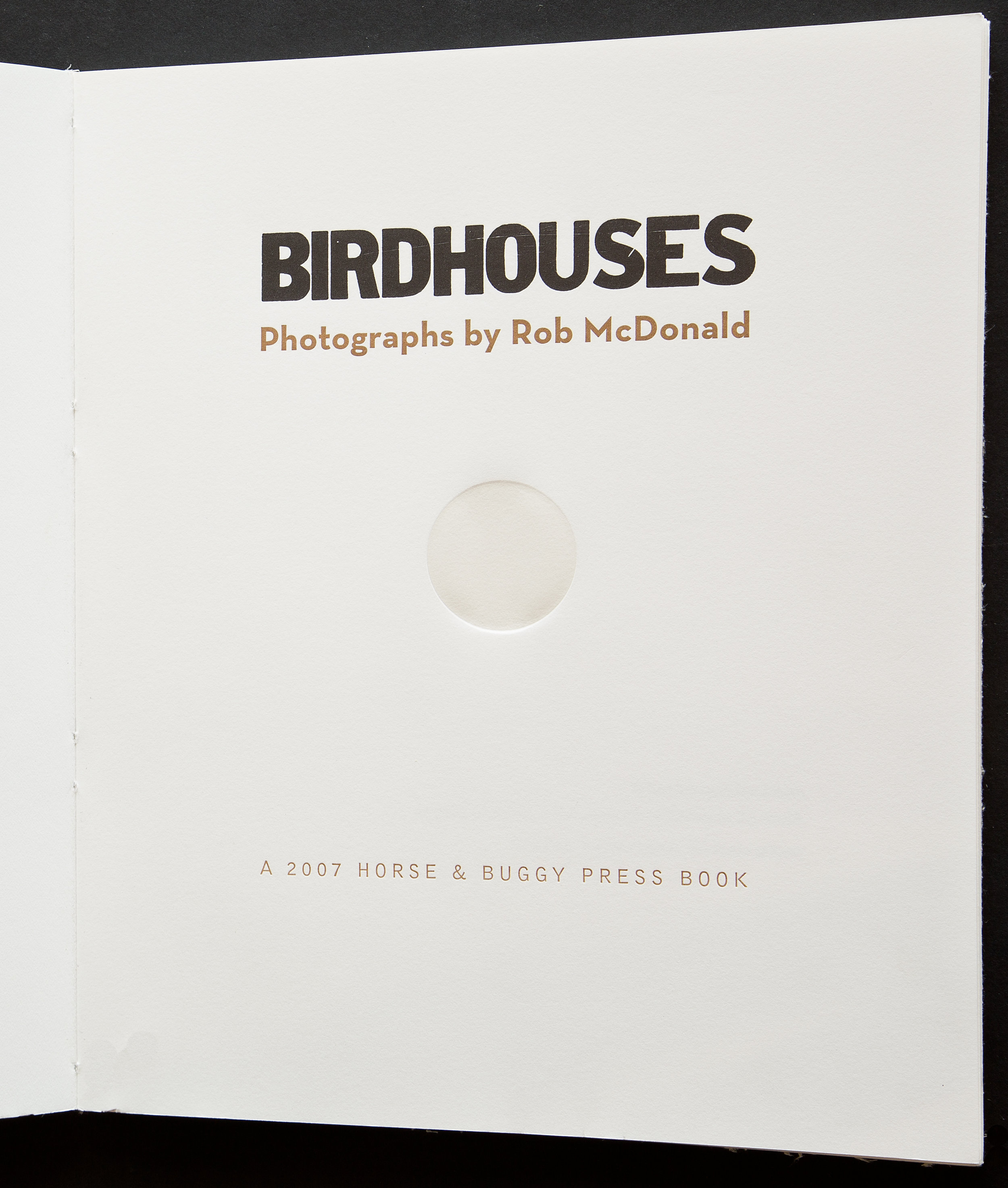
Titles spread is the first appearance of the book title. (we wanted a cover that would be mysteriously interesting).
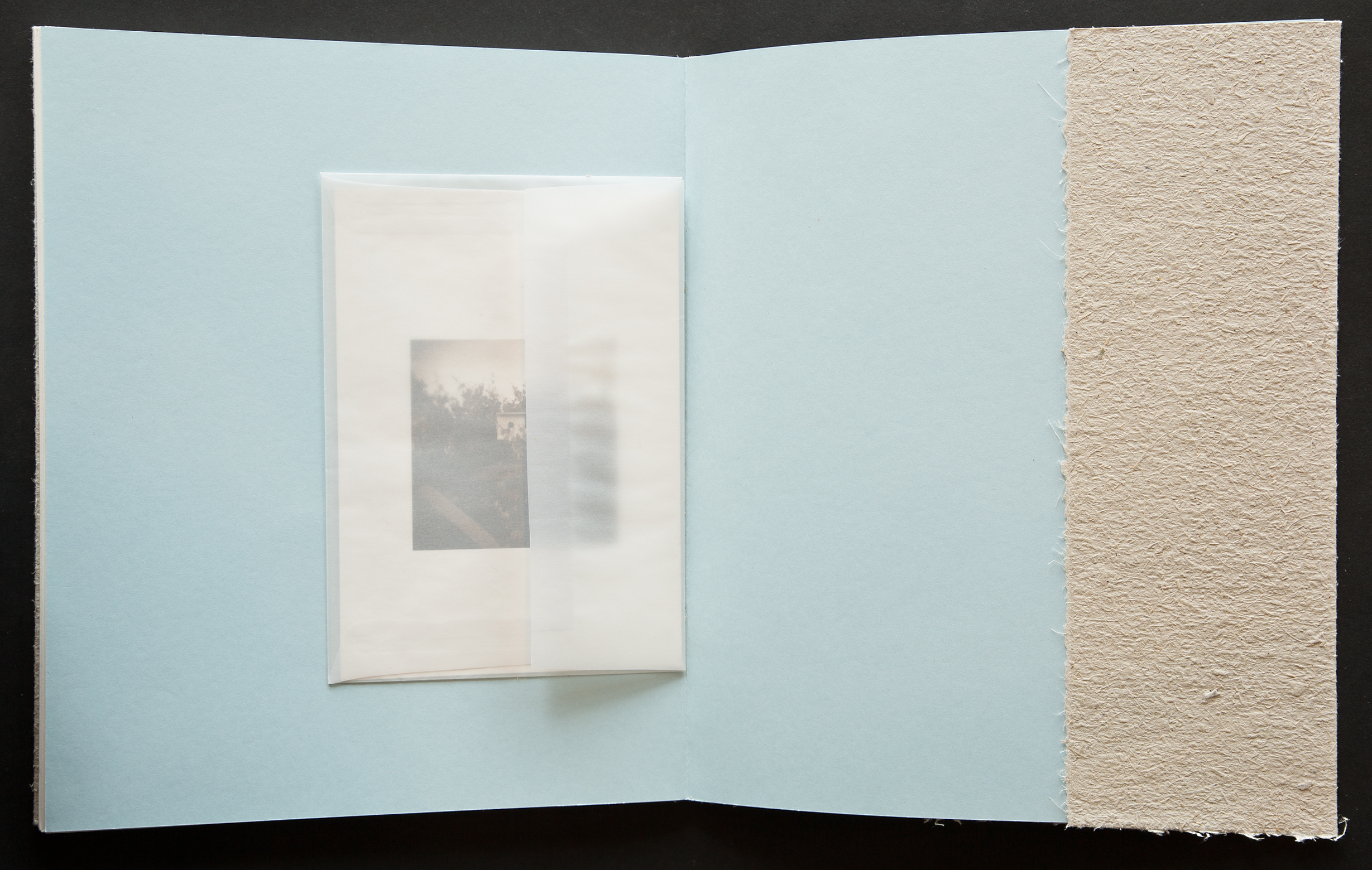
Each hand-sewn book includes a print suitable for framing inside a translucent envelop adhered to the inside back cover.
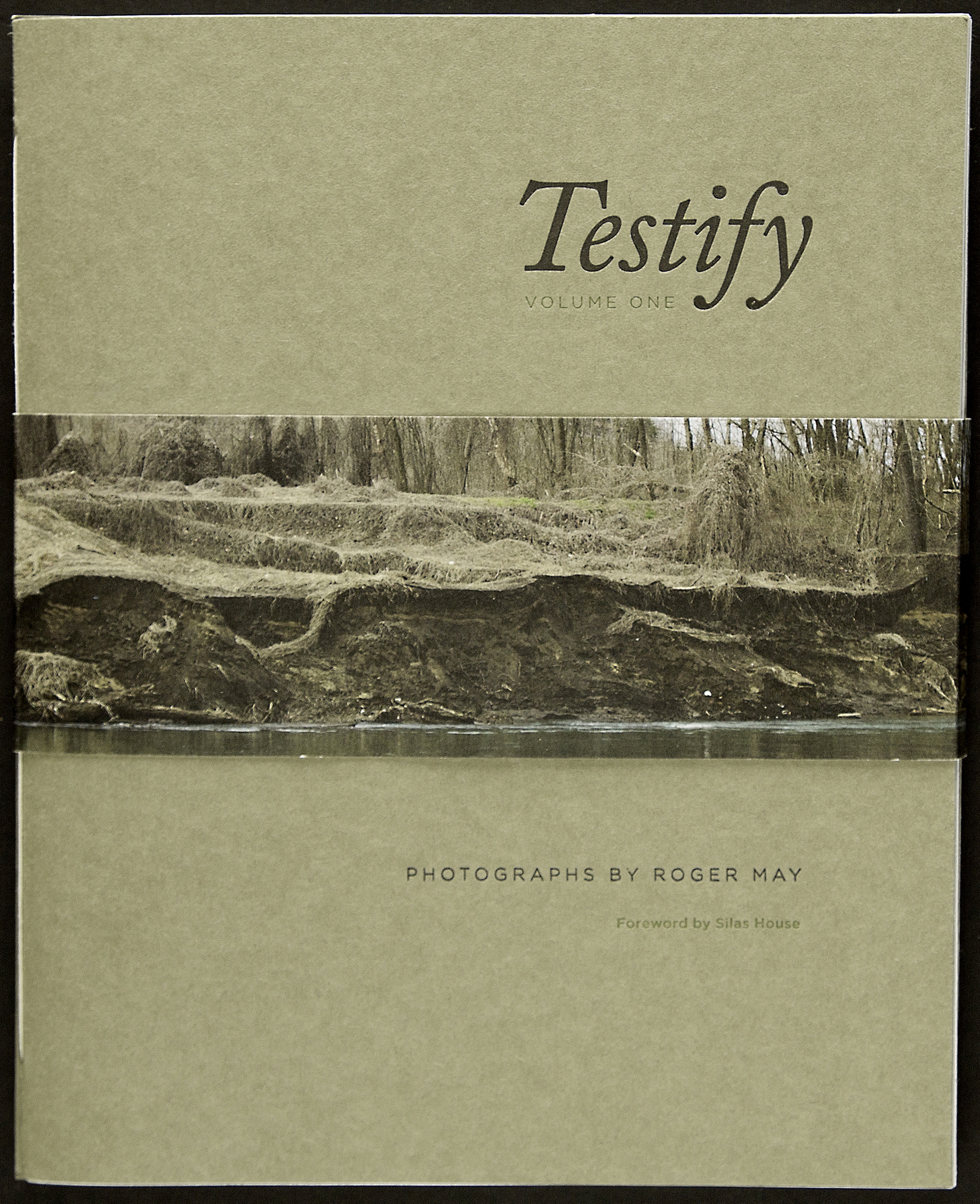
A printed bellyband holds the two volumes of this poetry collection together. The image is of the Tug River which separates West Virginia from Kentucky, the two states where Roger made the photographs in this collection.
Powerful frontispiece spread appears before the title page.
TItle spread.
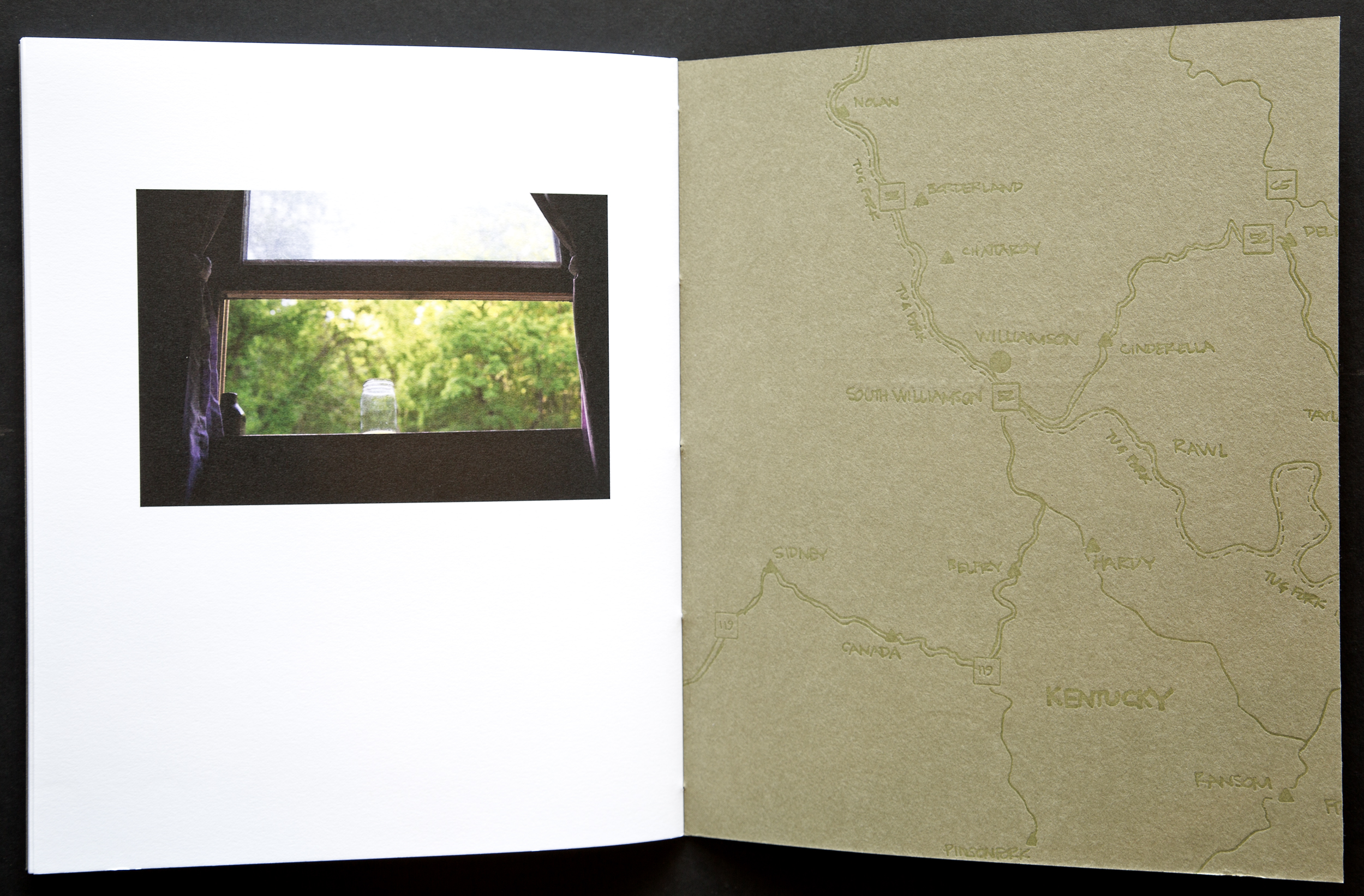
The image narrative is paused as volume one ends. The map on the inside back cover is lettepress printed and carries over onto the front cover of volume two.
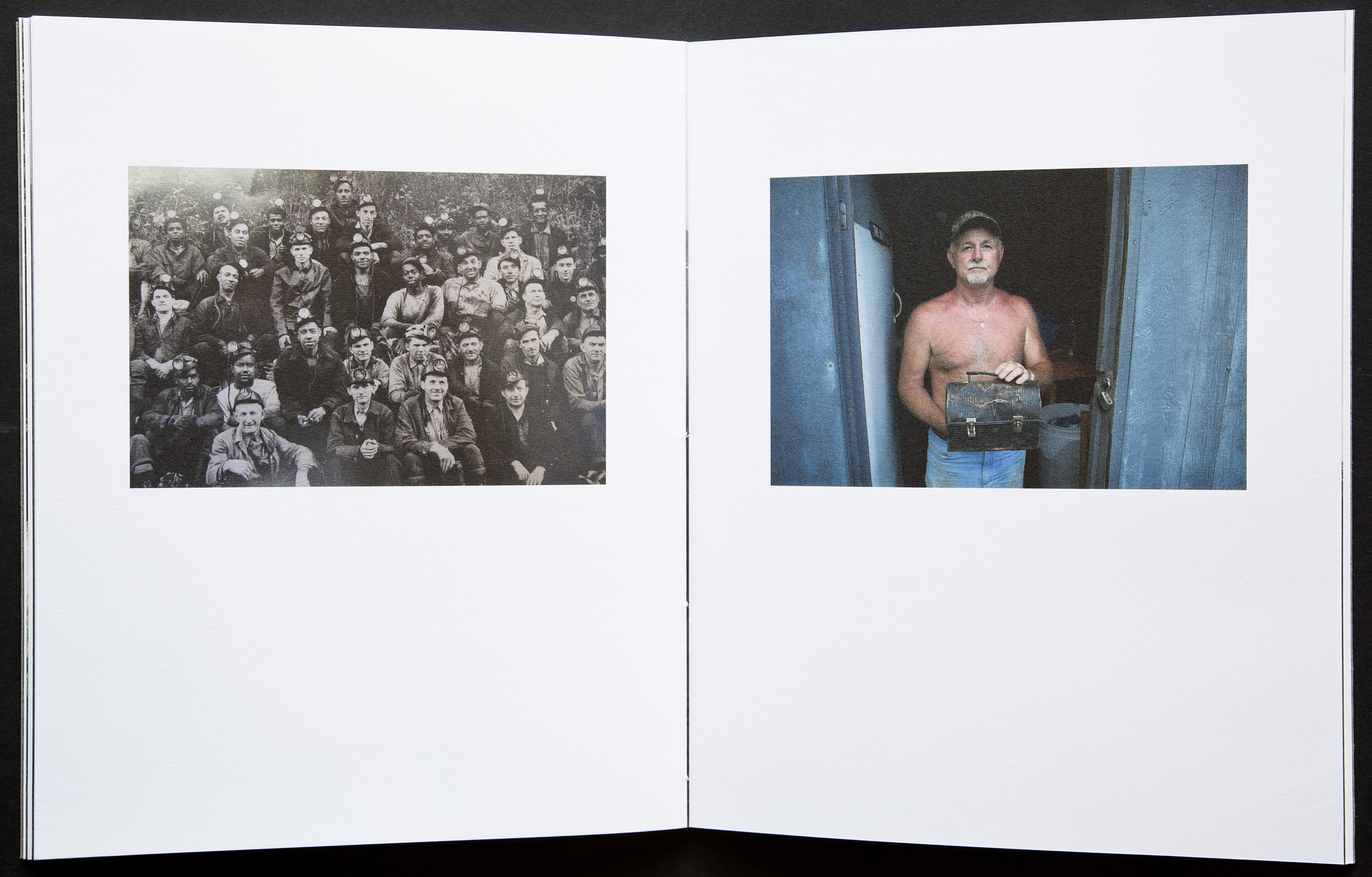
One of the fun challenges of this book was mixing the B&W photos with color rather than separating them into different sections.
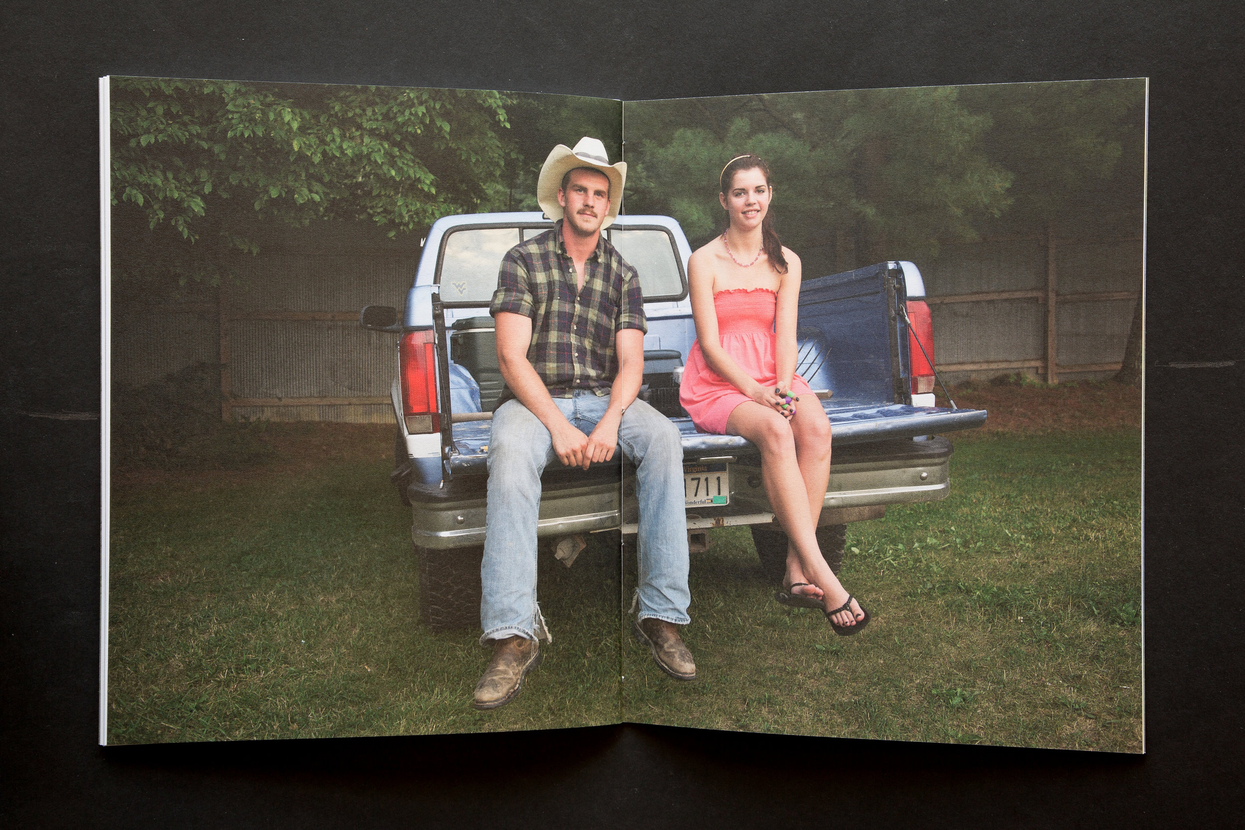
The photograph of Cody and Emily ends the image narrative.
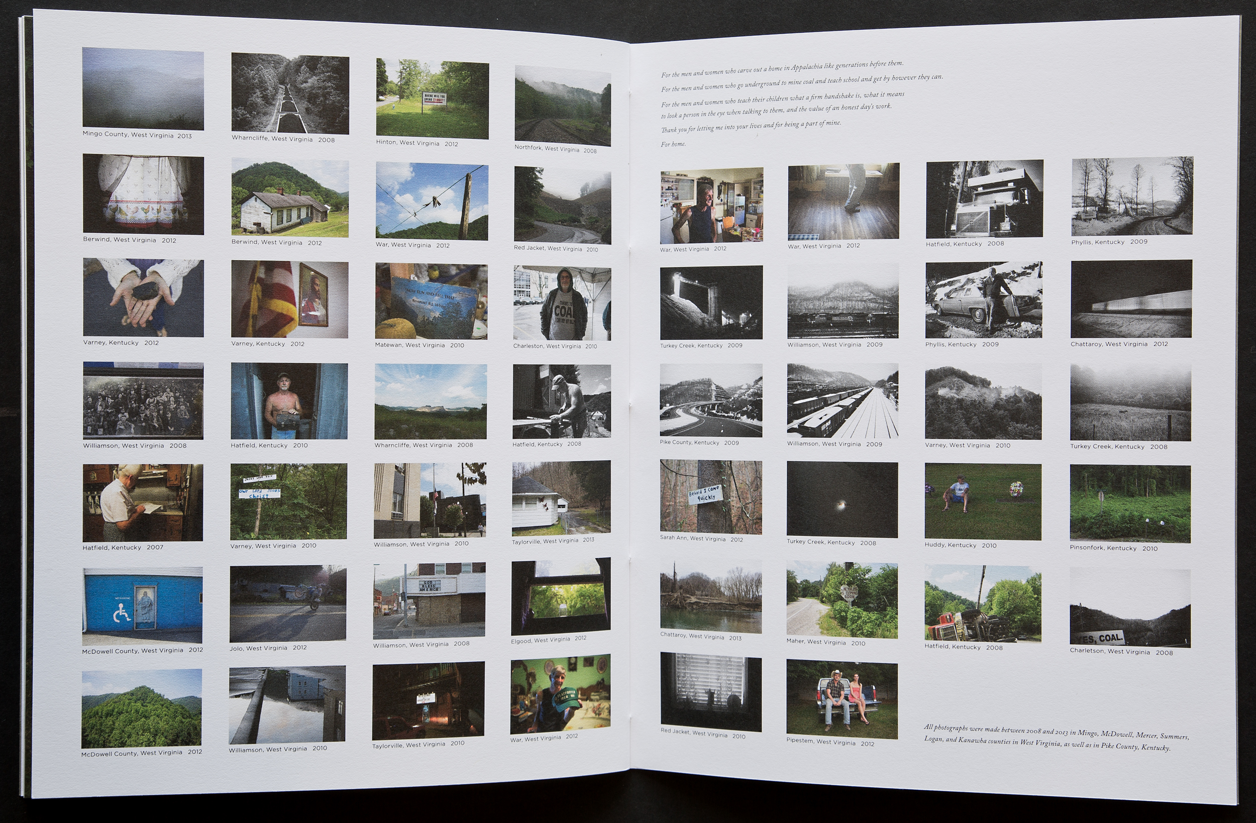
Plate list in the back allows us to give information about each photo without cluttering up the pages where viewers first see the images.
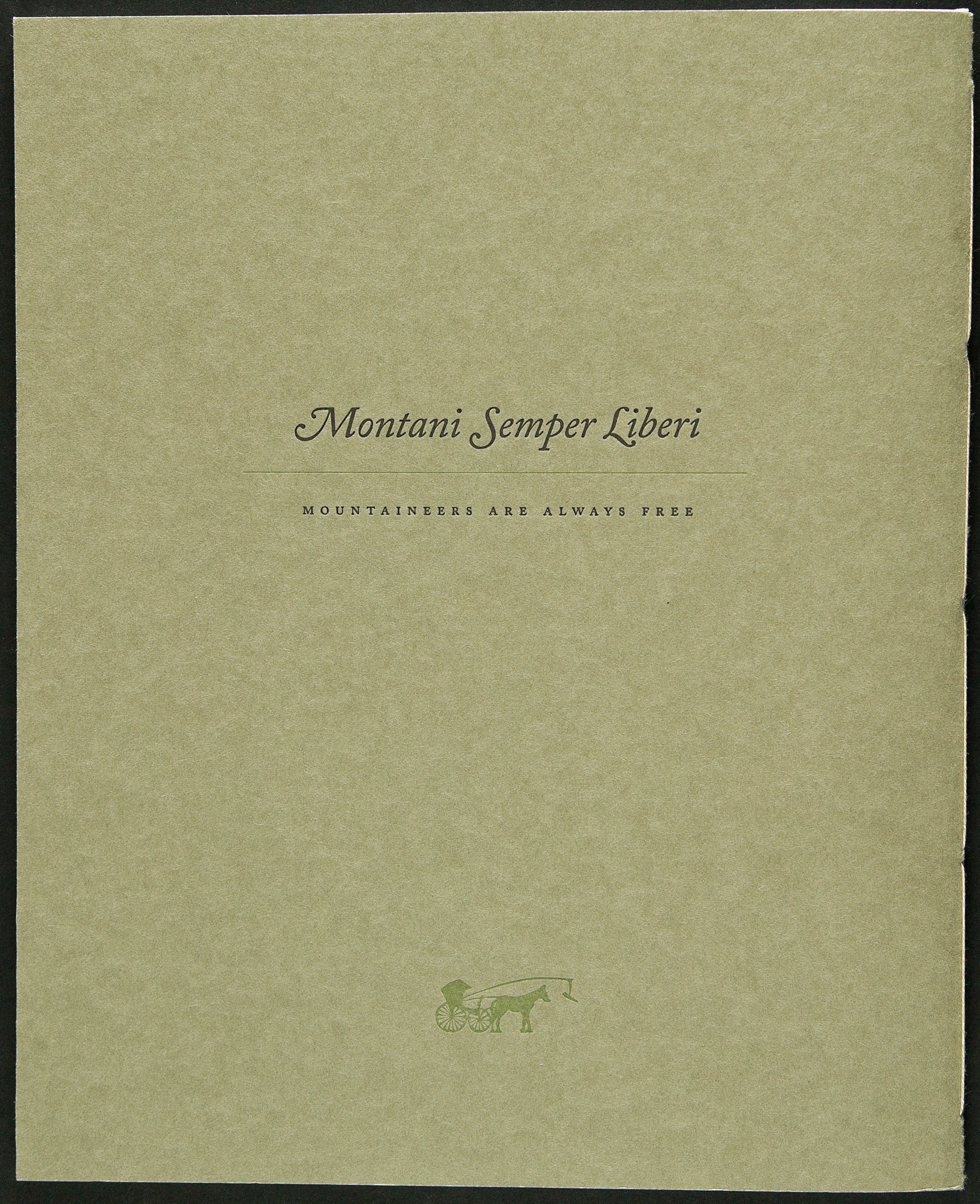
The back cover of volume one features the state motto of West Virginia. Volume 2 carries the state motto of Kentucky.

Poetry title letterpress printed on lotka fiber paper. Frank Ryan had several books published during his career and this hand-printed title was commissioned by his daughter as a retirement present for her father. All three of us worked together to decide which poems should be included and how they were sequenced.
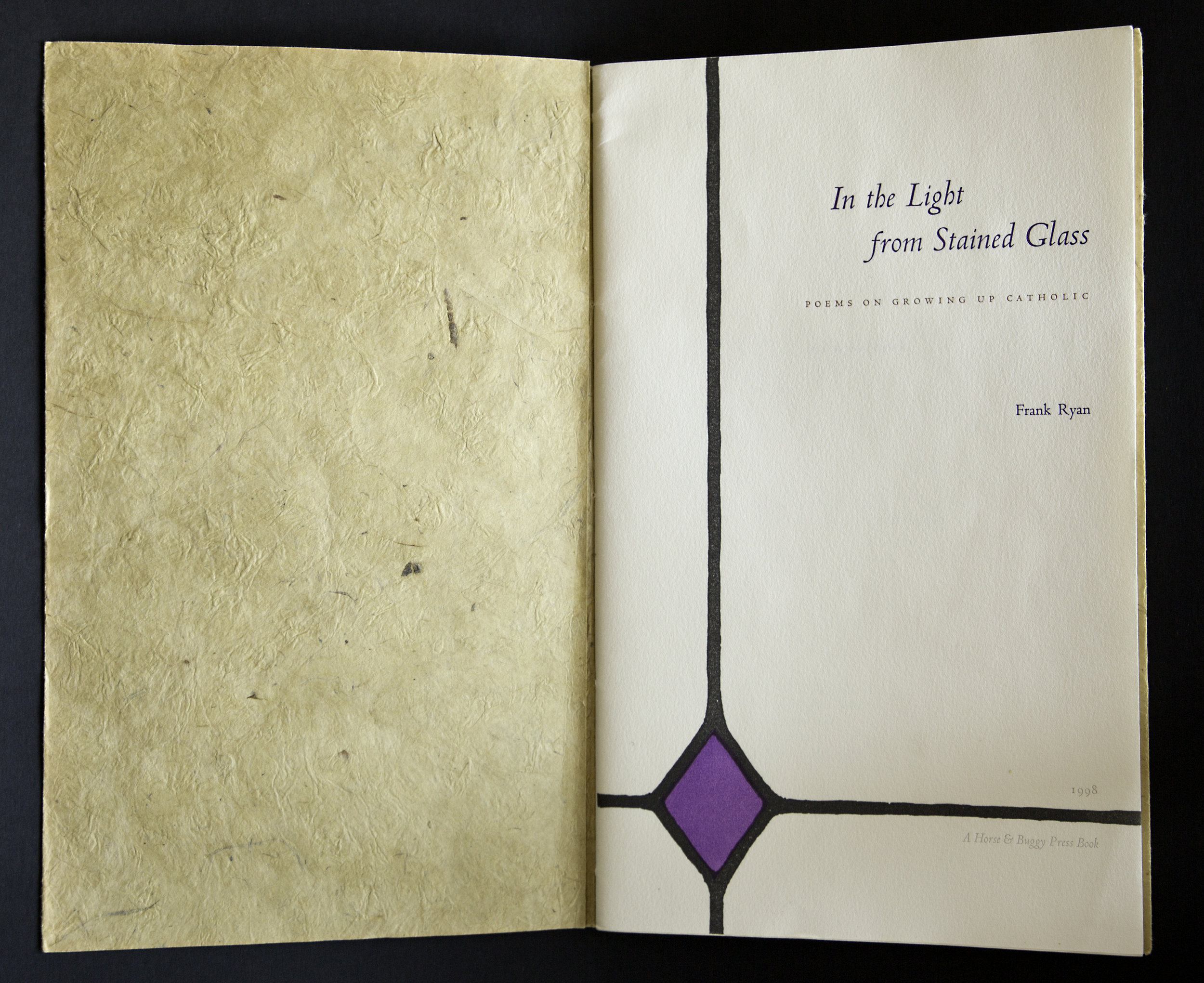
Title spread.
The classic book typeface Centaur was used. This book was hand-printed from cast Monotype. Today, we use photopolymer plates created from computer type-set design files. A different process but the same rich result of a tactile letterpress impression.
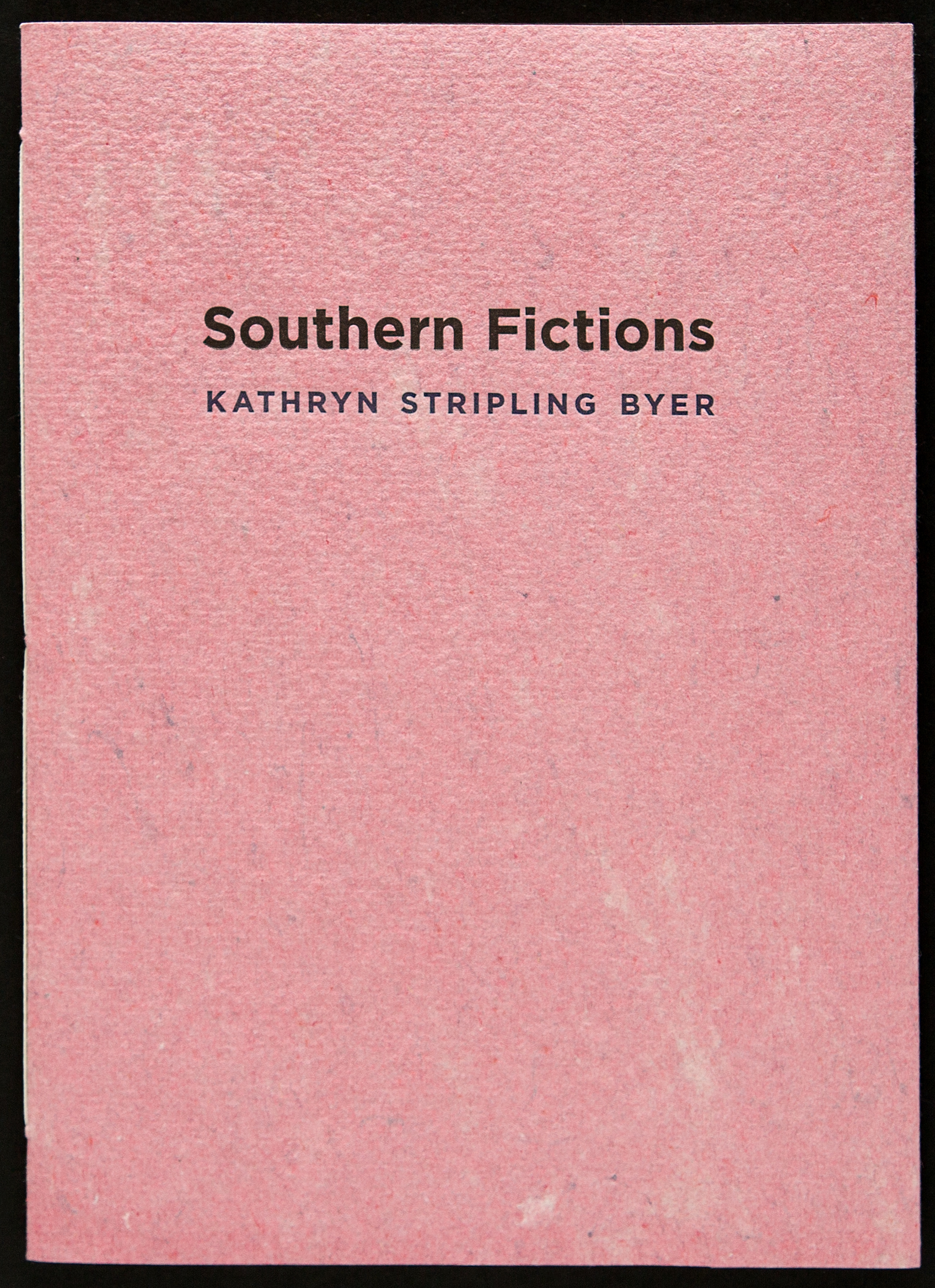
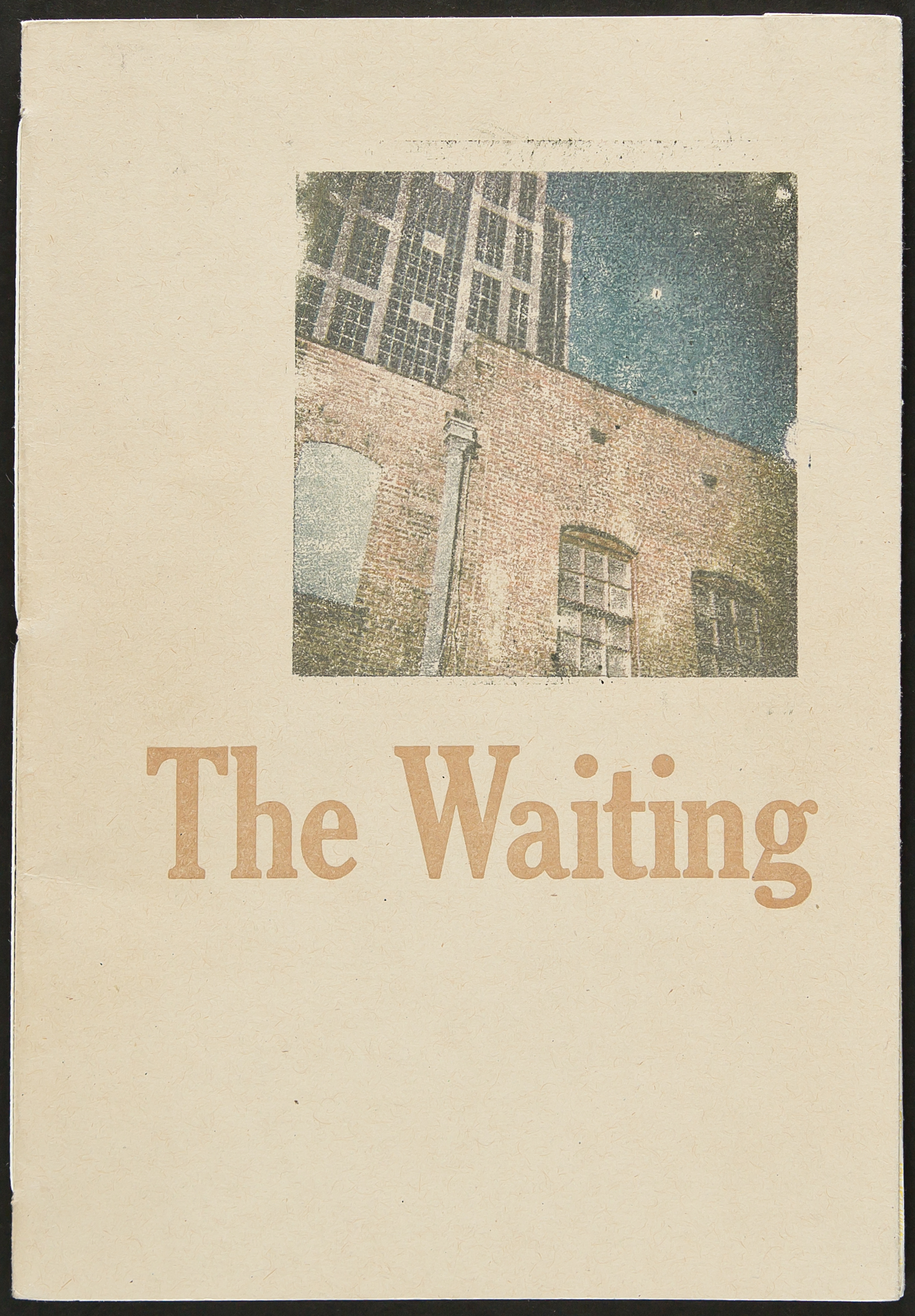
A book of sonnets by the former poet laureate looking back at growing up in rural Georgia during the Jim Crow era. The fiirst sonnet mentions how she hated how her father used to fly the Confederate battle flag—so we cut up several battle flags and re-purposed them into handmade paper covers for this edition of 200 books.
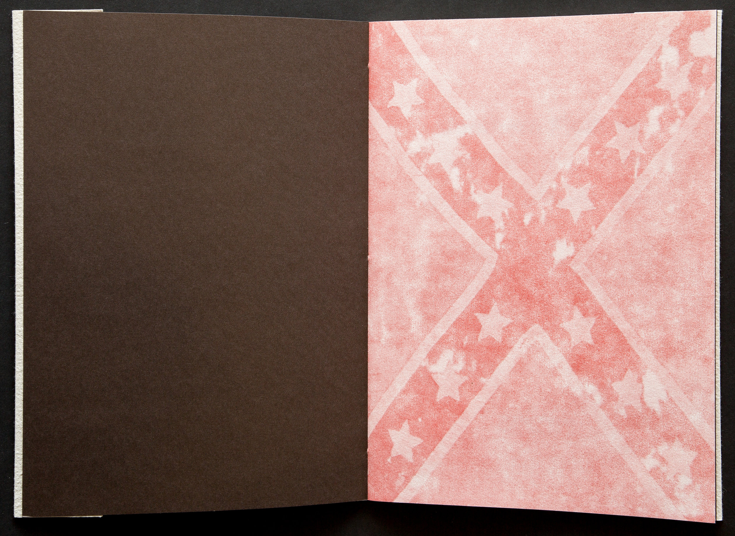
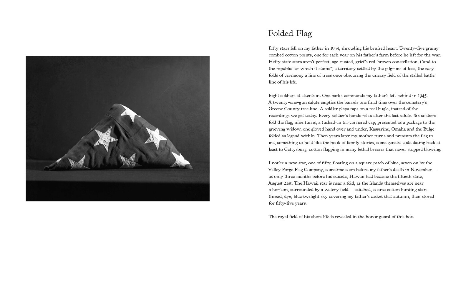
Frontispiece imagines what a flag would look like if left in the window for decades.
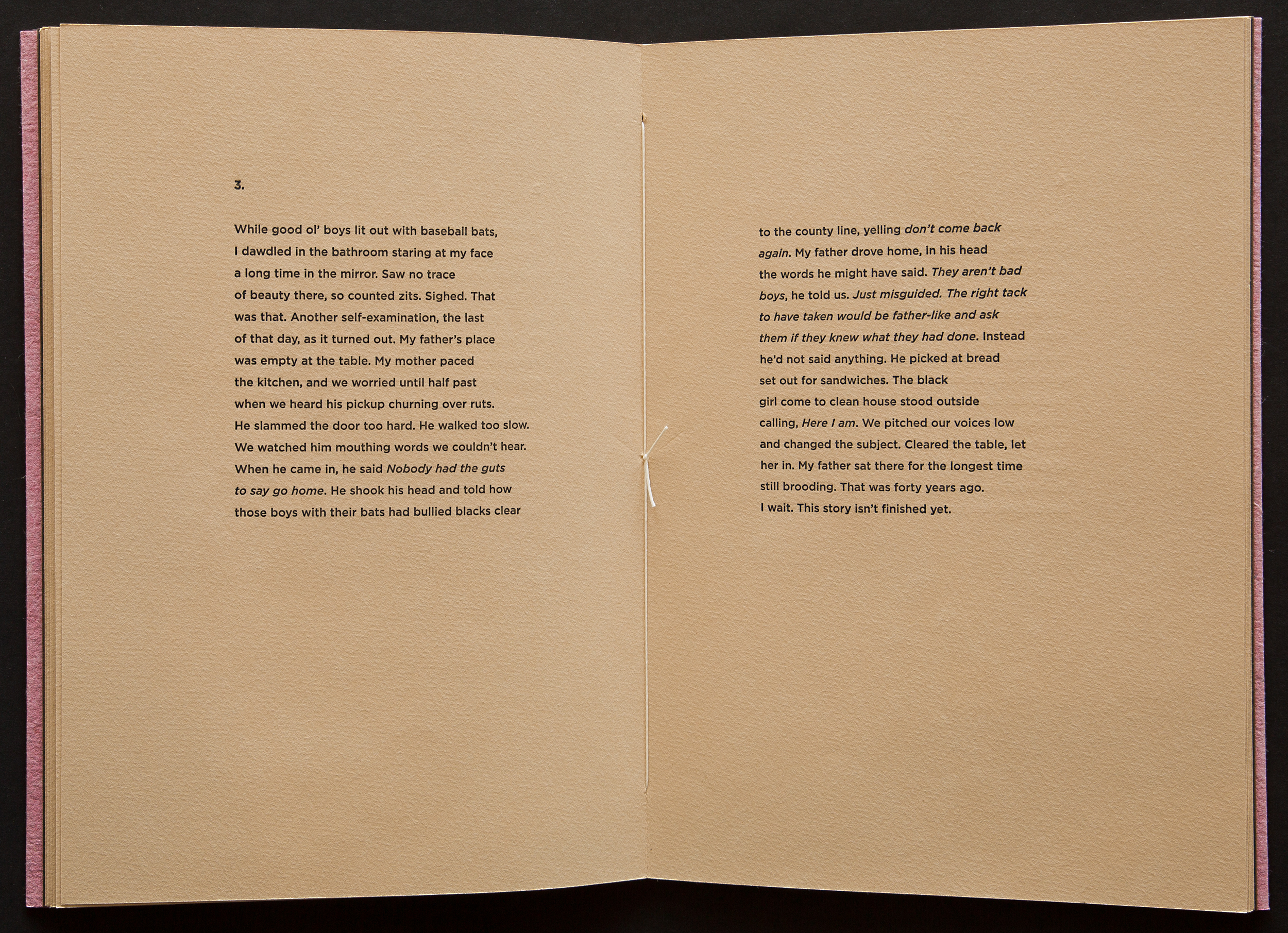
Centerfold spread. We used a tan paper to bring to the life the dirt roads and feel of the Georgia countryside depicted in the poems.
Chapbook cover. A xerox transfer image.
Cover collage featuring three different images from inside the book. Stevie made the drawings, and wrote some of the poems, in handmade sketchbooks I made him over the years since we became friends at Penland.
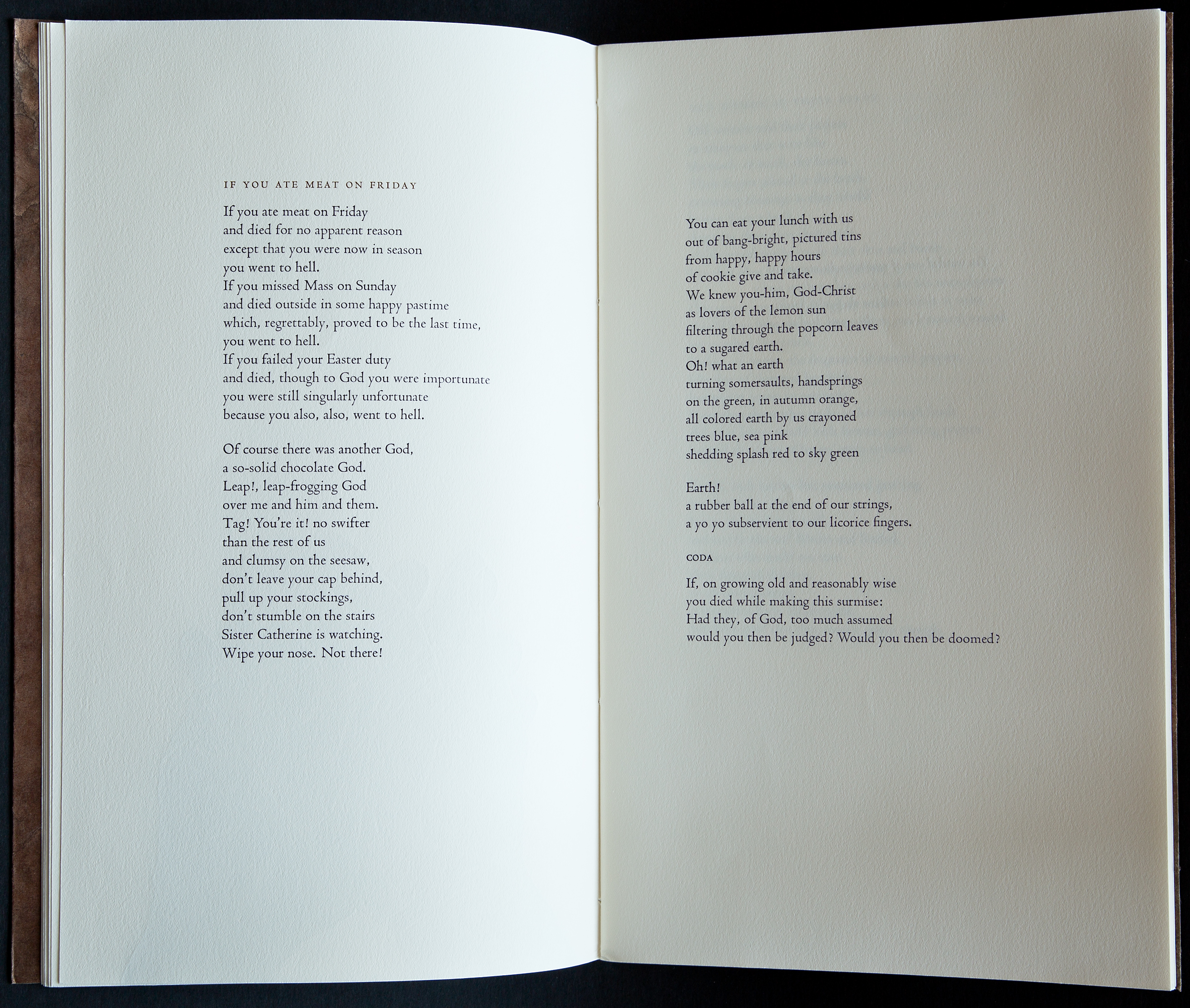
Introductory poem.
Offset printed photograph opposite letterpress printed text.