
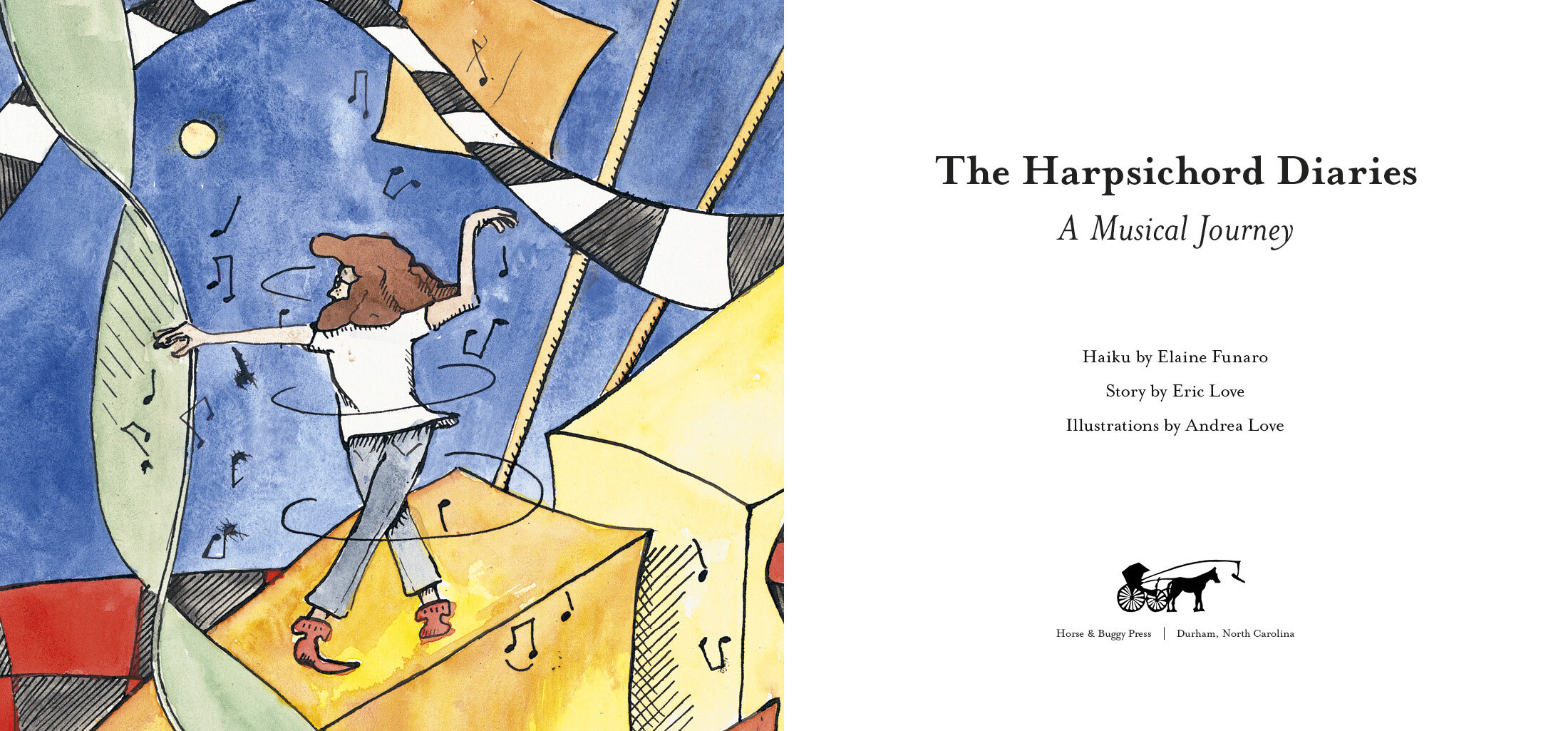
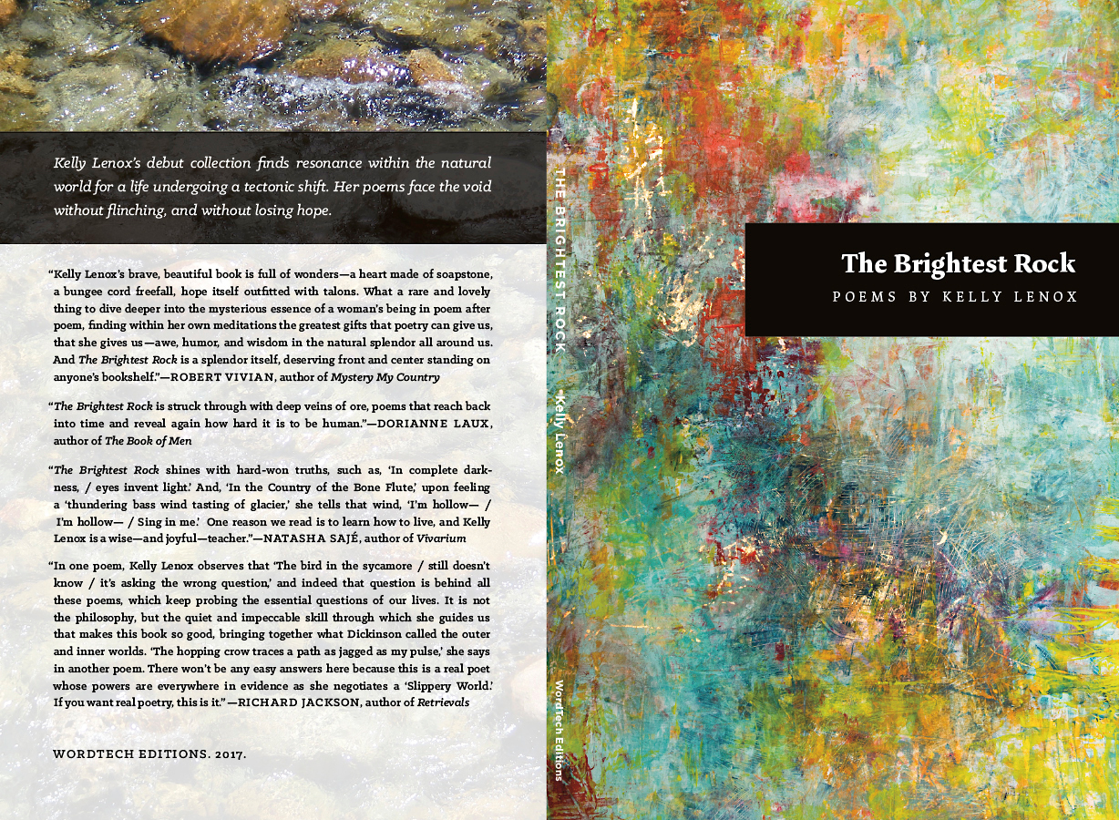
Book cover.
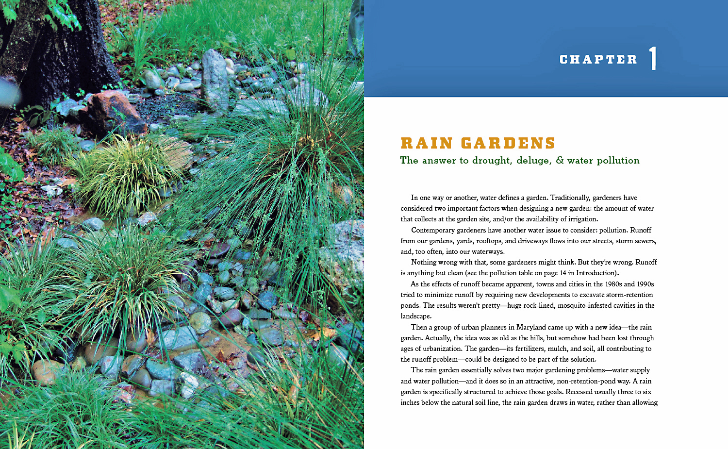
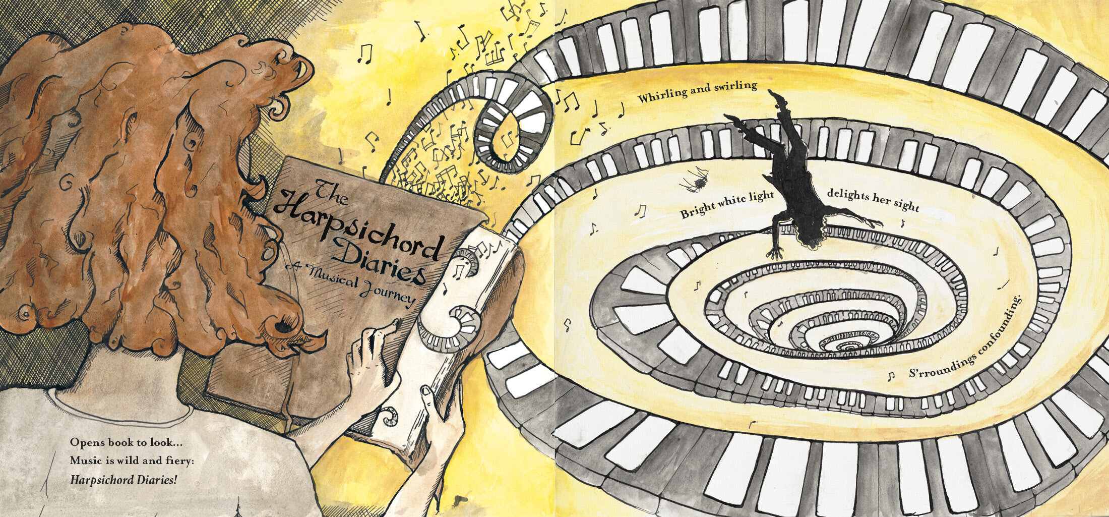
Chapter opener.
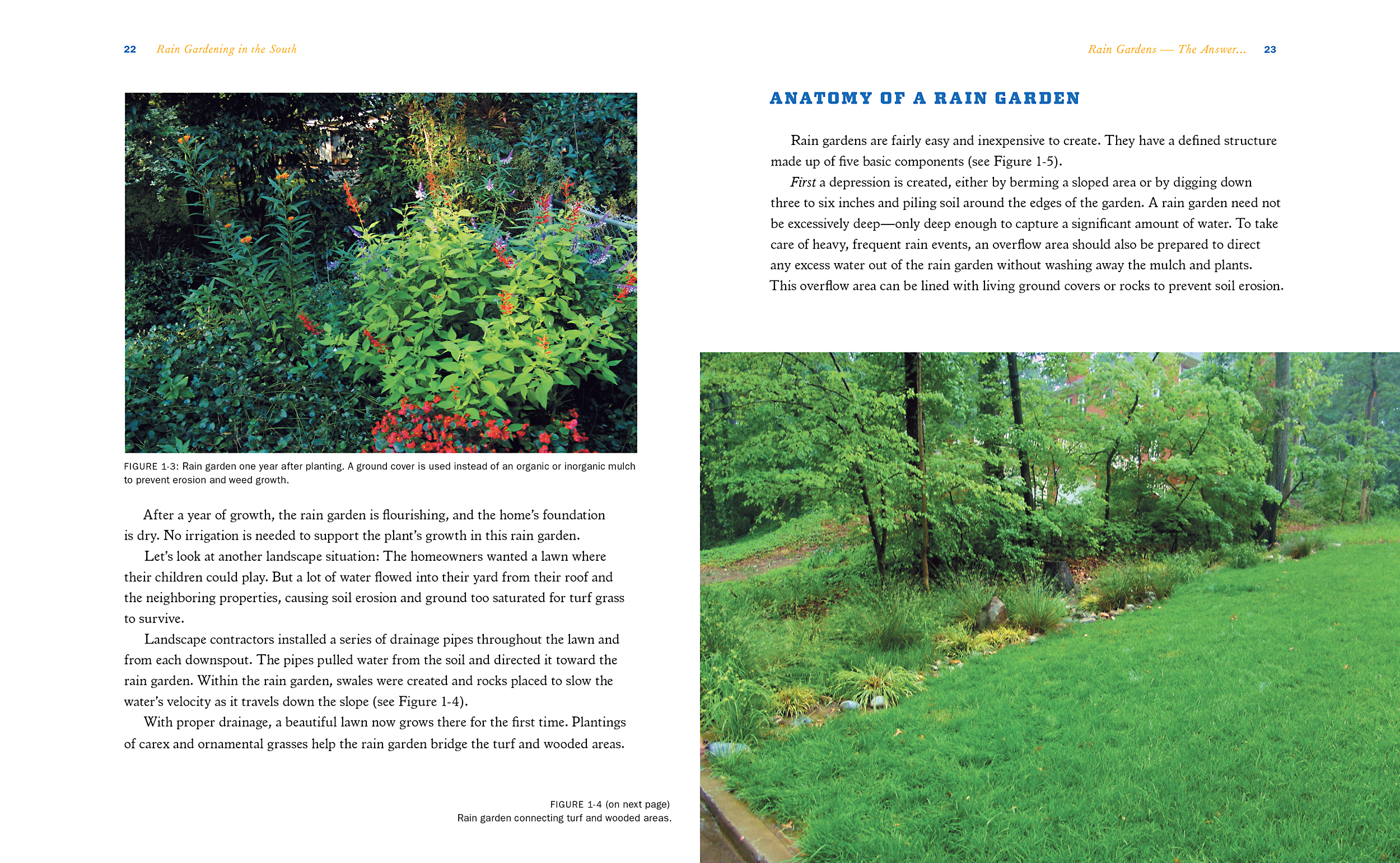
Great photography illustrates the text.
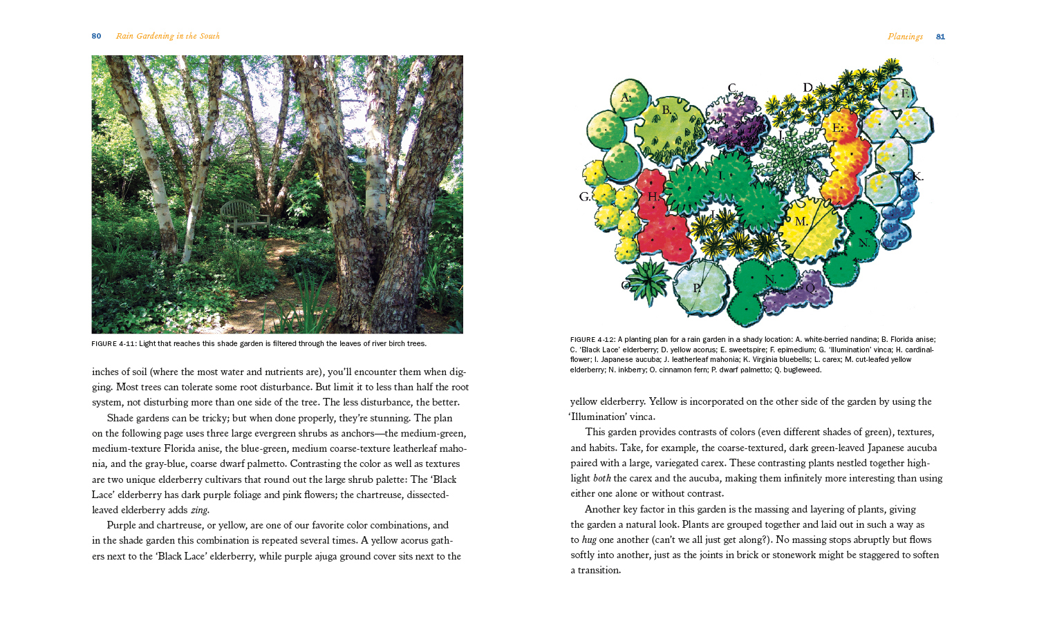
Landscape architecture drawings integrating with photos and text.
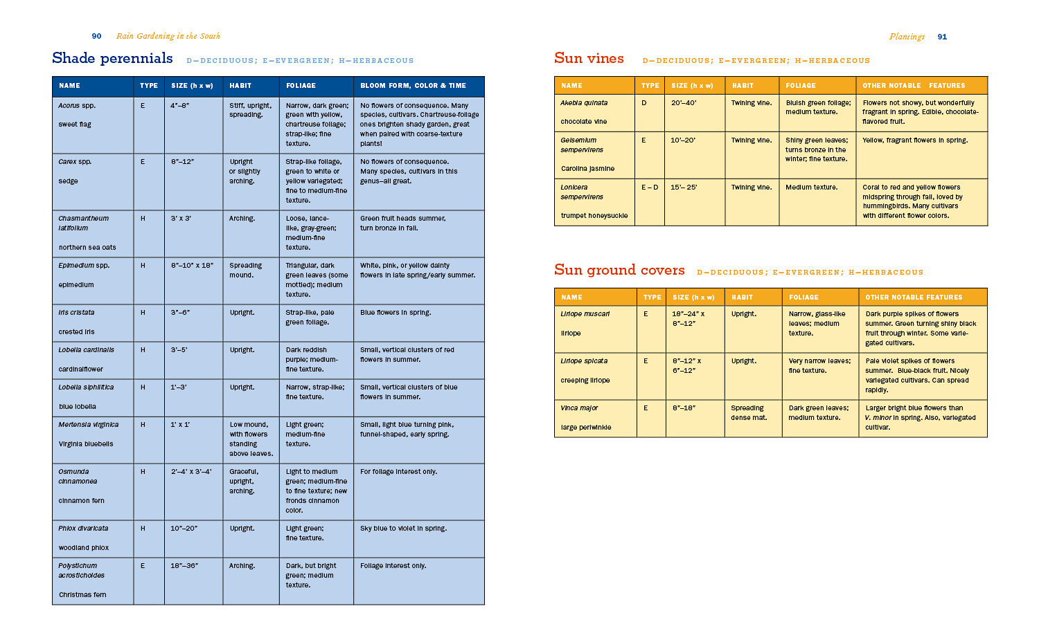
The twelve page index carries a lot of useful information and is much more visually interesting, and easier to read, than most indexes.
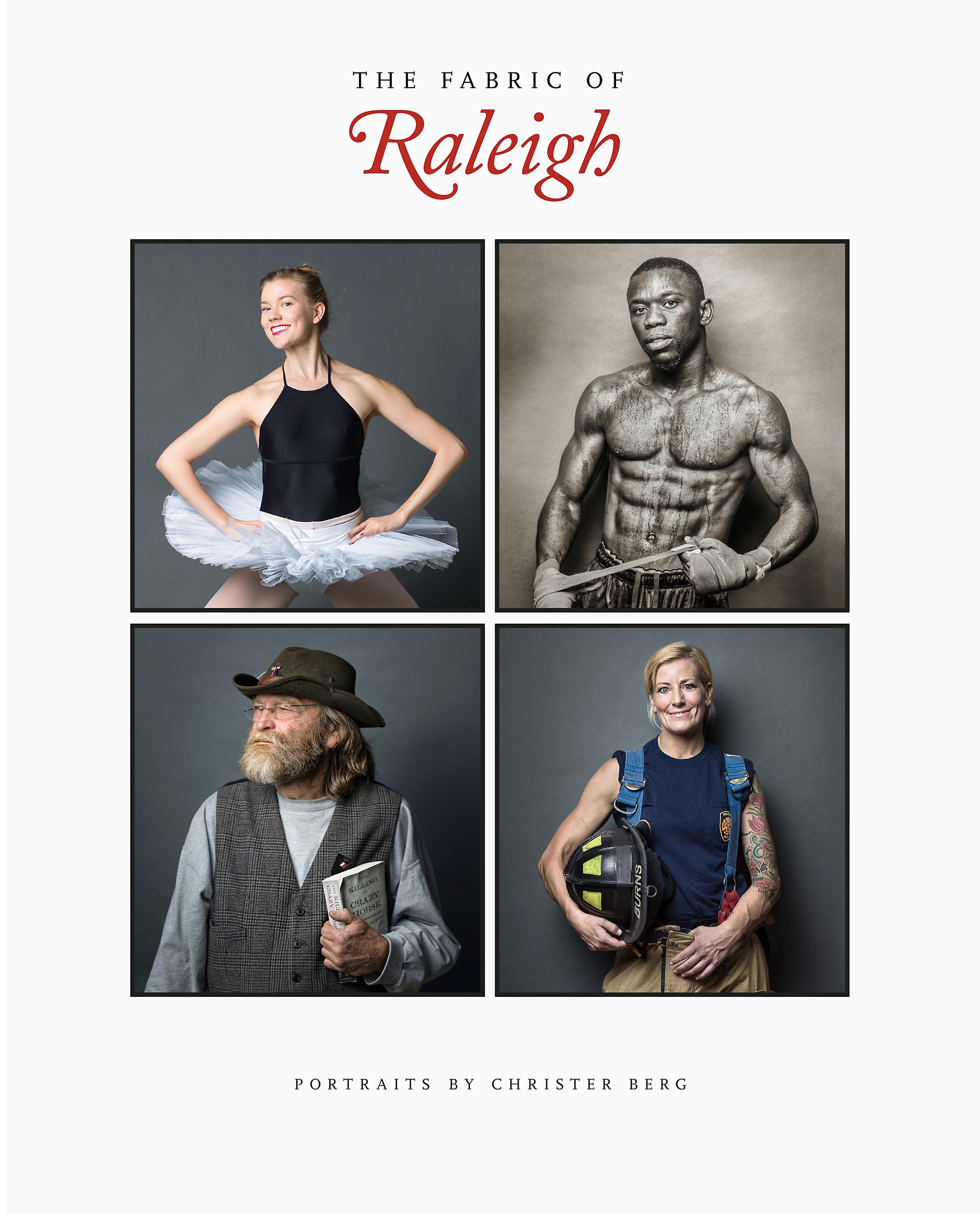
120 page photography book where the reader can decide what is the front cover . . .

. . . and what is the back cover.
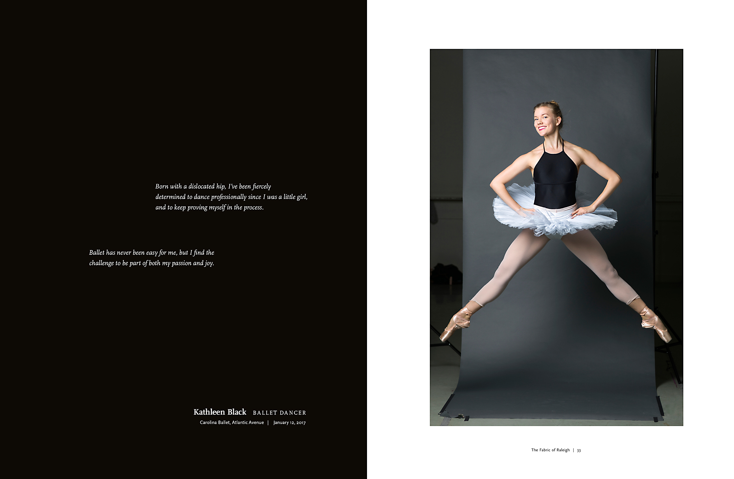
Spreads feature writings by the subjects and each design layout of the text was a play on what is going on within the portrait.
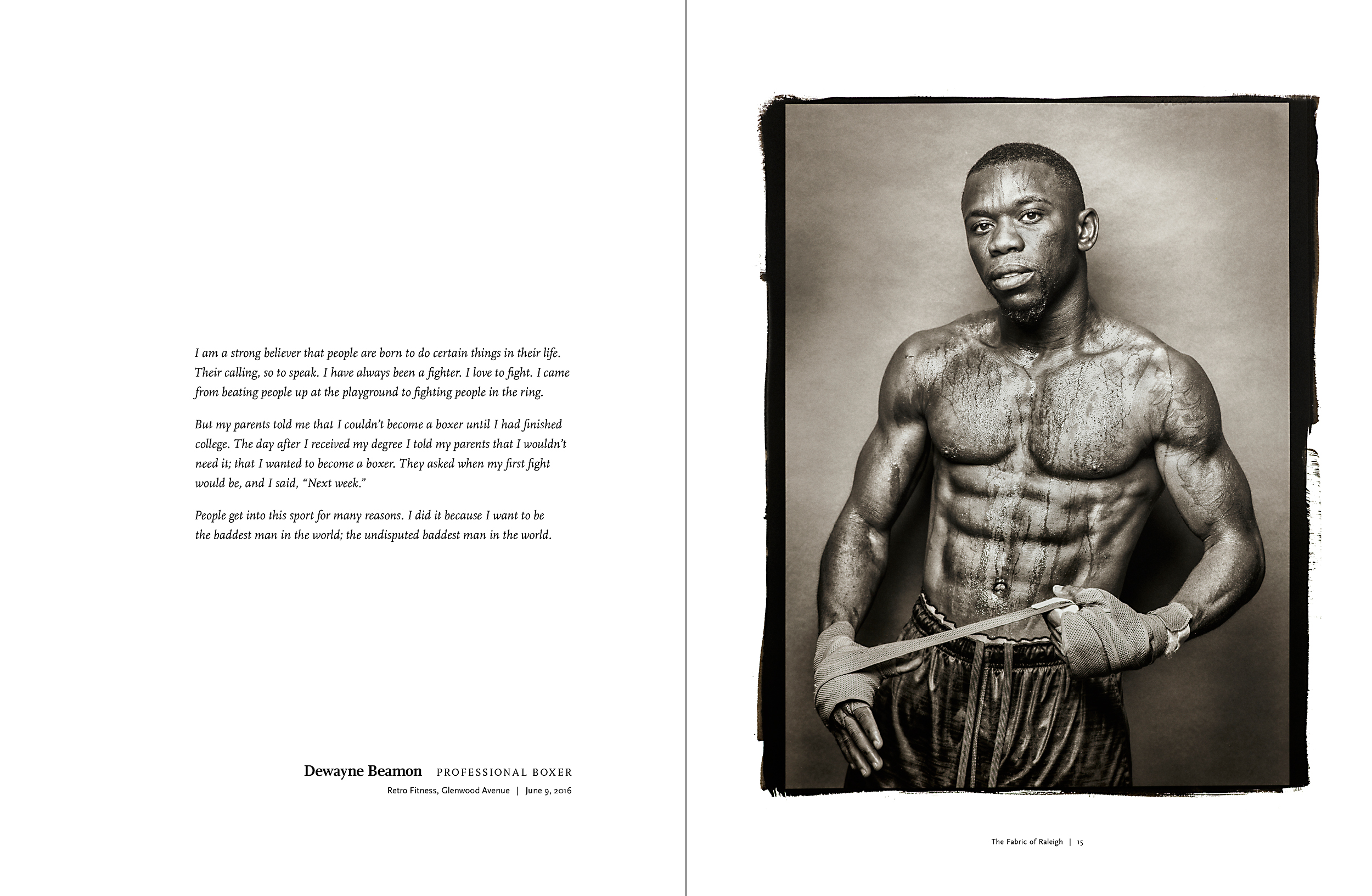
Several palladium prints were in the mix.
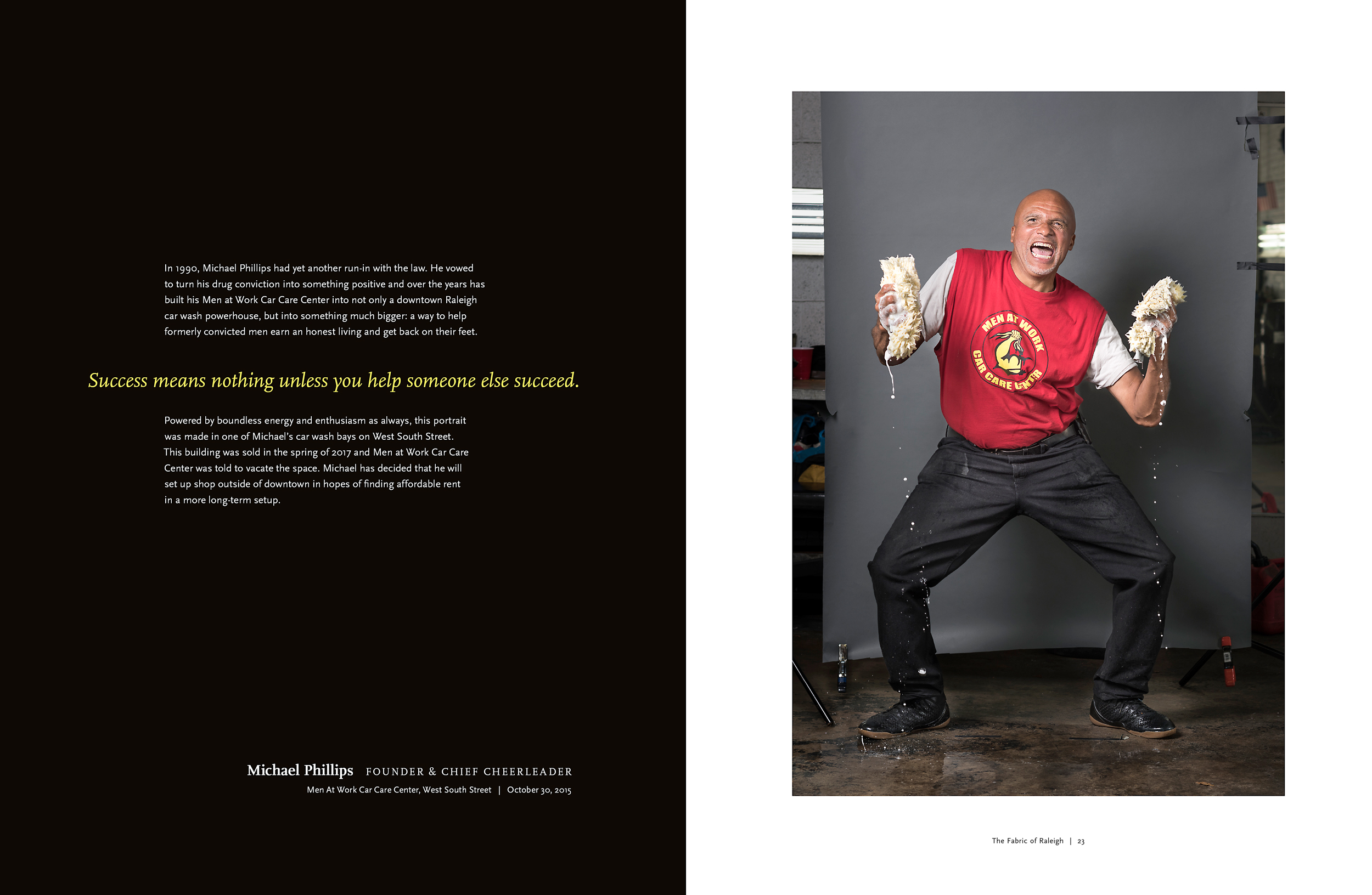
Calling out part of the text excerpt in a color from the heart of the subject's shirt.
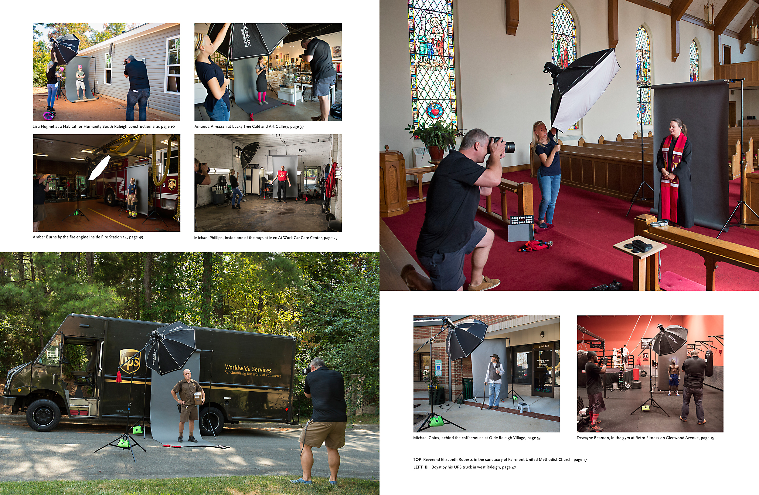
Behind the scenes spreads show how the photographs were made and provide a glimpse at more of the environments around town.
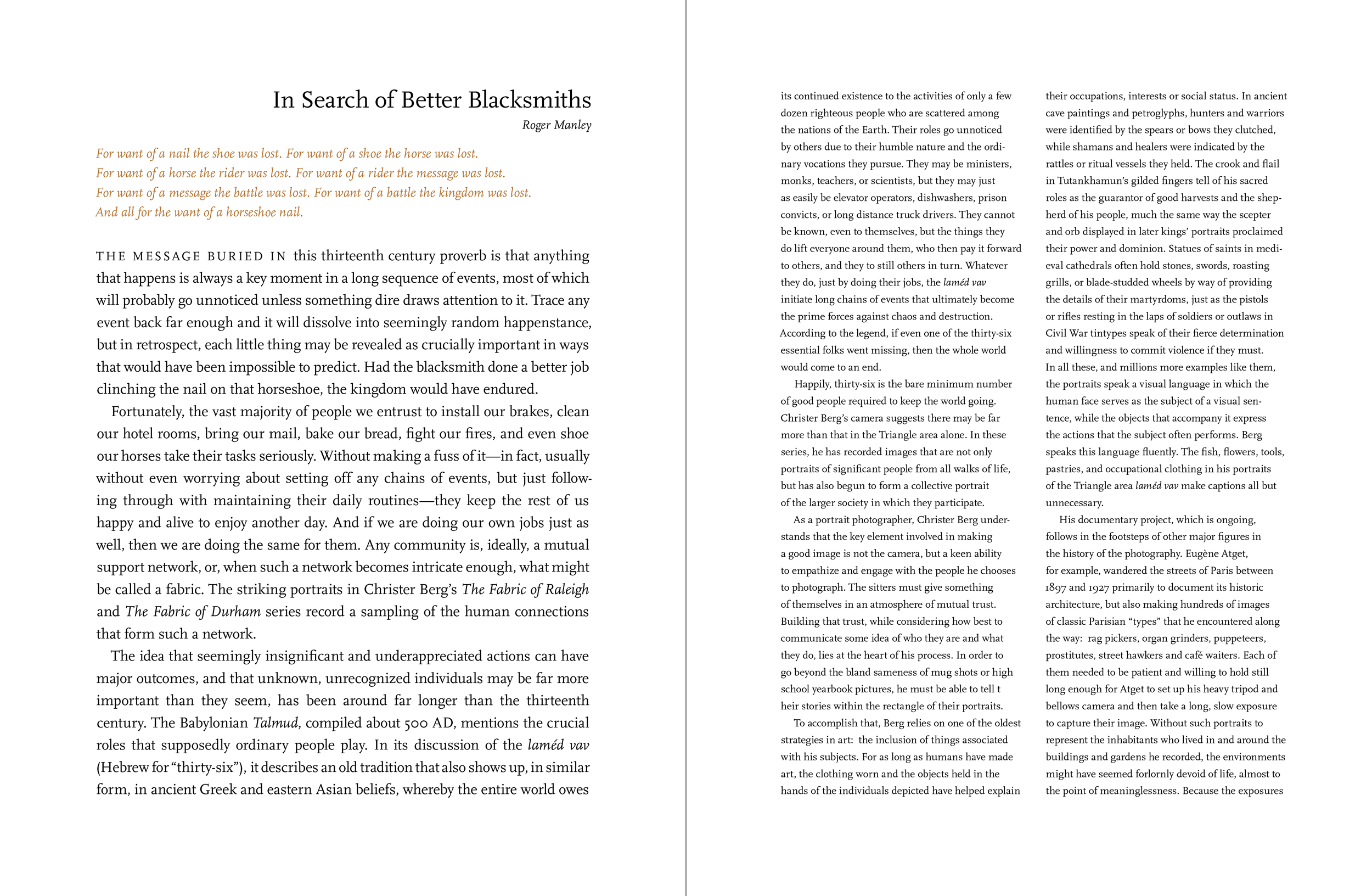
The center of the book, where the Raleigh and Durham sides converge from different directions, carries a four page essay by the director of the Gregg Museum that provides a larger historical context to Christer’s approach to portraiture.
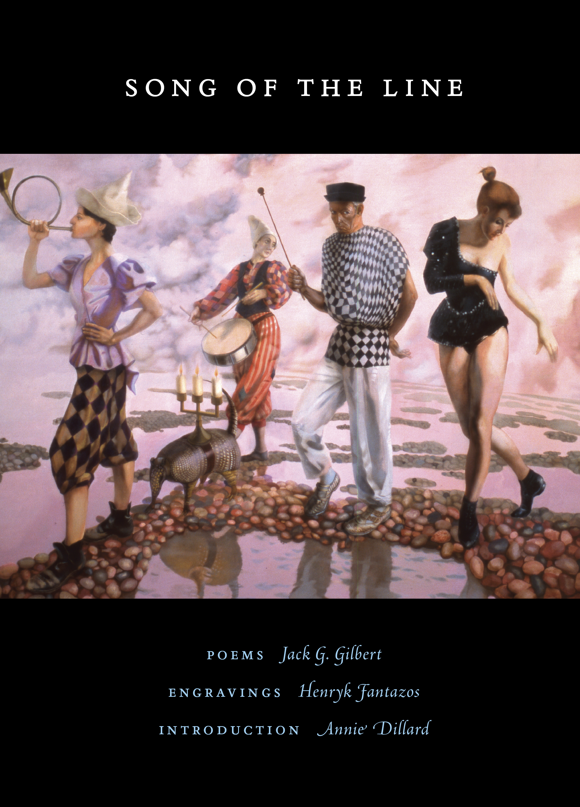
Cover for a book that was equal part poetry and photography. Background image was digitally printed (as a primitive duotone) and then the type was letterpress printed on top of that. The image is later seen inside the book as a full color photograph.
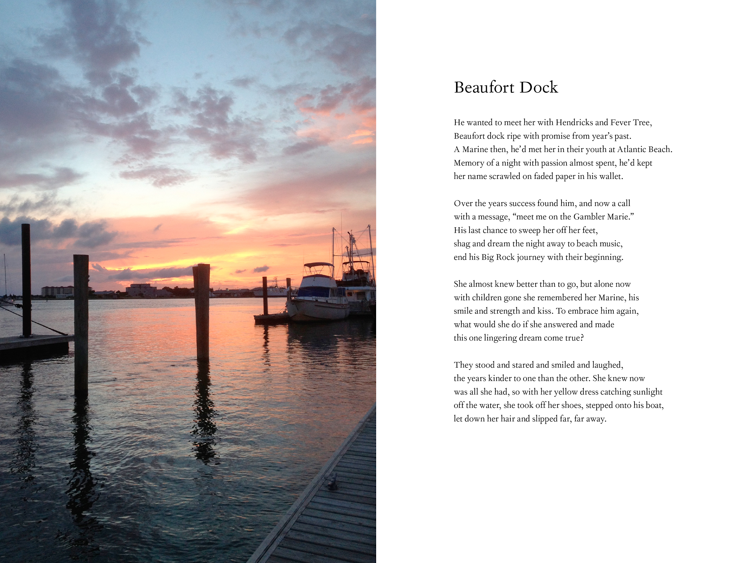
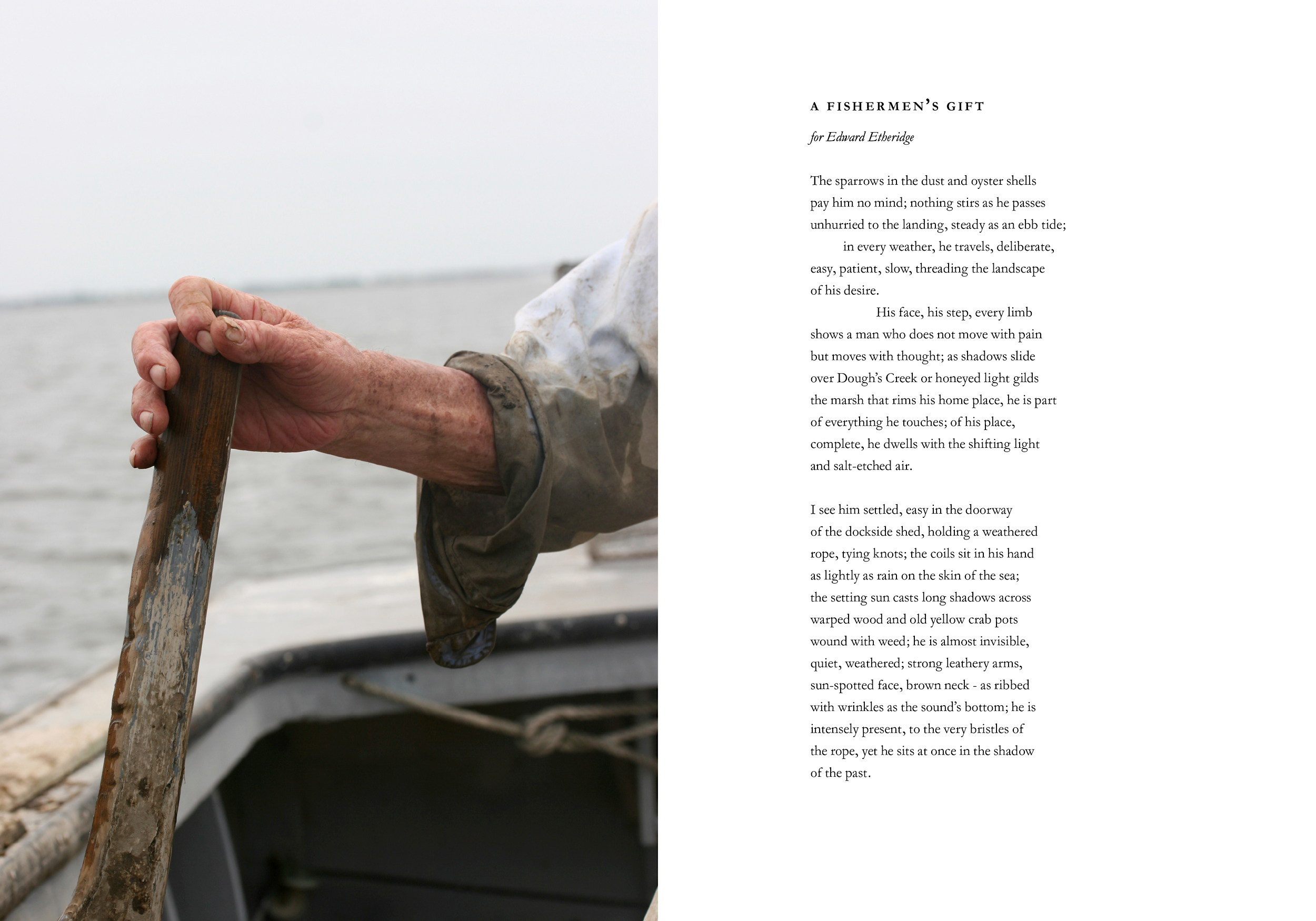
Interior spread. Many photographs bleed to envelope the viewer in the scene, and strengthen how the white space on the surrounding page activates the poem.
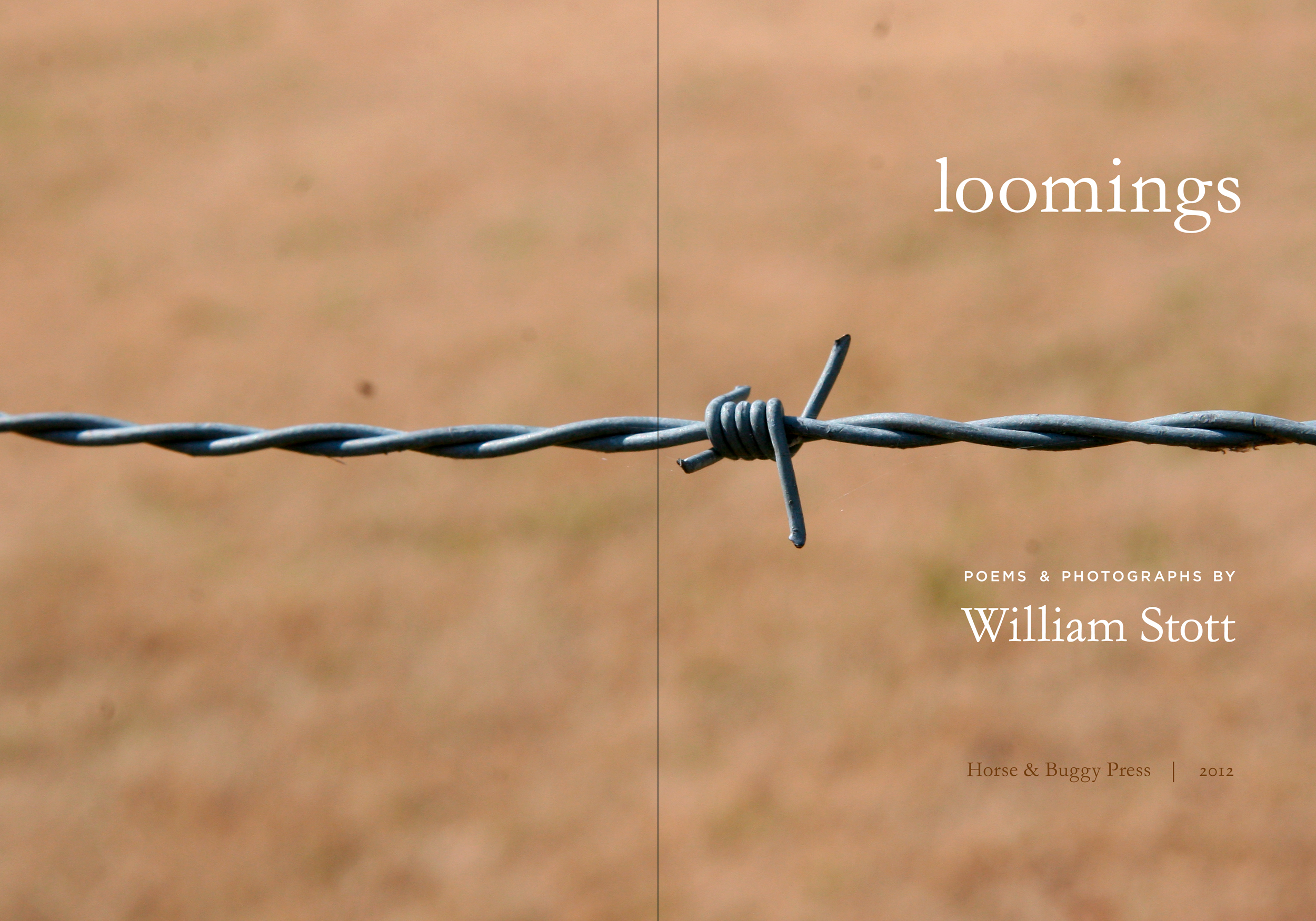
Book cover features a softened background detail of a drawing from the interior. The text was letterpress printed. (in the first printing). Subsequent second printing did not feature hand-printing.
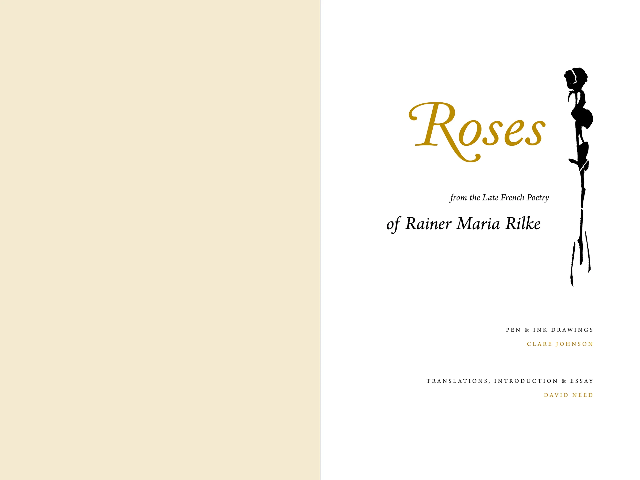
Title spread. Bilingual poetry book was printed on a two color offset press so that the poems on facing pages could be in different colors. This shows a screened back flood of the spot color to set off the title page (and this styling was employed at section breaks within the book).
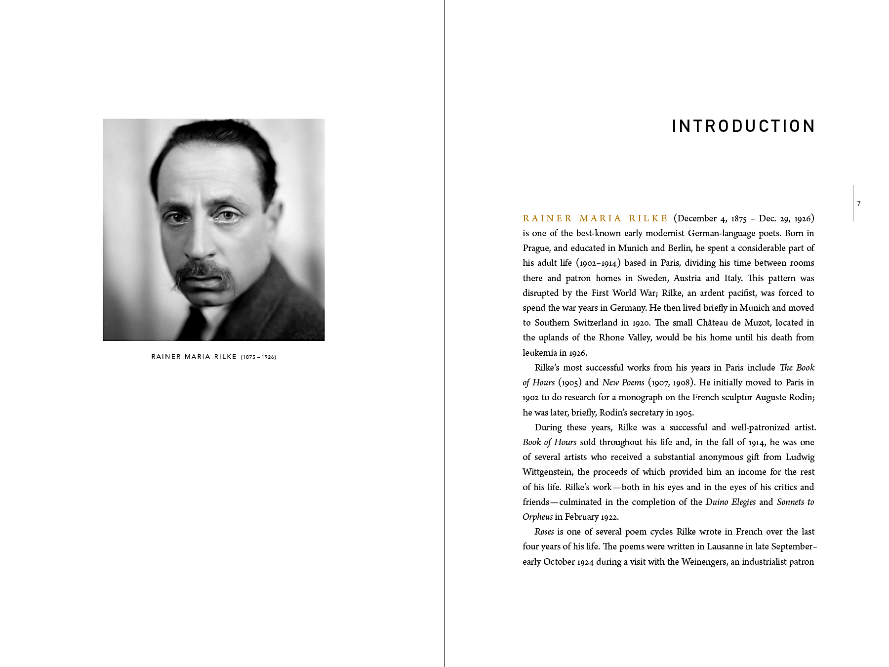
Introduction spread. Rilke looks at us from another century as we read about him.
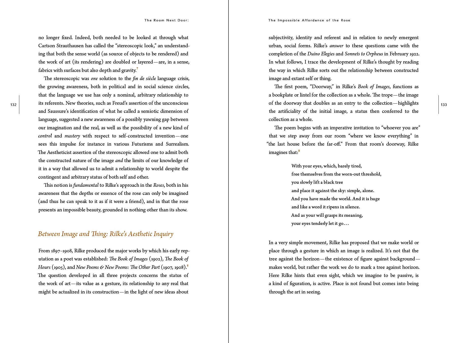
Essay spread. More info about this 220 page book can be found in the blog section of the website.
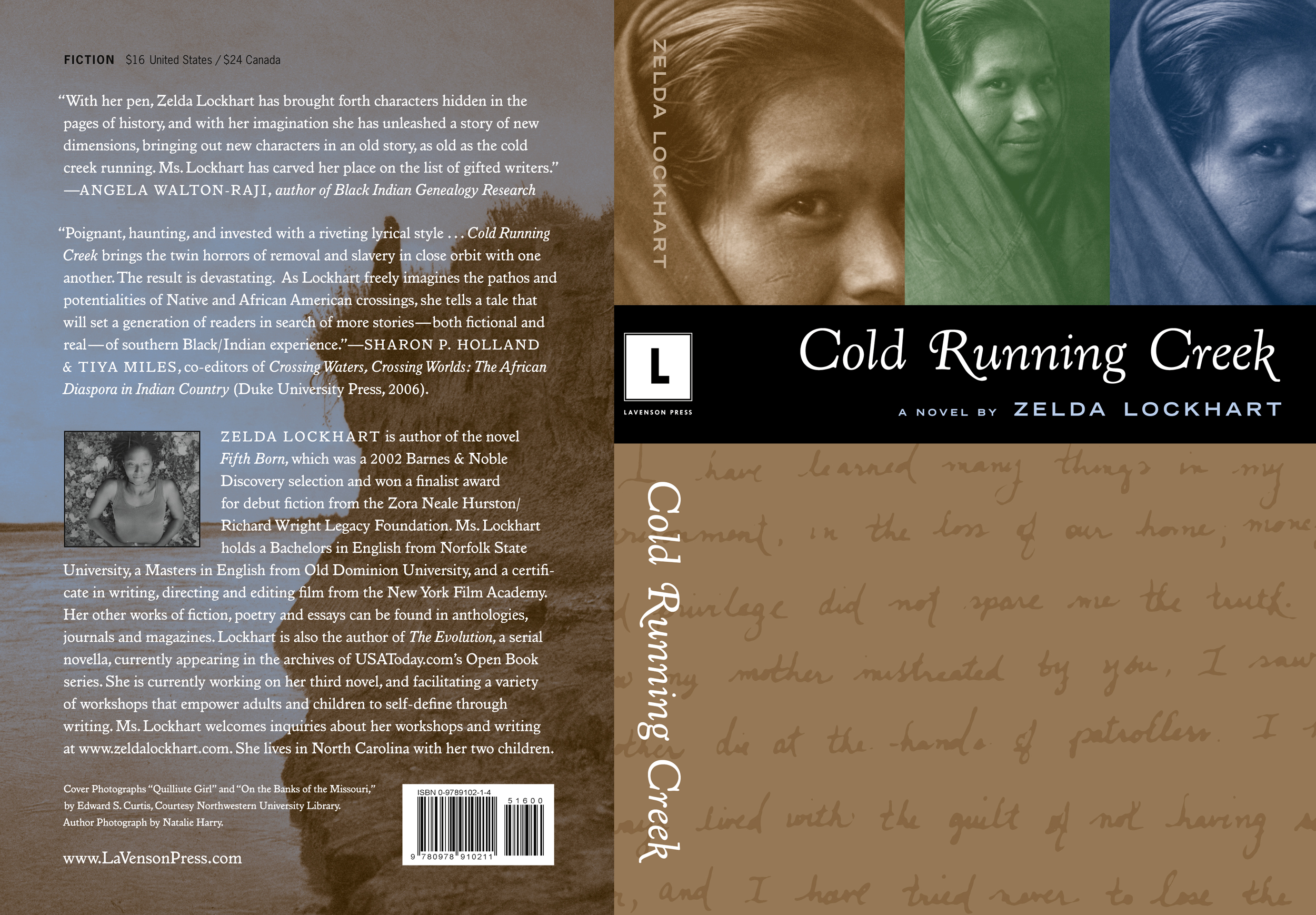
Cover design. (we also designed and typeset the interior). Zelda got tired of waiting for her NYC publisher to release her second title, so she pulled it from them and paid me to design it and started her own imprint. The book has subsequently been reprinted several times.
Cover design. (we also designed and typeset the interior)
Title spread.
Contents spread. The feel of morning as one begins the book.
Opening spread of a ten page photo/poem essay.
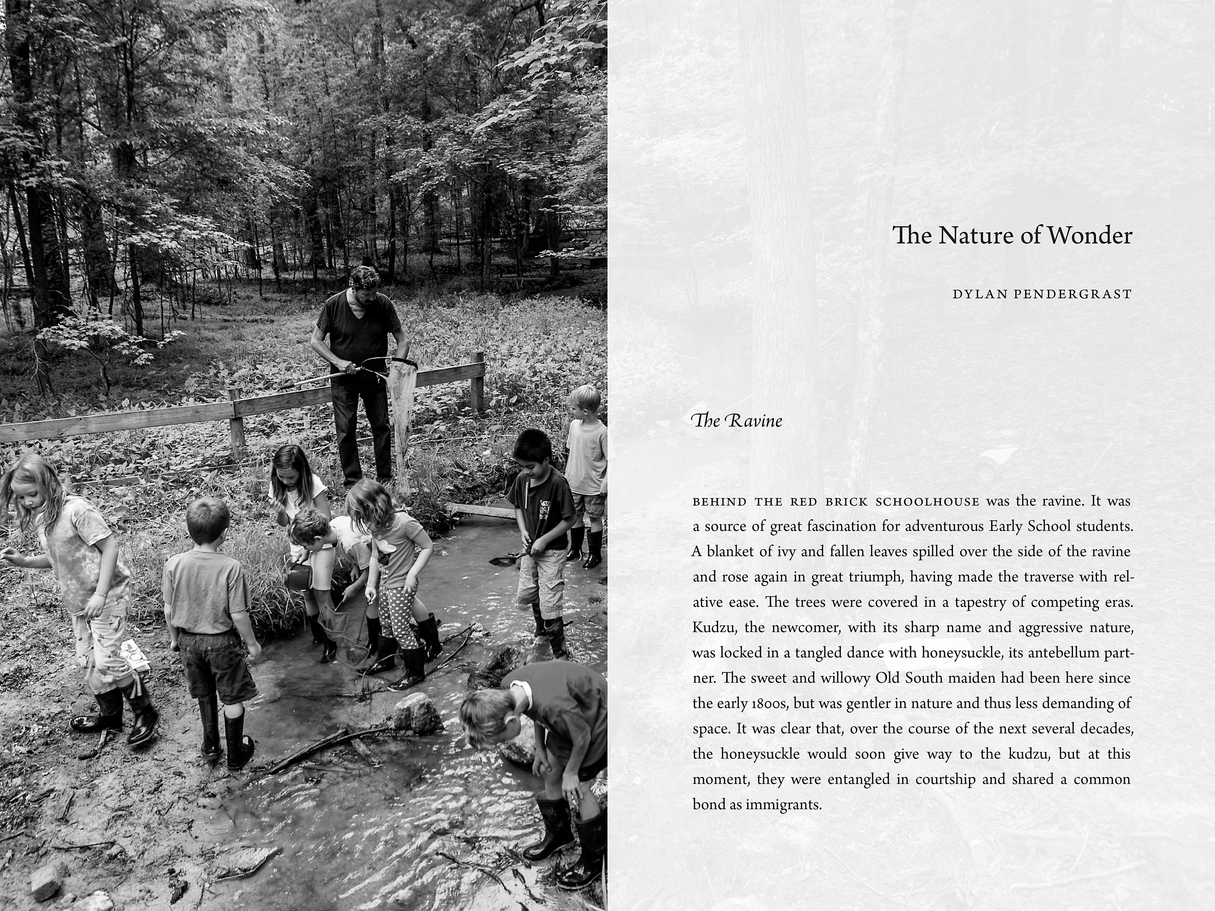
Chapter opening for a book on the history of the Carolina Friends School.
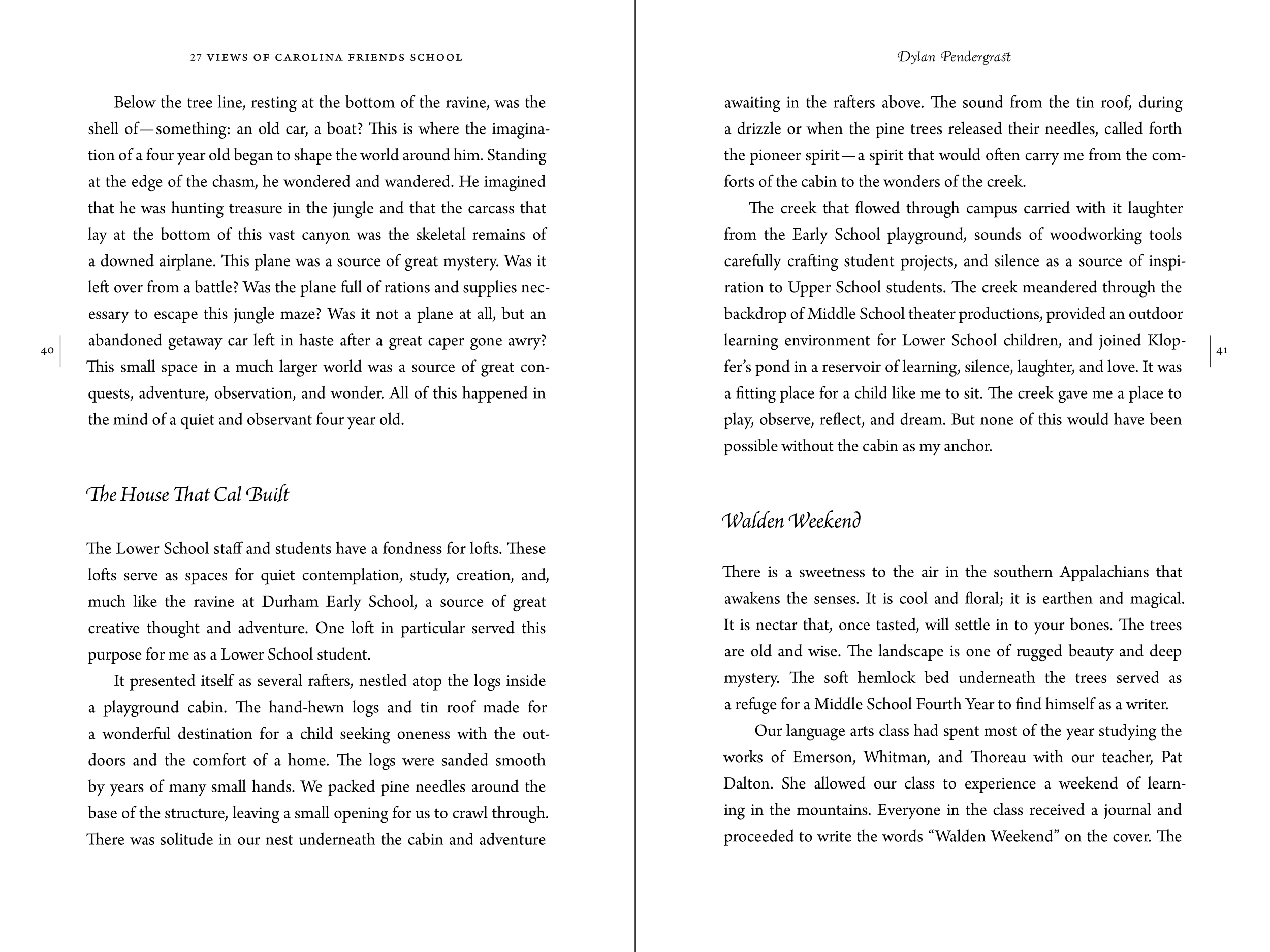
Spread for CFS history book.
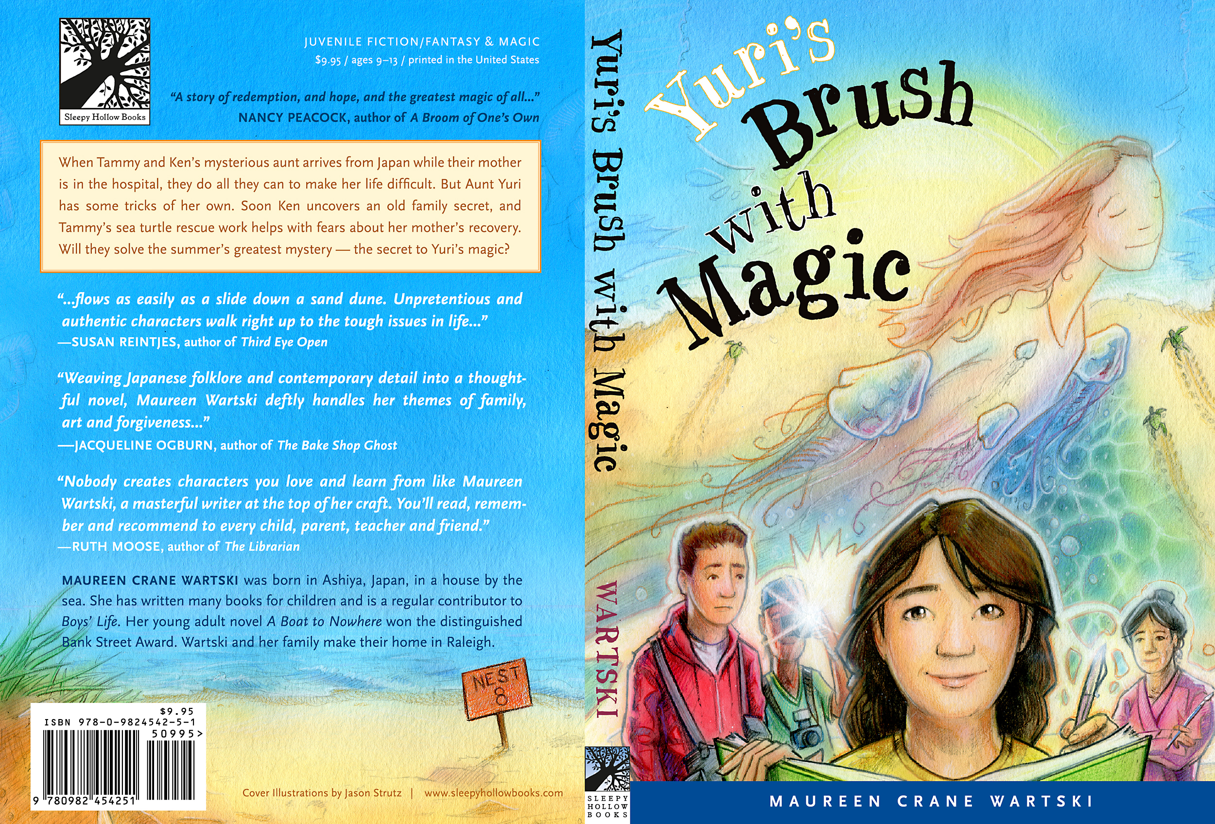
Back cover/spine/front cover for children’s novel.
Chapter opener.
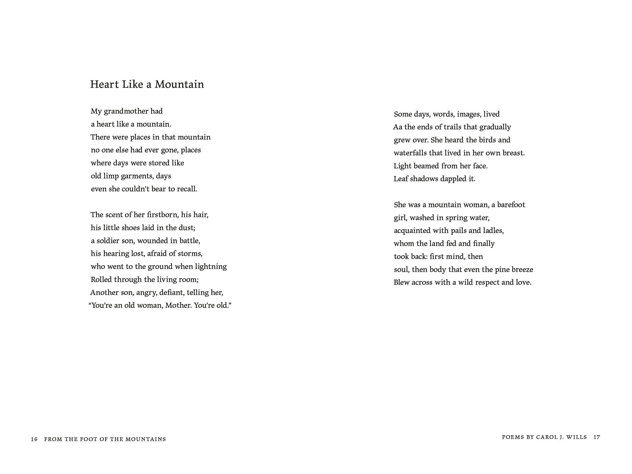
Paul’s Hill was a long autobiographical poem and we went with a larger page size to allow for long lines to remain intact (without breaking or having to be very small in point size).
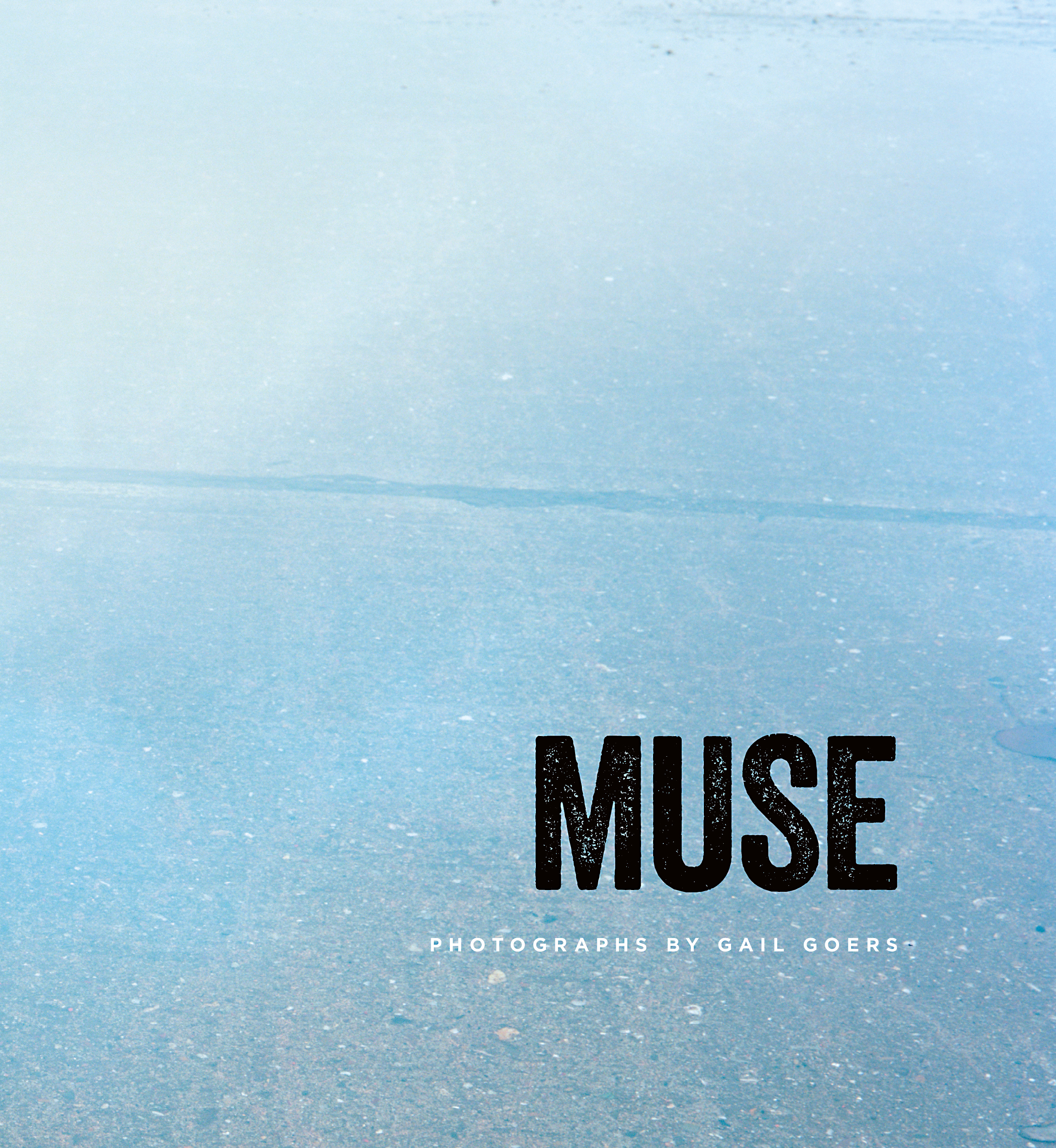
Front cover for photography book. 10 x 13 inches. Image is a detail of a photo to be seen in its full composition an interior spread (puddle collected on a sidewalk).
Dustjacket. Front cover.
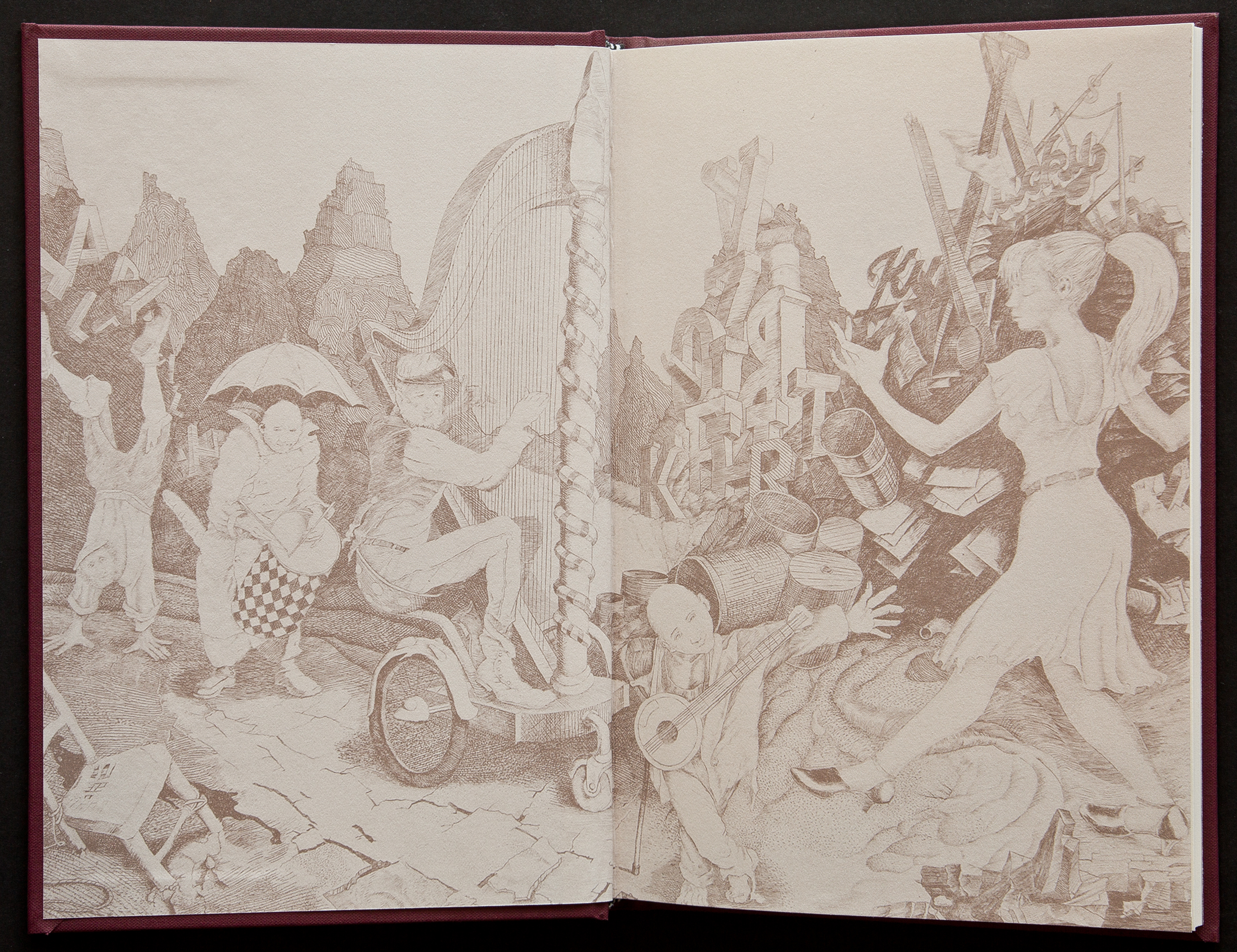
Printed endsheets for the hardcover edition was another deluxe touch . . .

. . . as was printing the interior pages 80lb Mohawk Superfine, eggshell finish. Extensive attention was given to the images to make sure the images were reproduced with the "correct" amount of plate tone from the original hand-printed engravings. Production coordination can be as important as design.